Renata Joy | project criteria
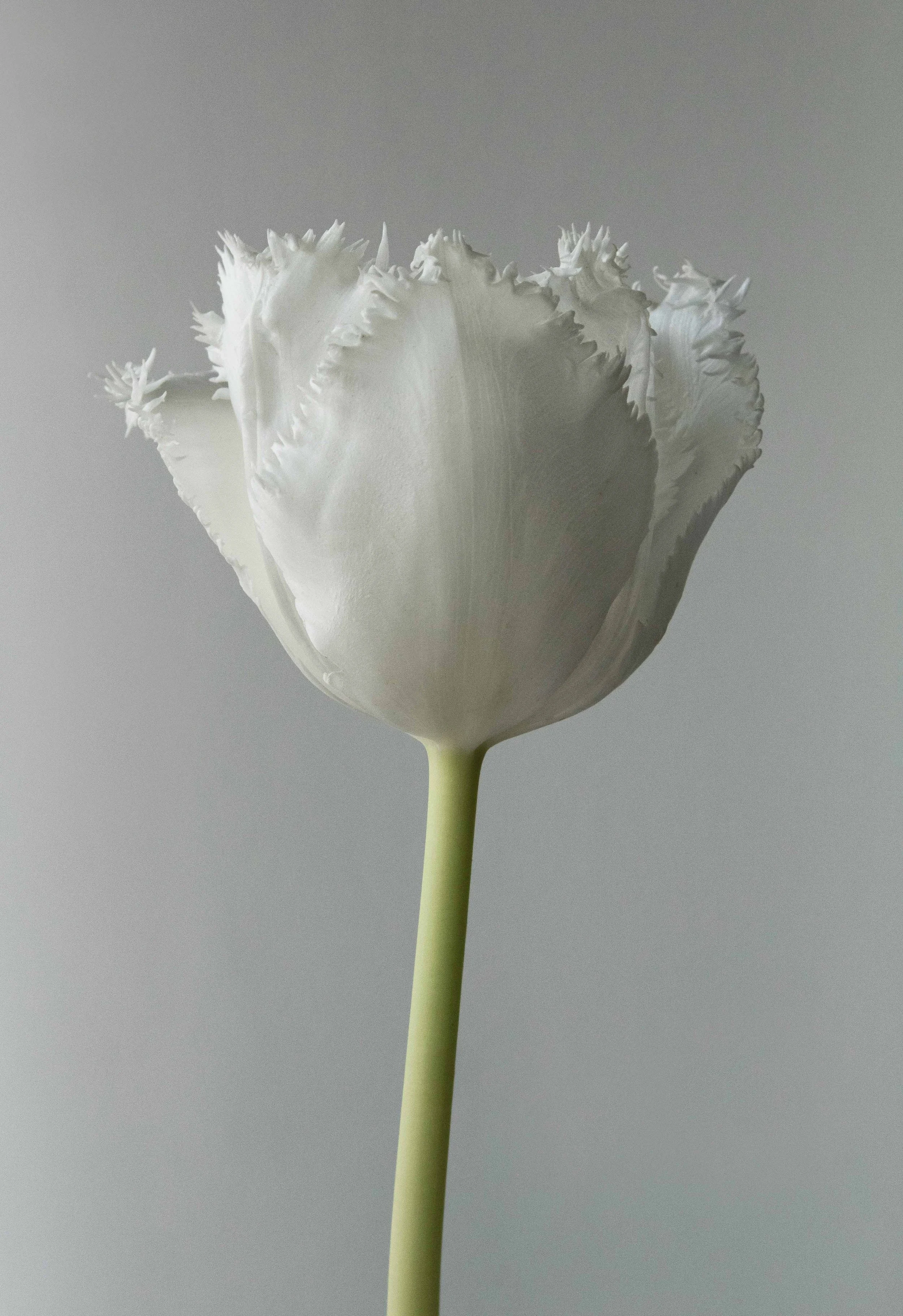
In past discussions with the author (Renata Joy) and cover designer (Ann Weinstein), the concept of using B/W floral portraits as key visual elements for The Joy Journal is a welcome approach. The B/W floral portraits strike a nice balance between their presence inside the book and the accompanying text in the journal. All agree full color versions would be too vibrant and overpowering. With the move from B/W printing for the journal’s interior to printing with full color, team members agree it is worthwhile to shift the B/W images towards a rich black version of each one. (I.e., full-color is used to enhance the visual depth and richness of each floral portait while maintaining the “B/W presentation” of these image). There as been discussion of carrying the floral portrait concept over into the cover of the journal, as well as the memoir and pocket edition.
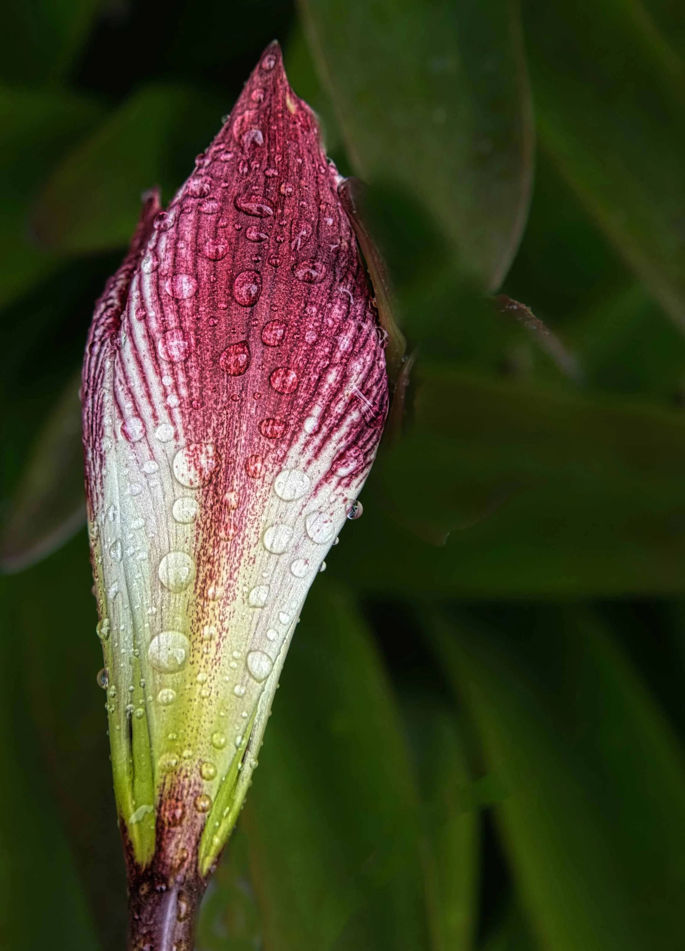
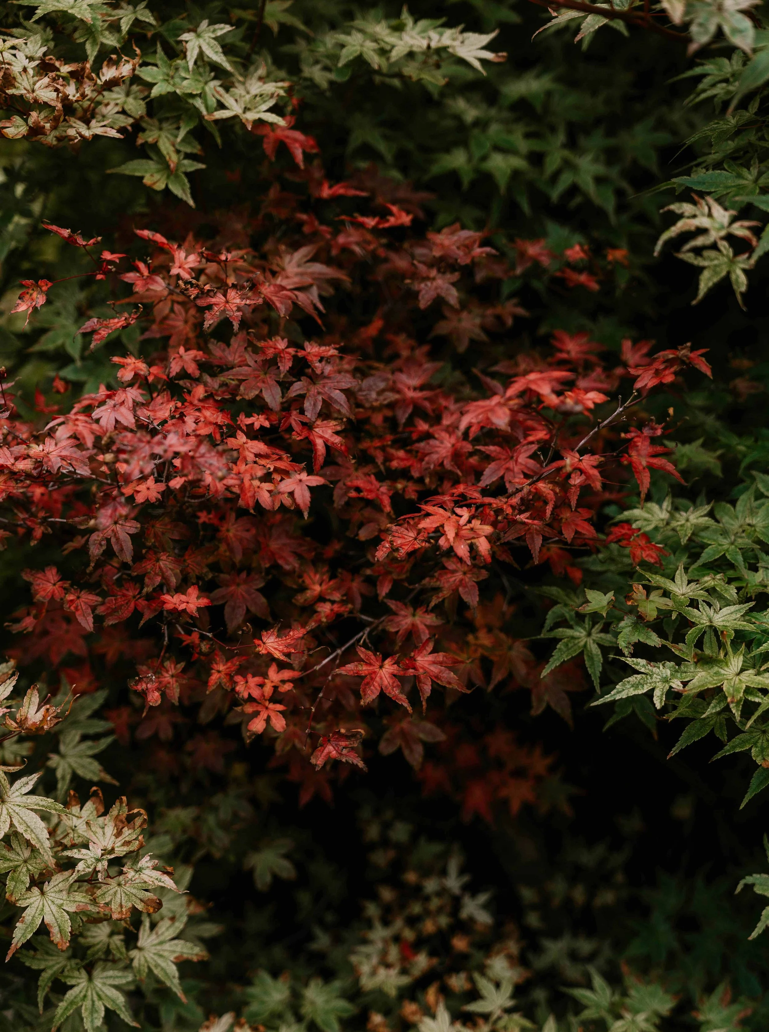
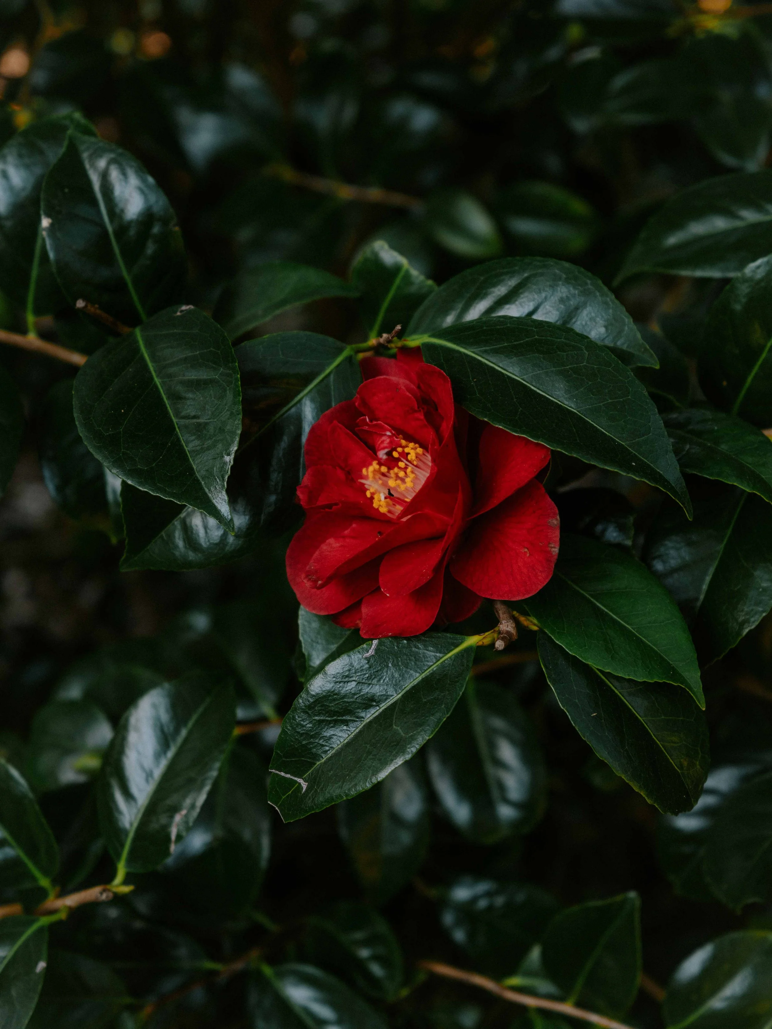
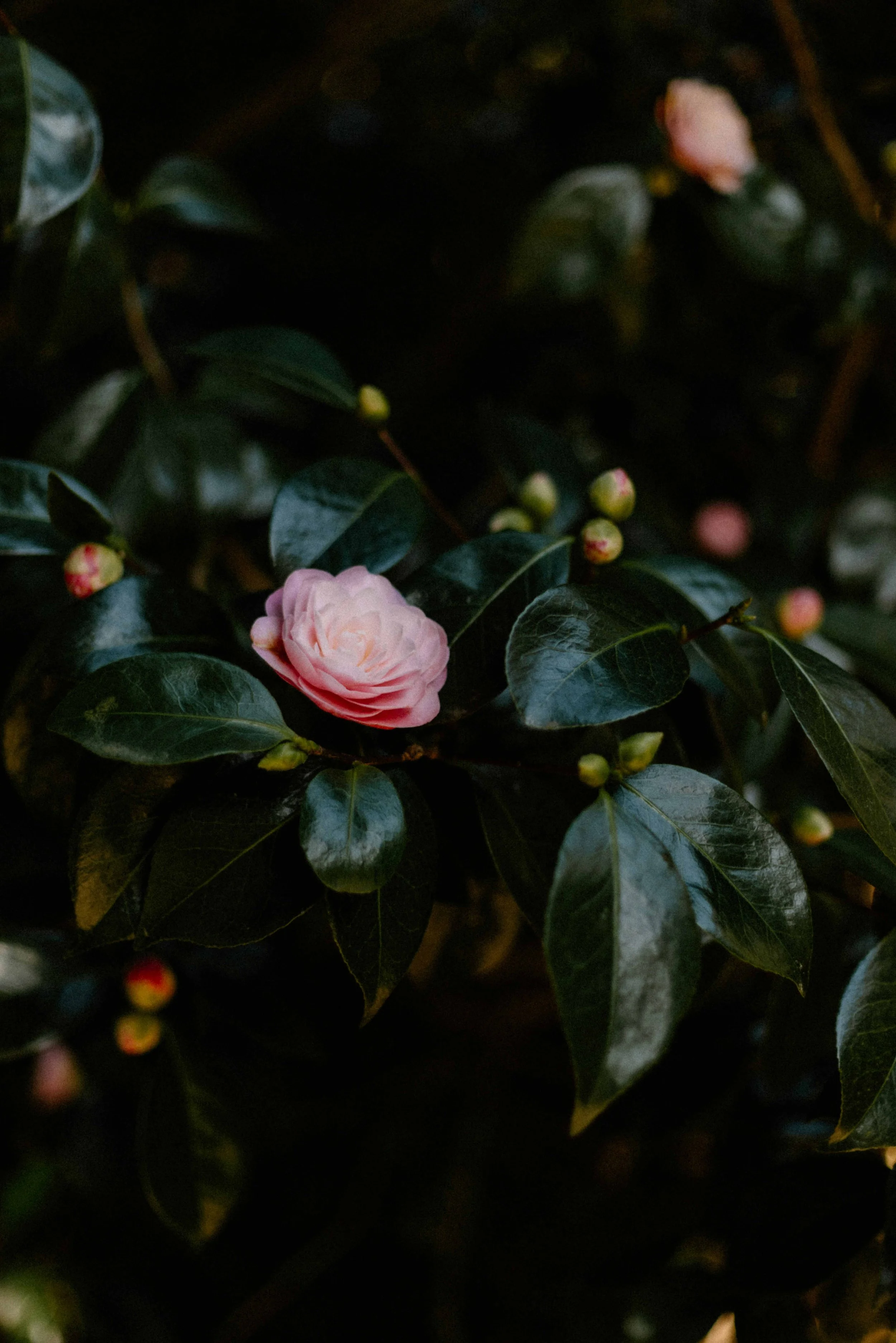
When contemplating an overall color scheme for The Joy Journal, as well as The Joy I Came Back For and the pocket edition, working with colors found in nature — in flowers — would mesh well visually and conceptually.
PROJECT DOCUMENTS:
The Design Idea Sheet prepared by the author. The brief encapsulates design discussions to date, as well as offering sirection and suggestions based upon the content found in the final, edited MS for The Joy Journal. (The final MS is considerably streamlined in terms of individual design elements sprinkled throughout each day and week when compared to the draft used for the preliminary design.) Download a PDF version of the Design Idea Sheet.
The Design Memo for The Joy Journal has been updated to reflect the final, edited MS. Download a PDF version of the Design Memo for the journal.
A preliminary design was completed to get a better handle on an estimated length (castoff) for an earlier draft of The Joy Journal MS. That draft design has been the basis of discussion for the visual design moving forward. Download a PDF version of the preliminary design.
COLOR PALETTE POSSIBILITIES
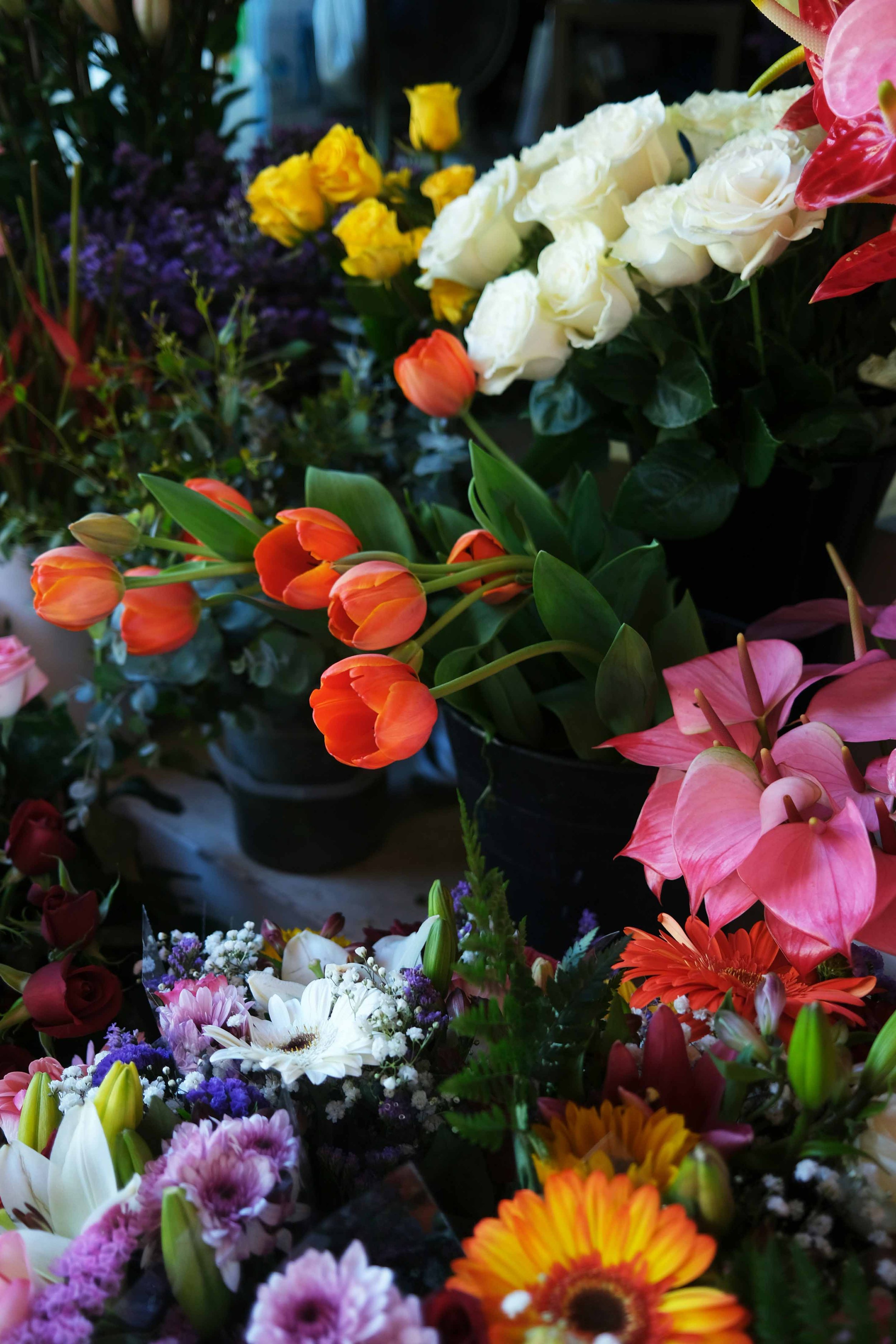
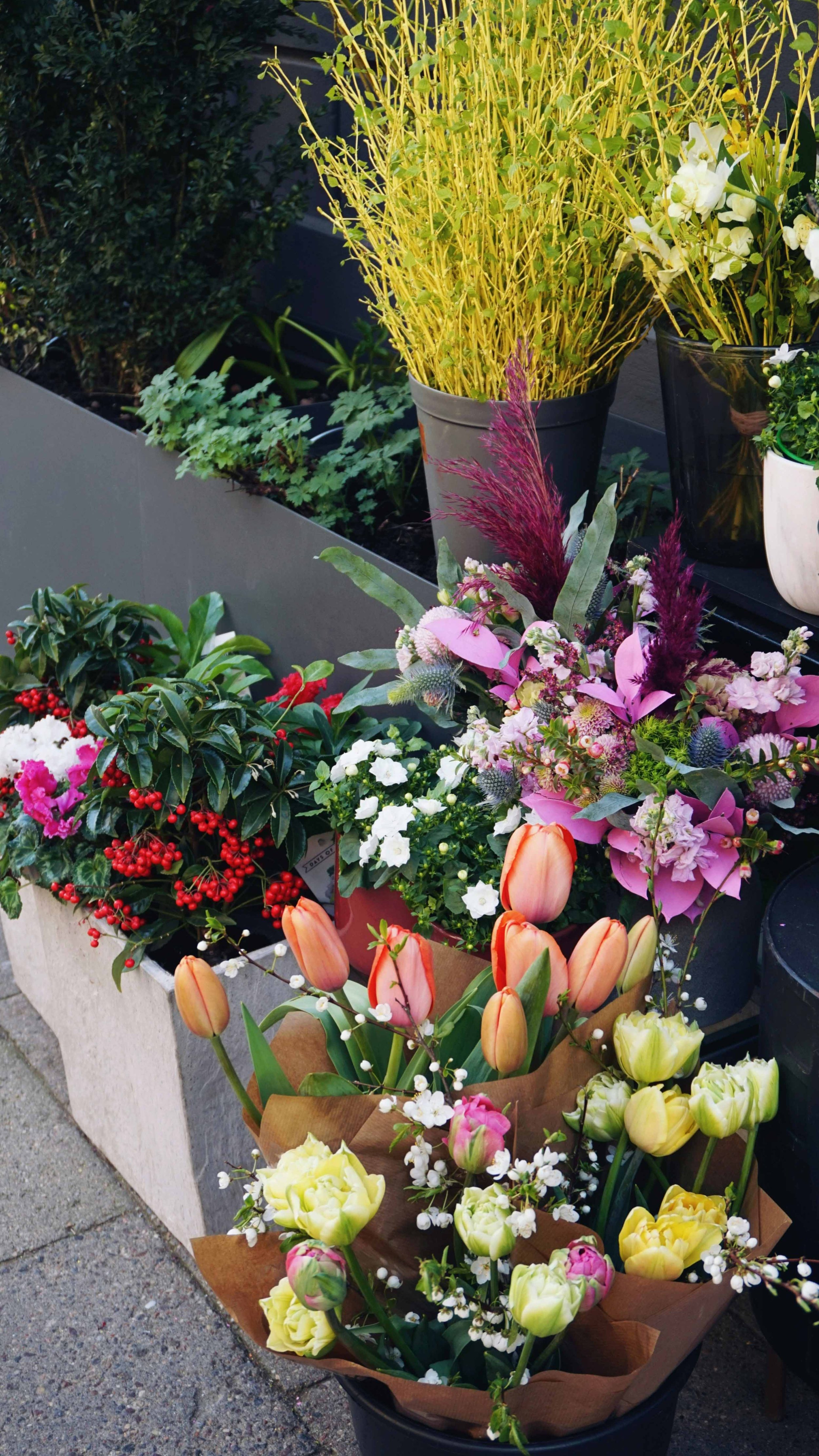
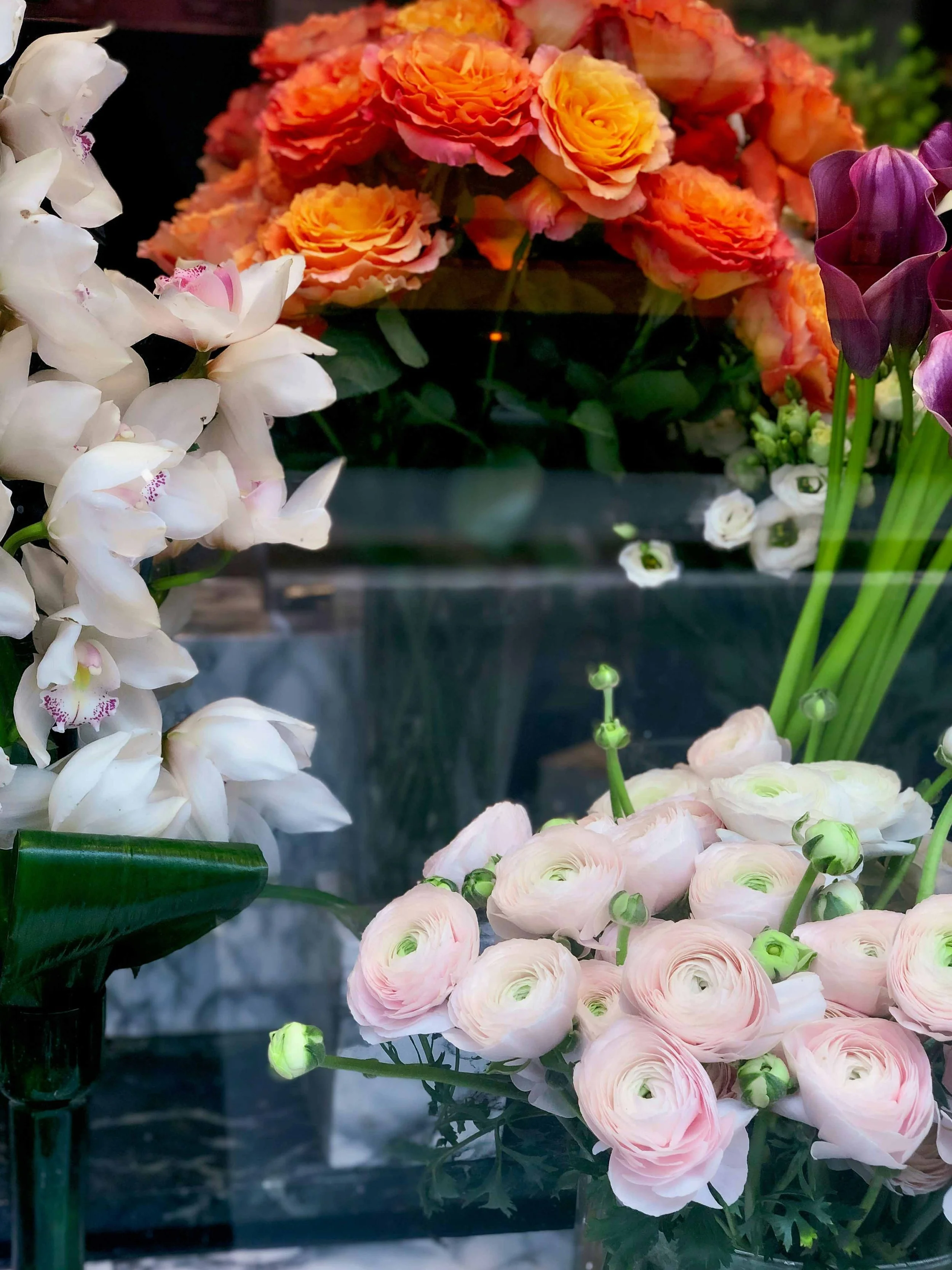
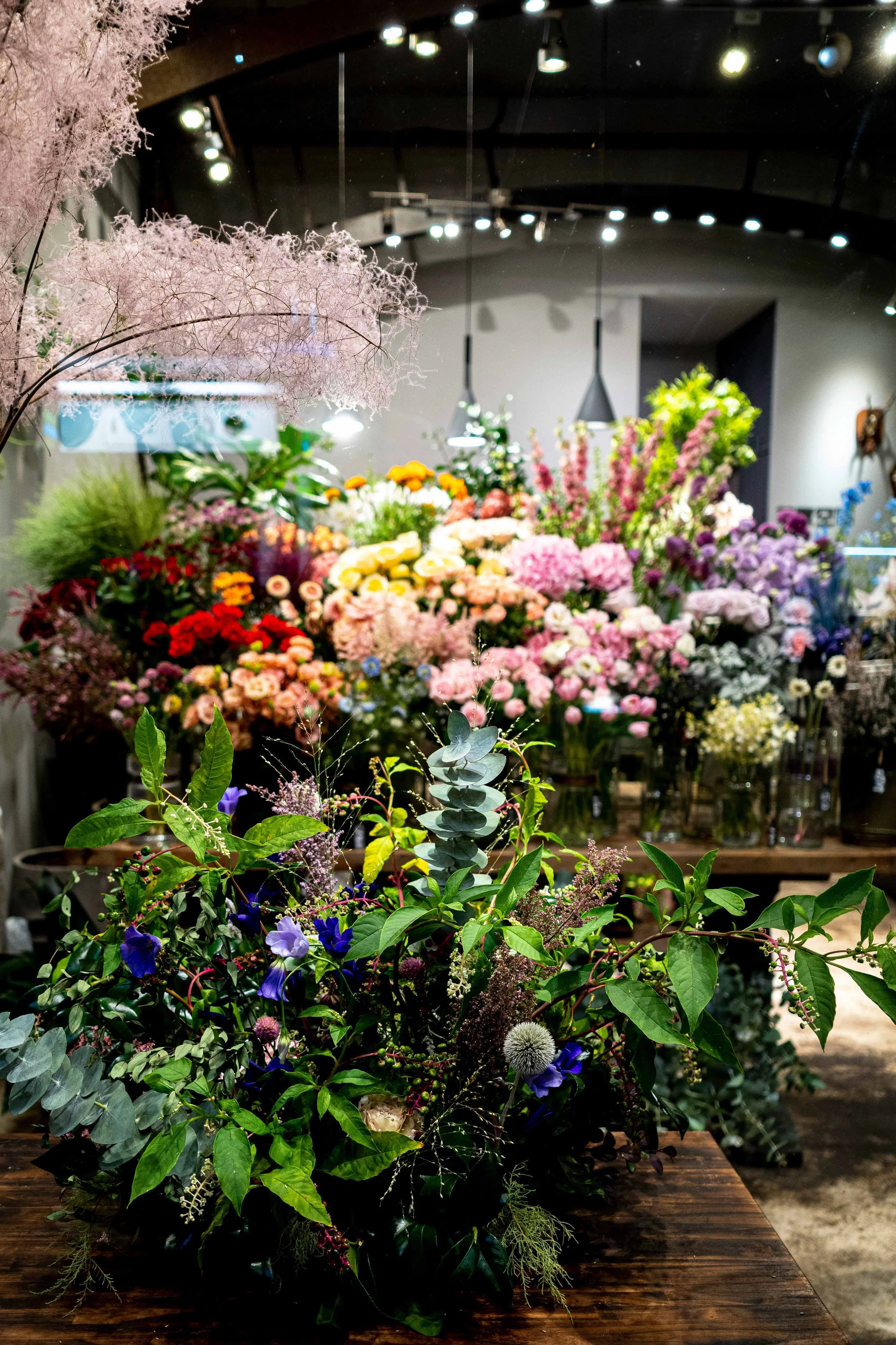
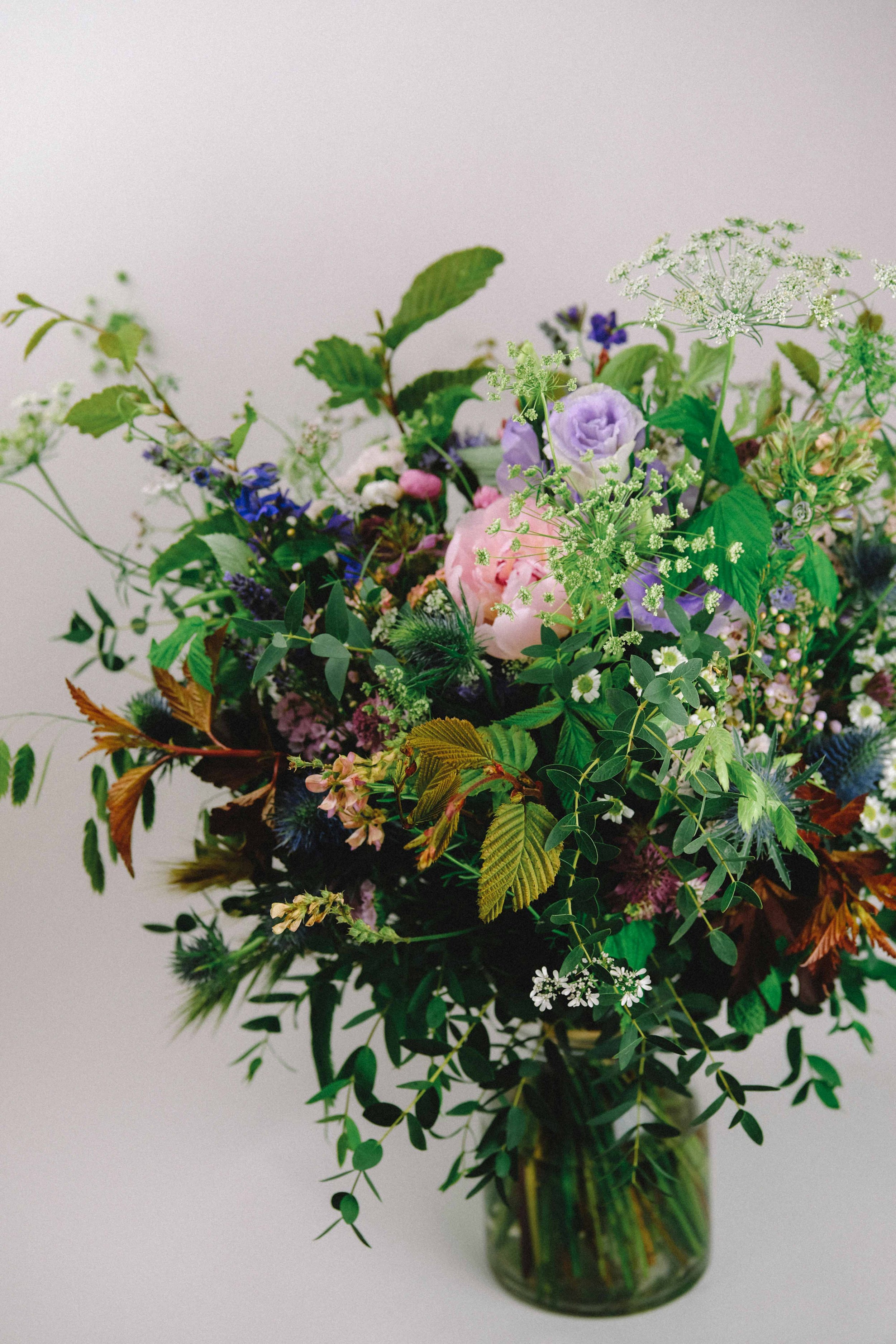
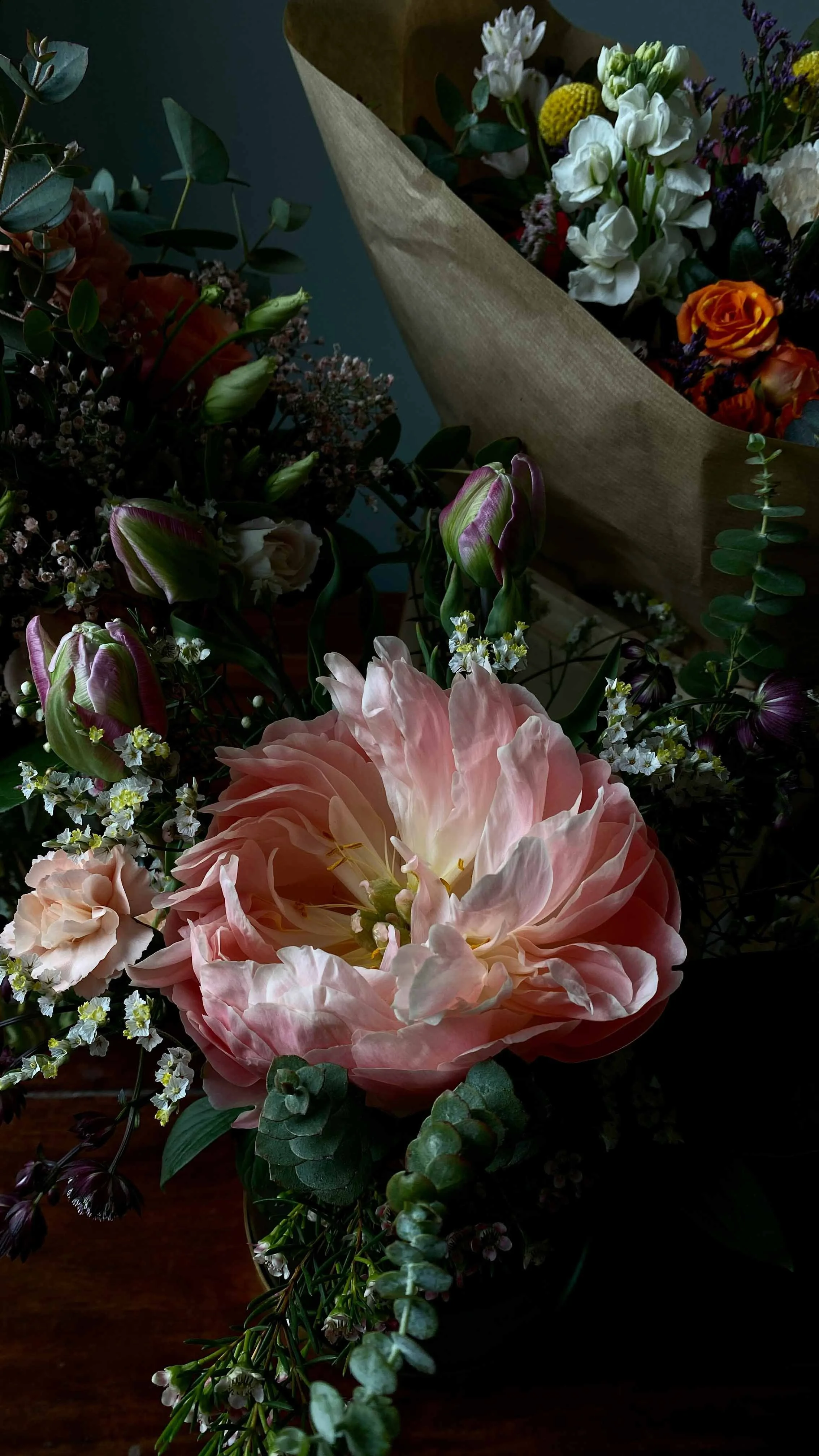
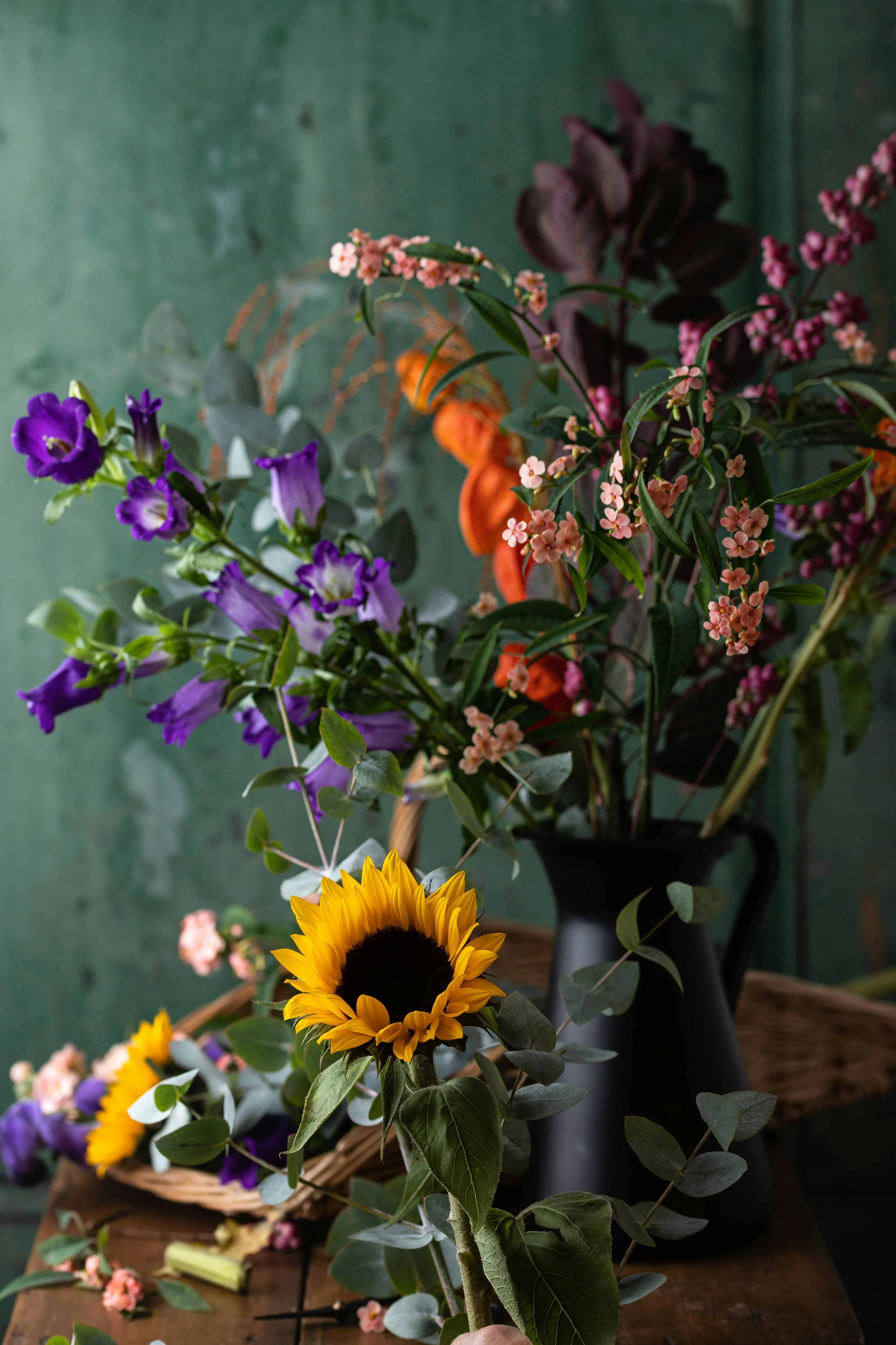
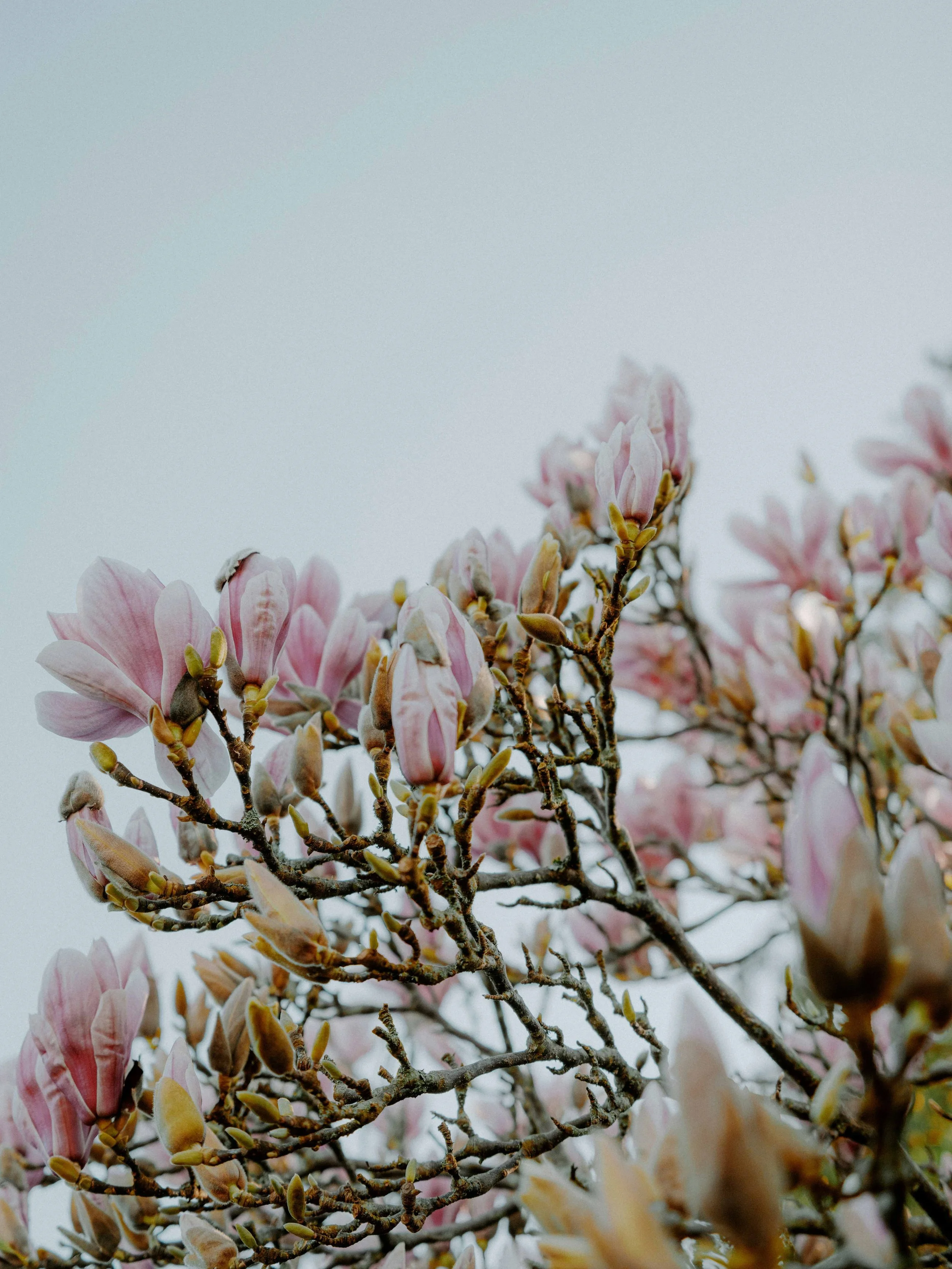
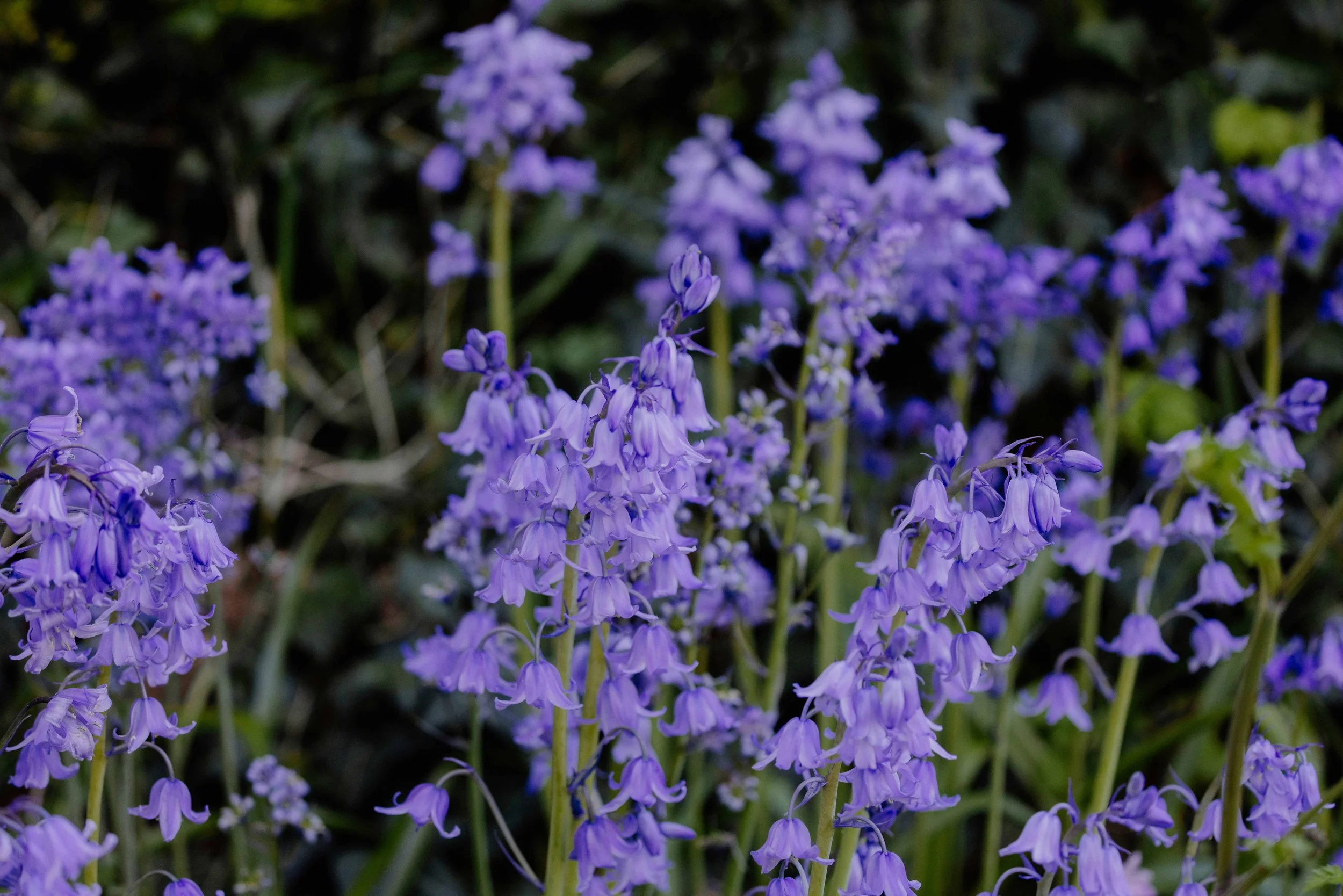
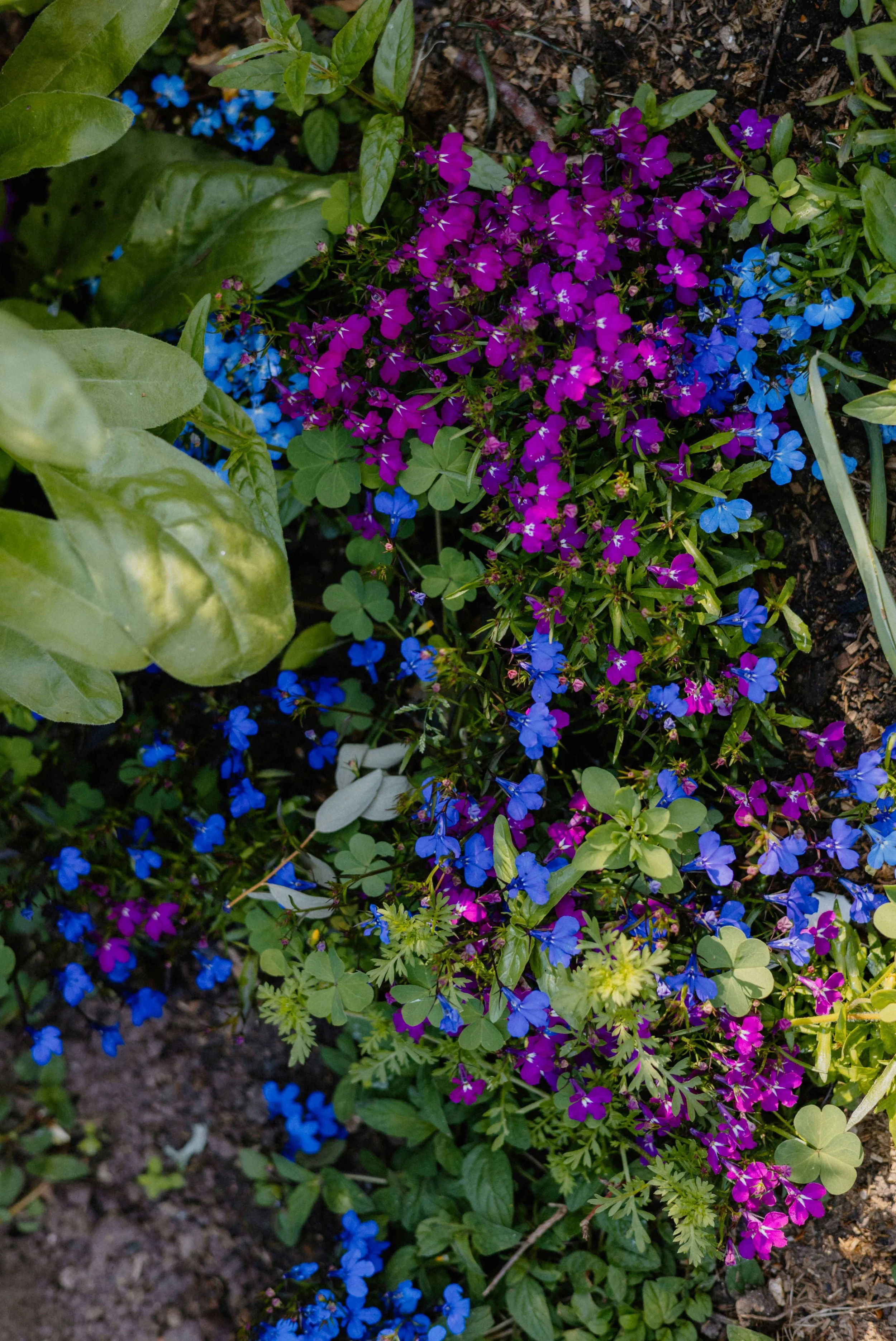
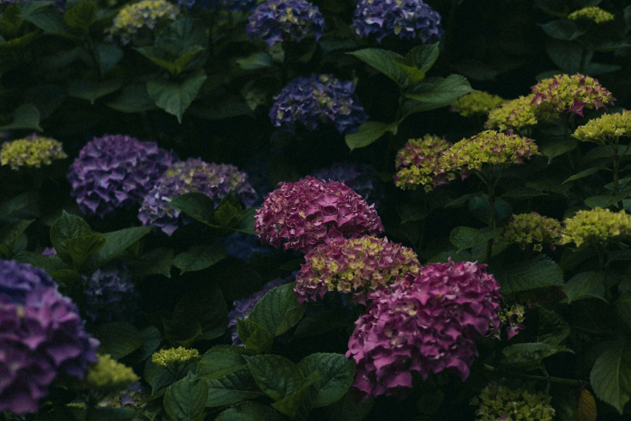
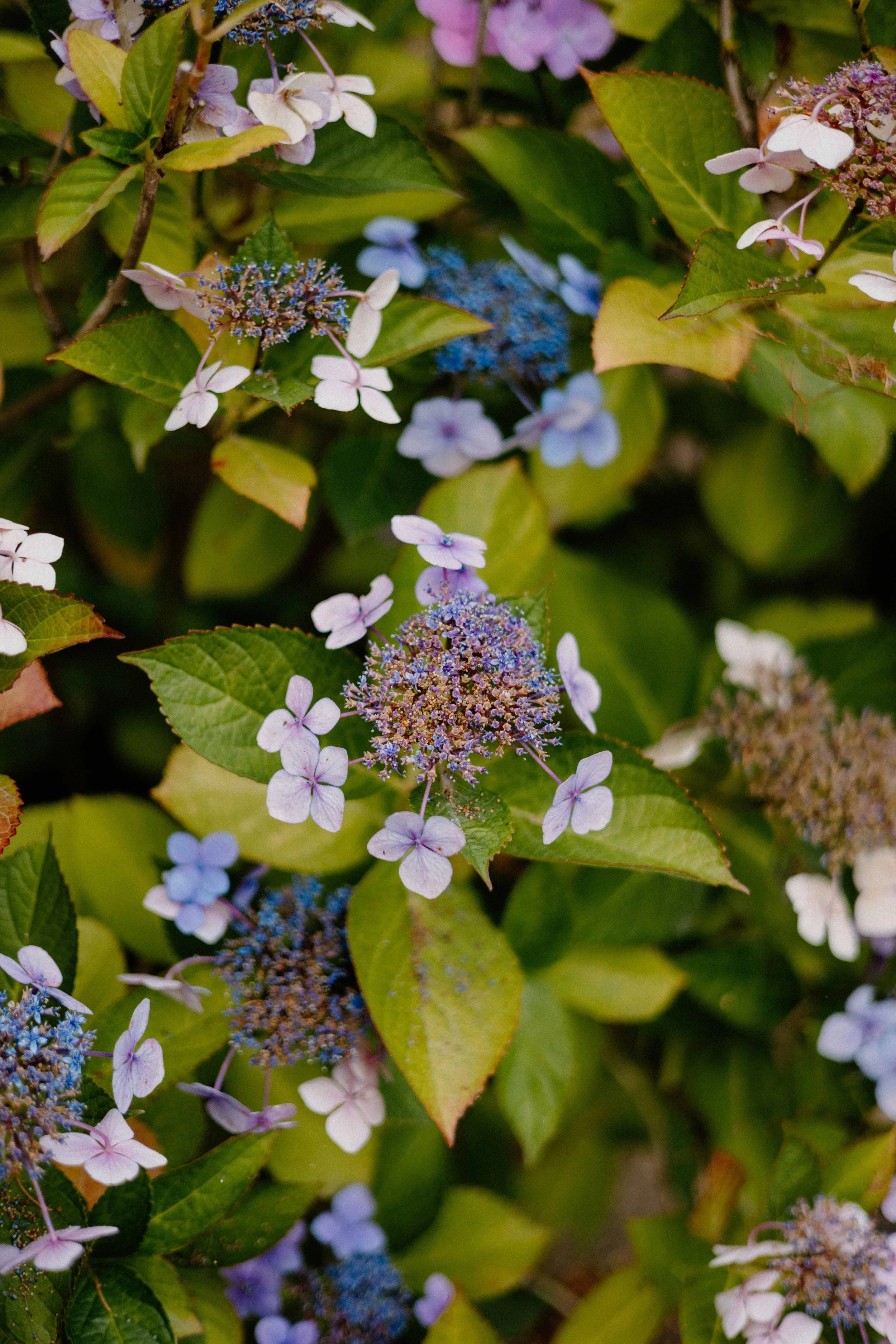
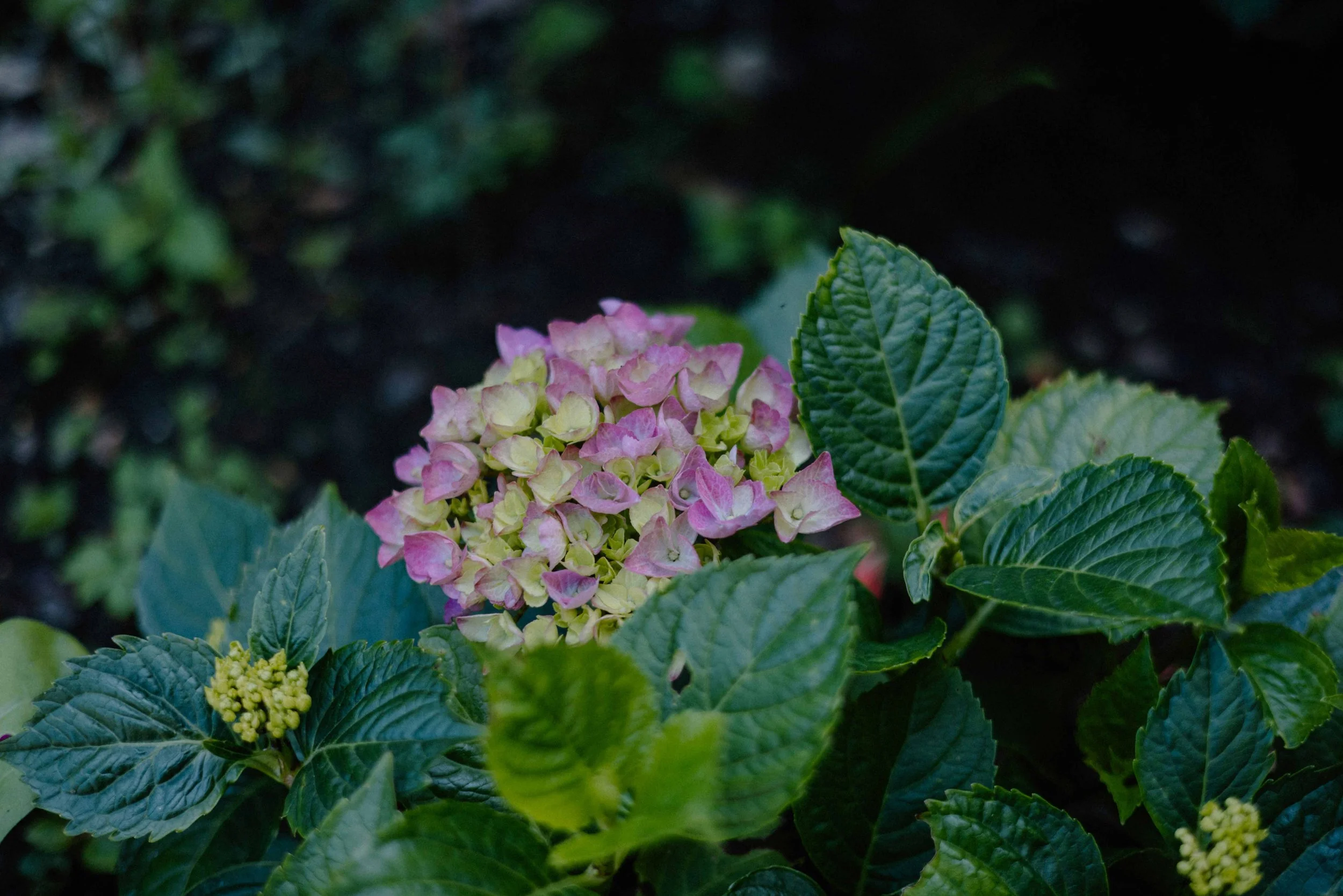
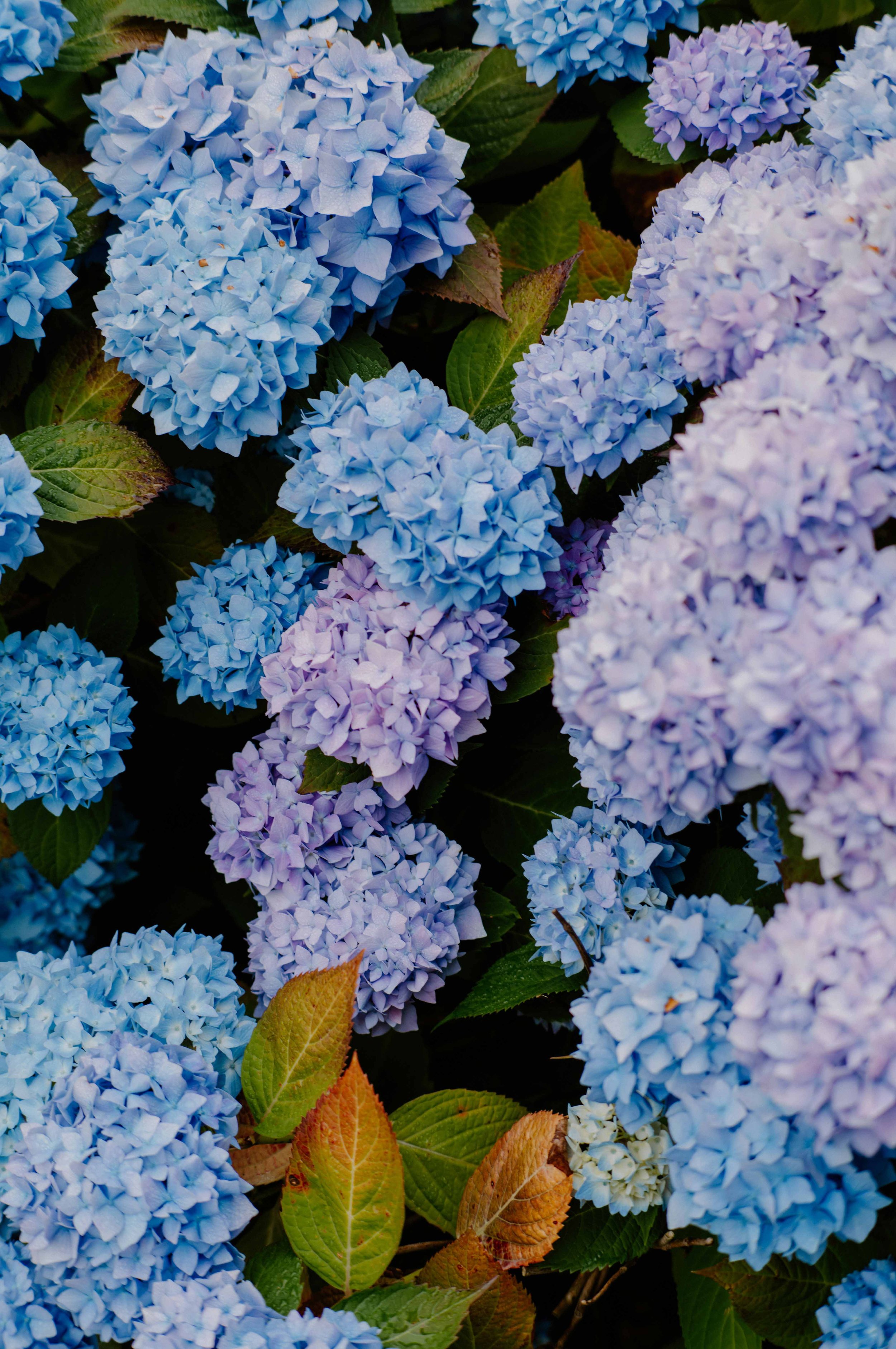
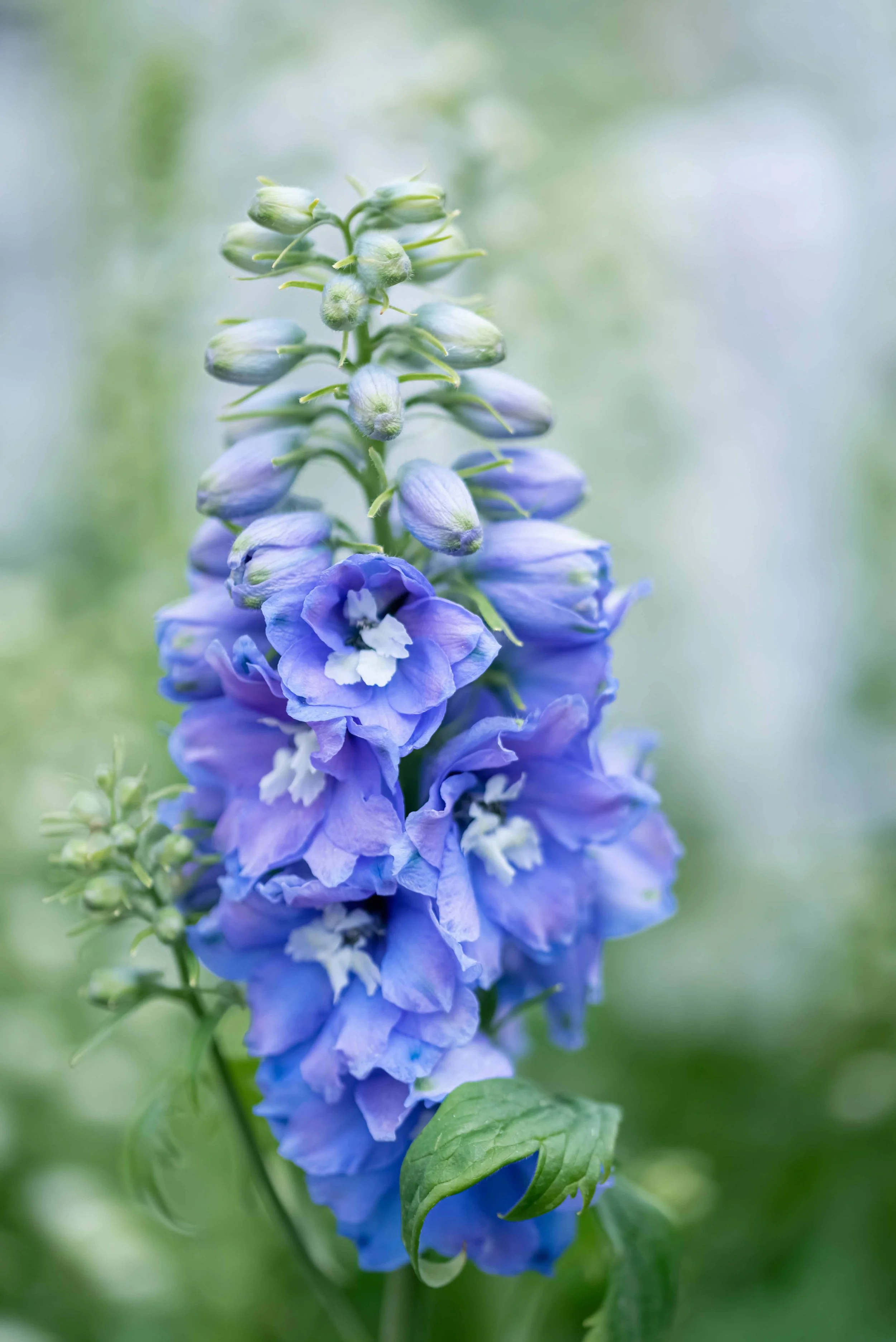
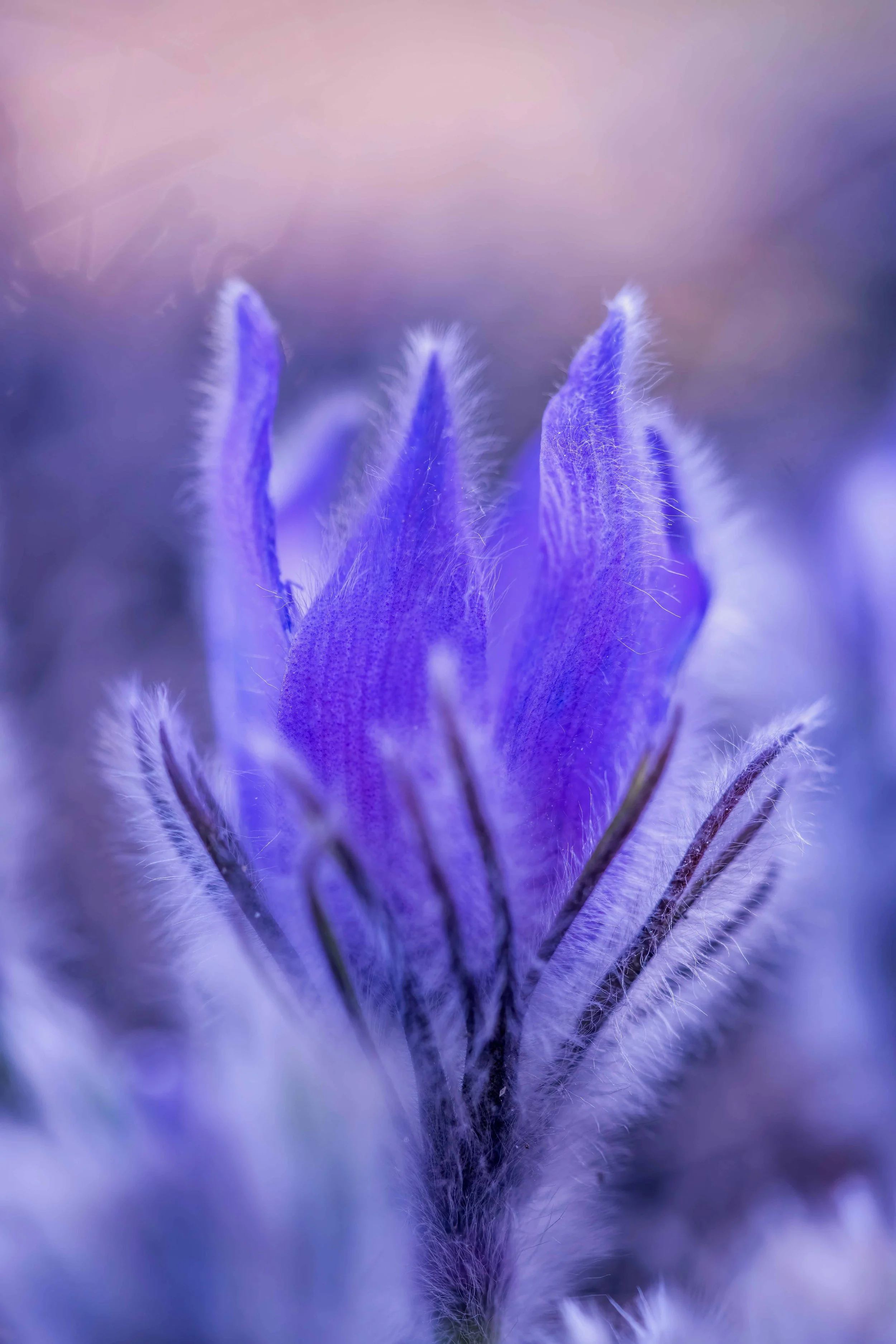
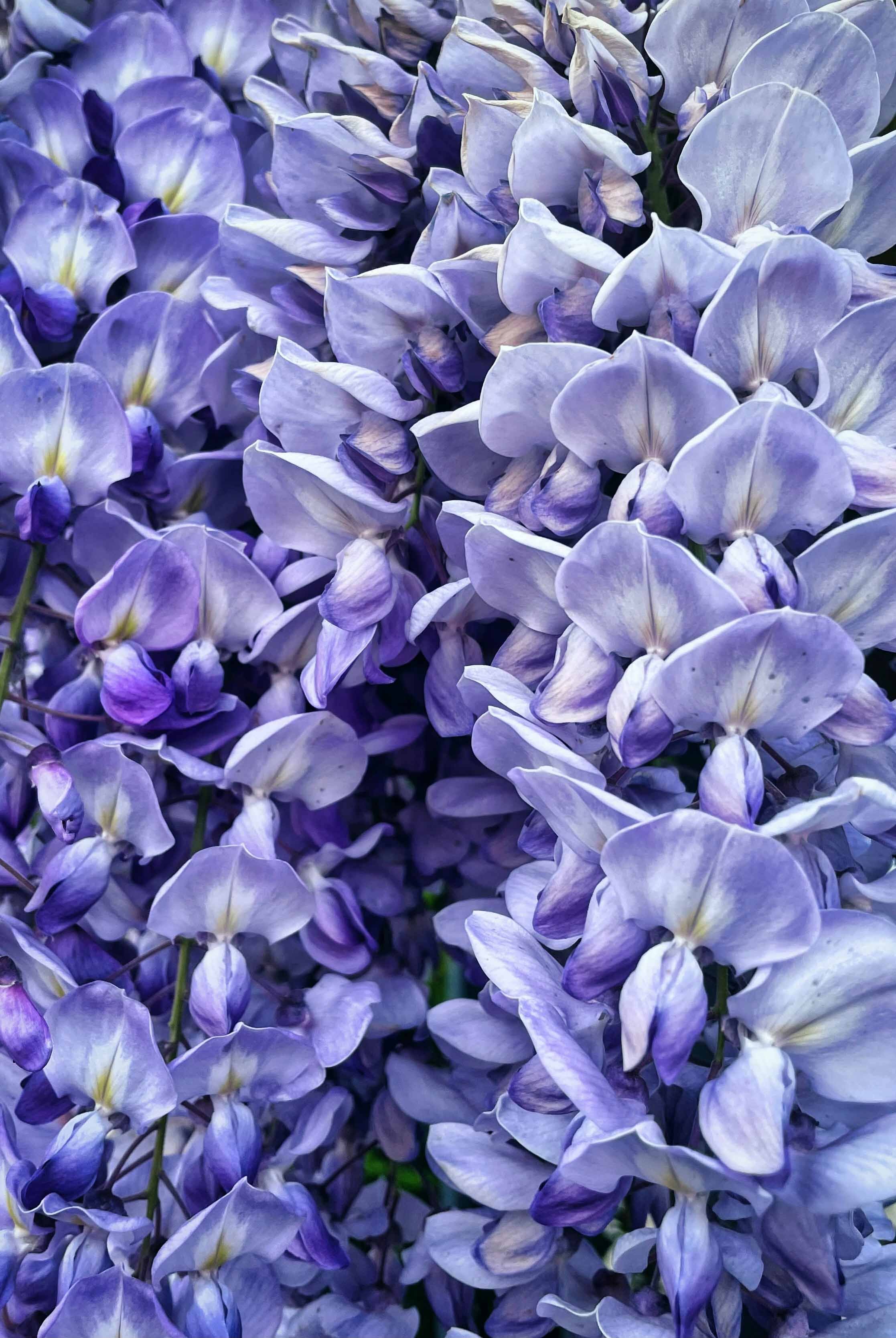
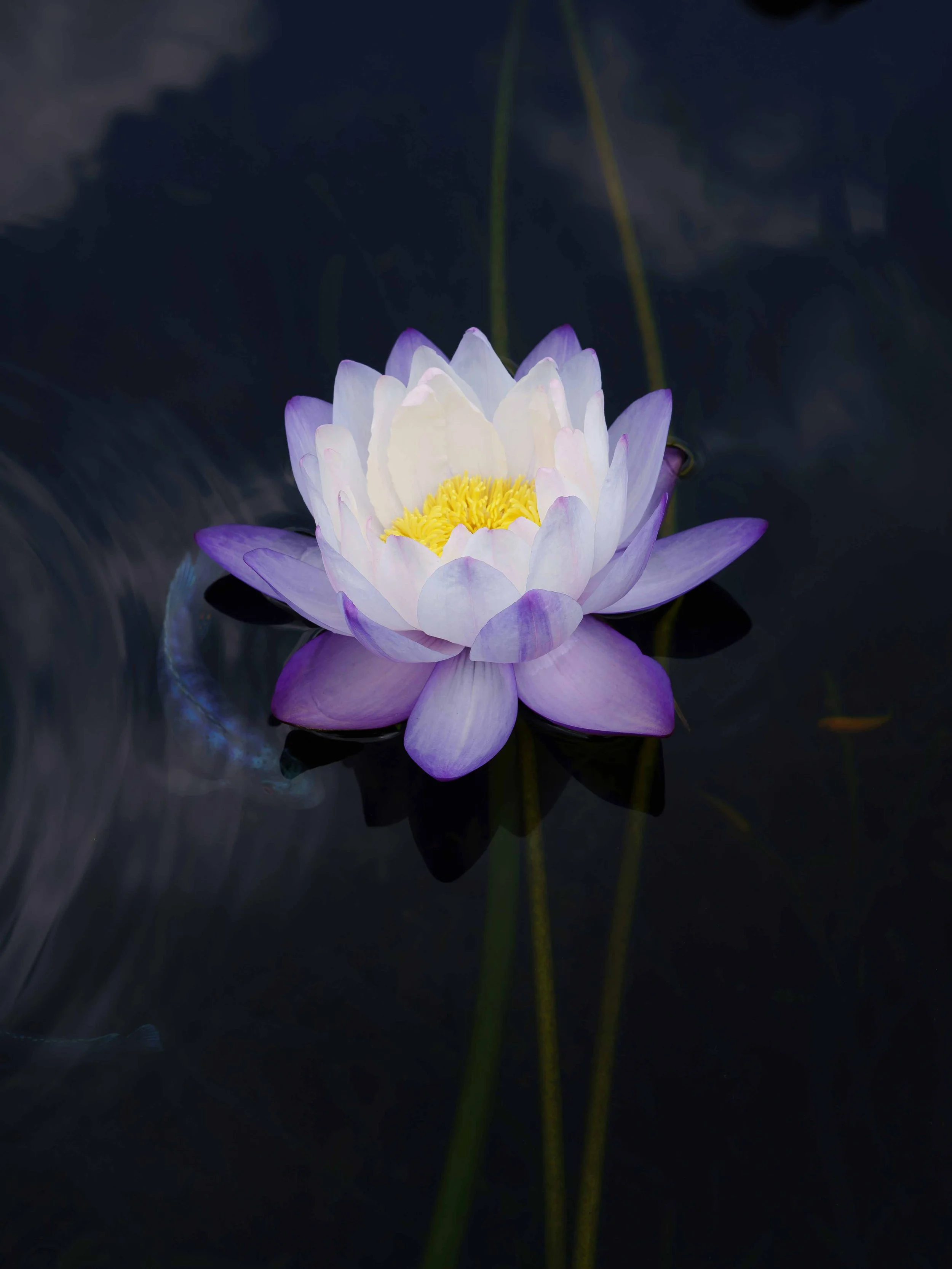
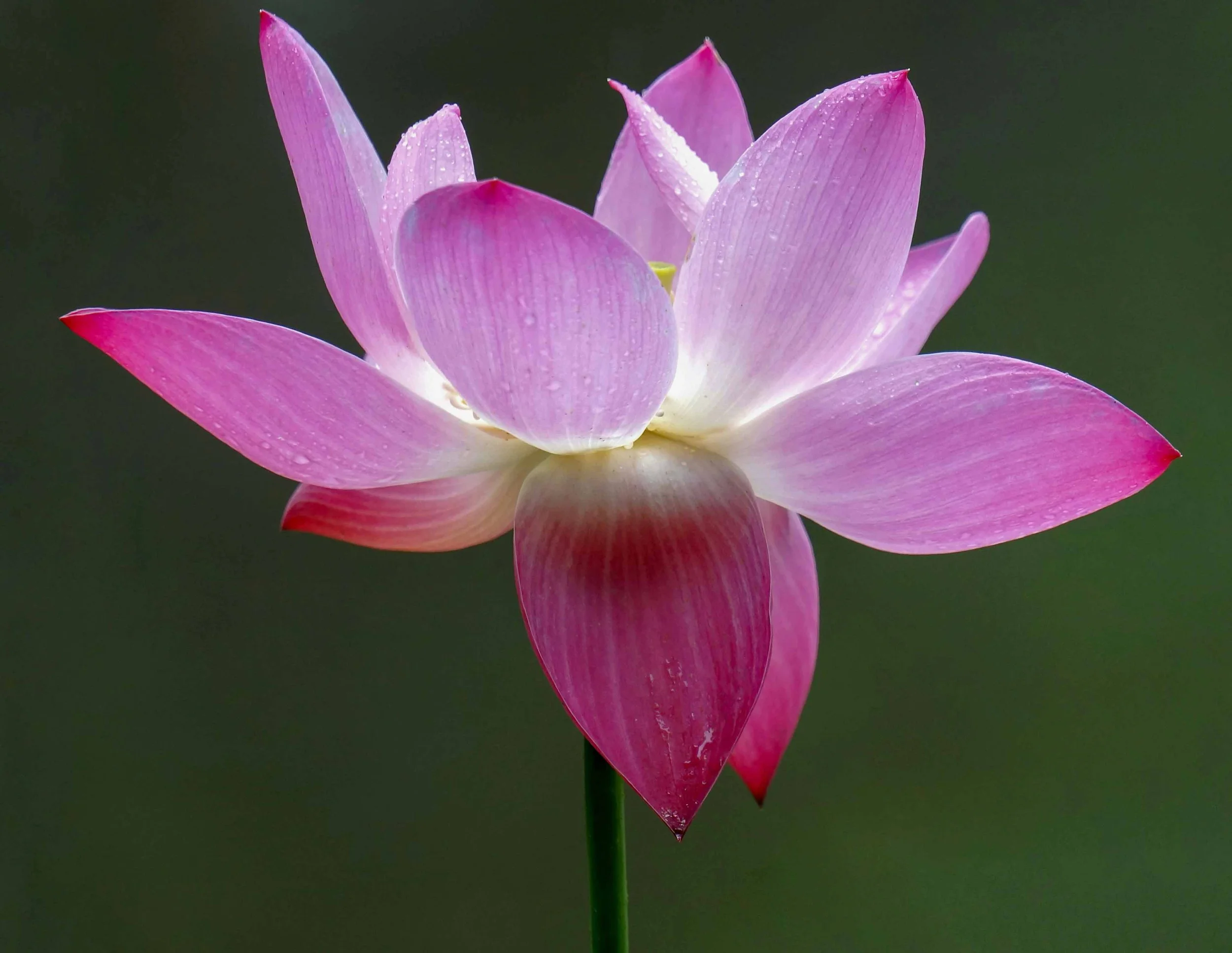
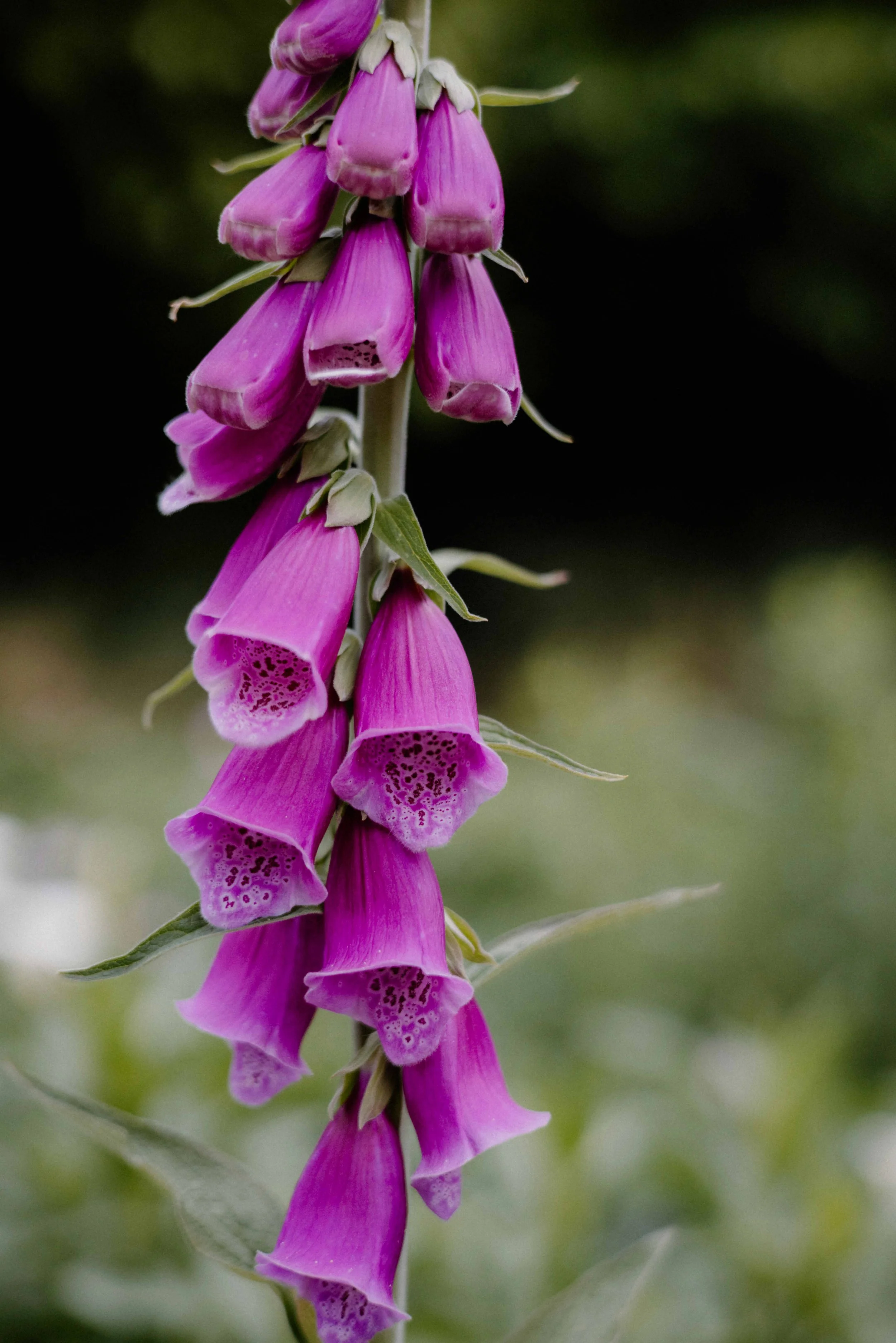
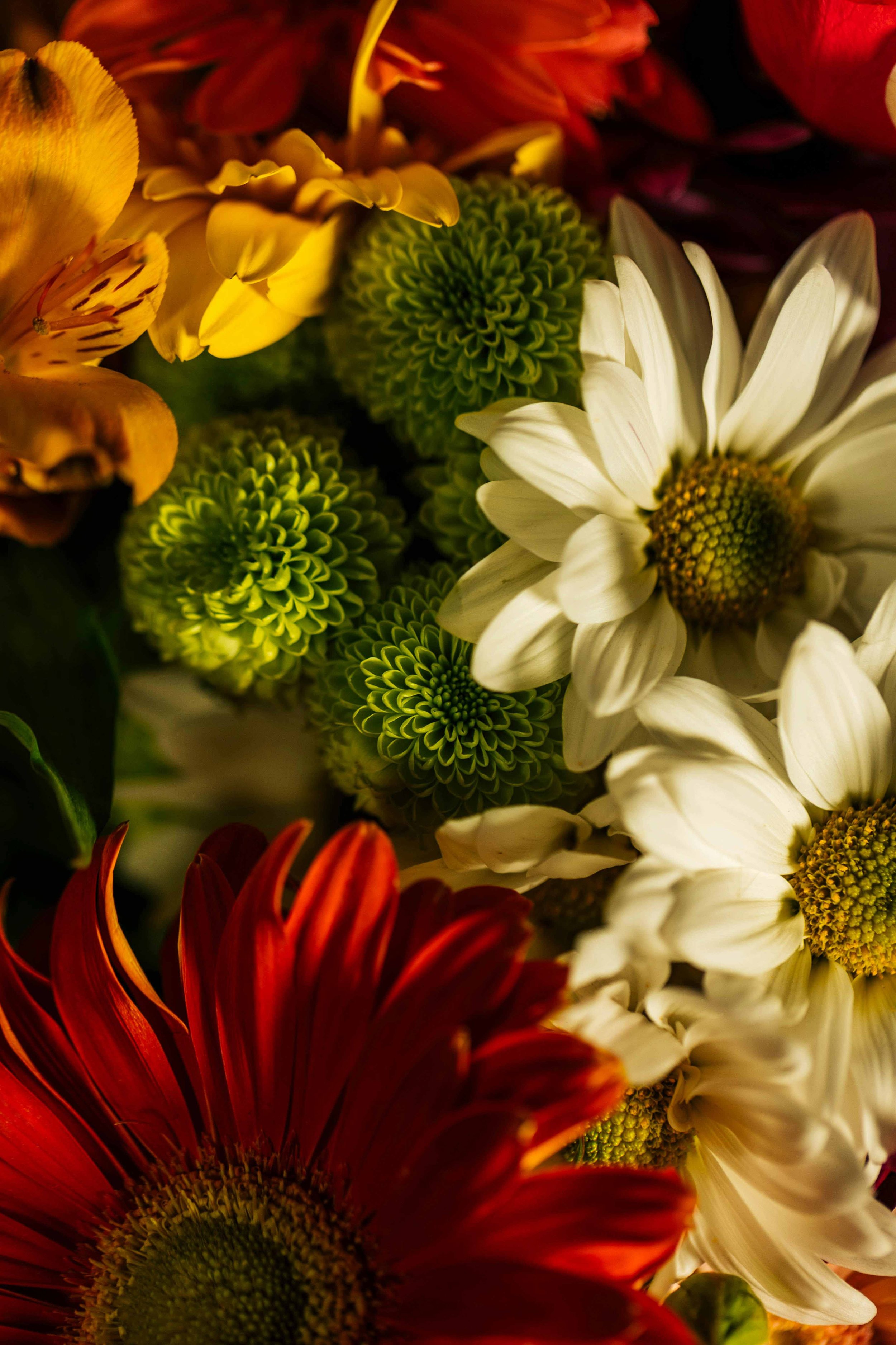
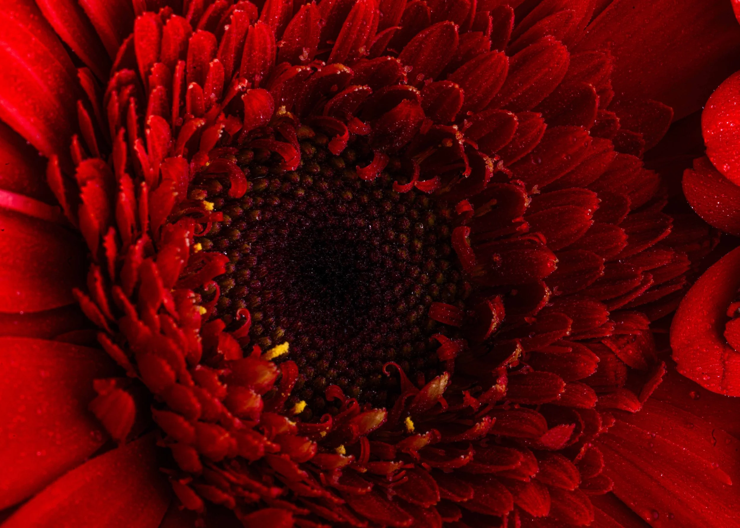
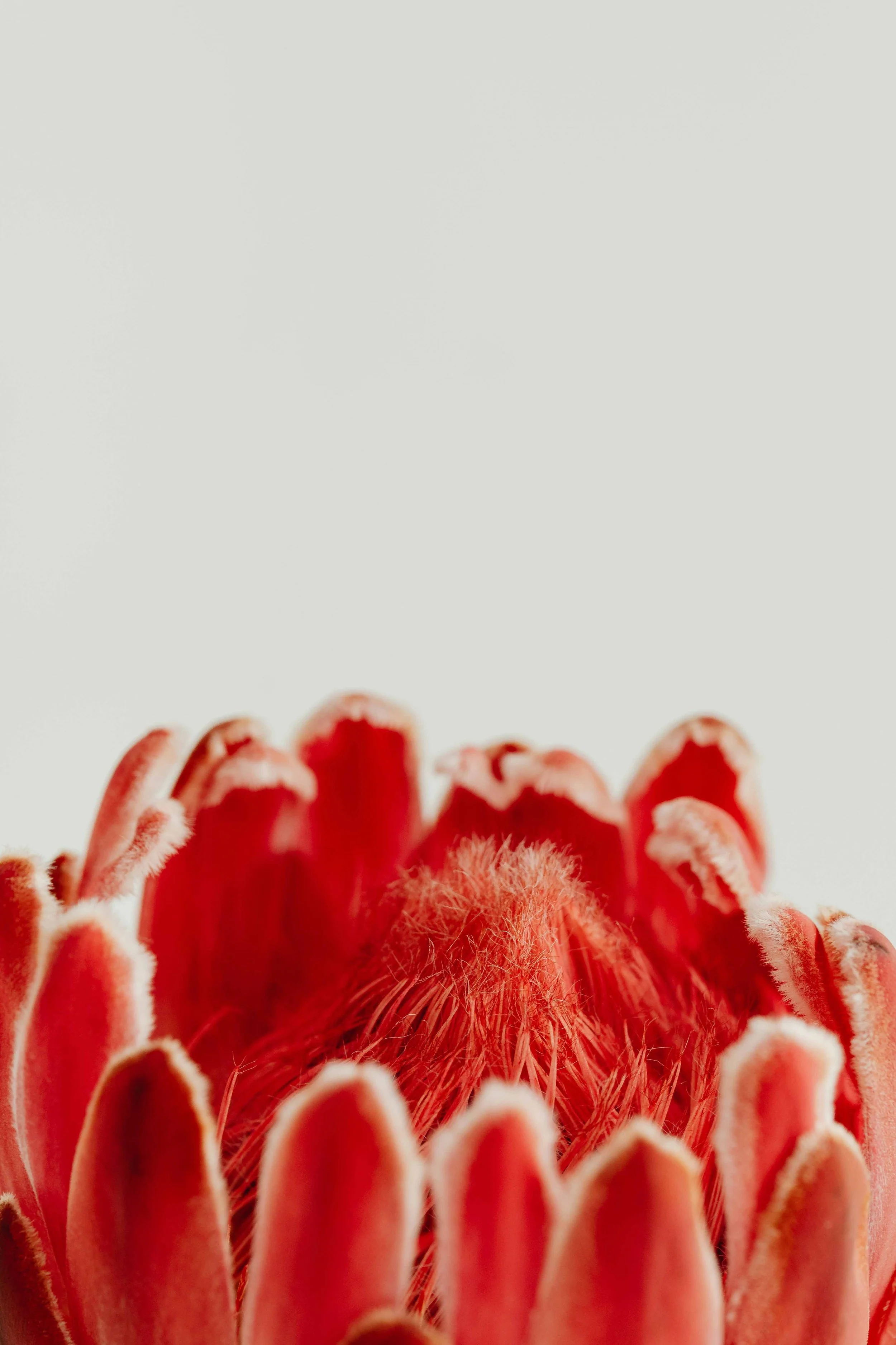
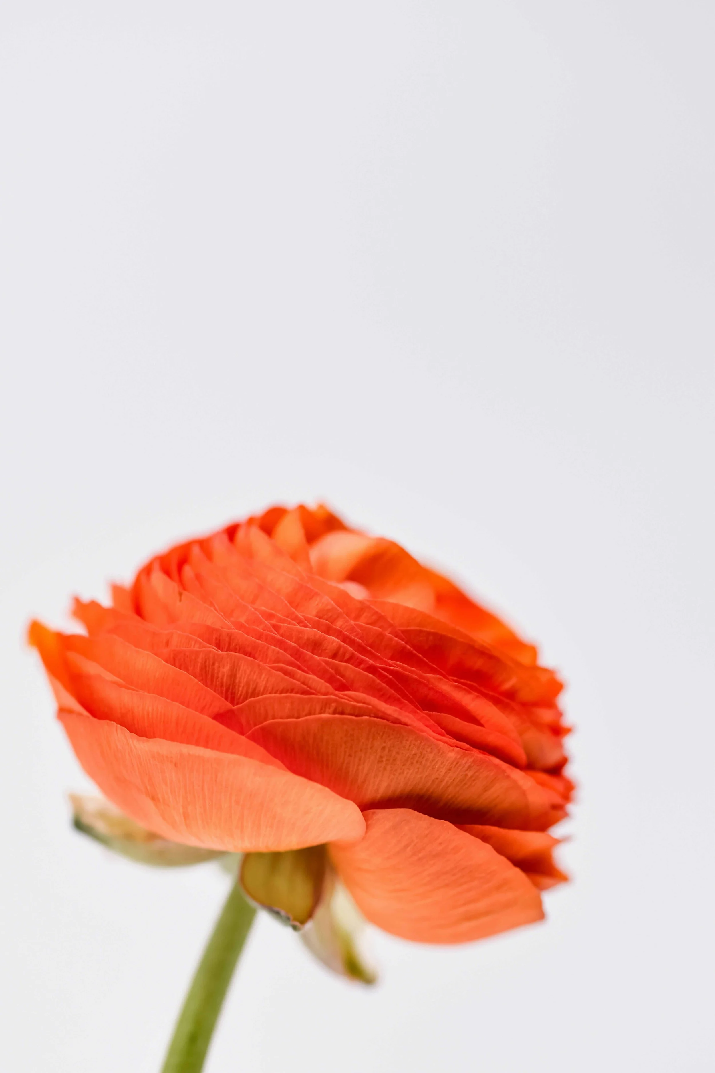
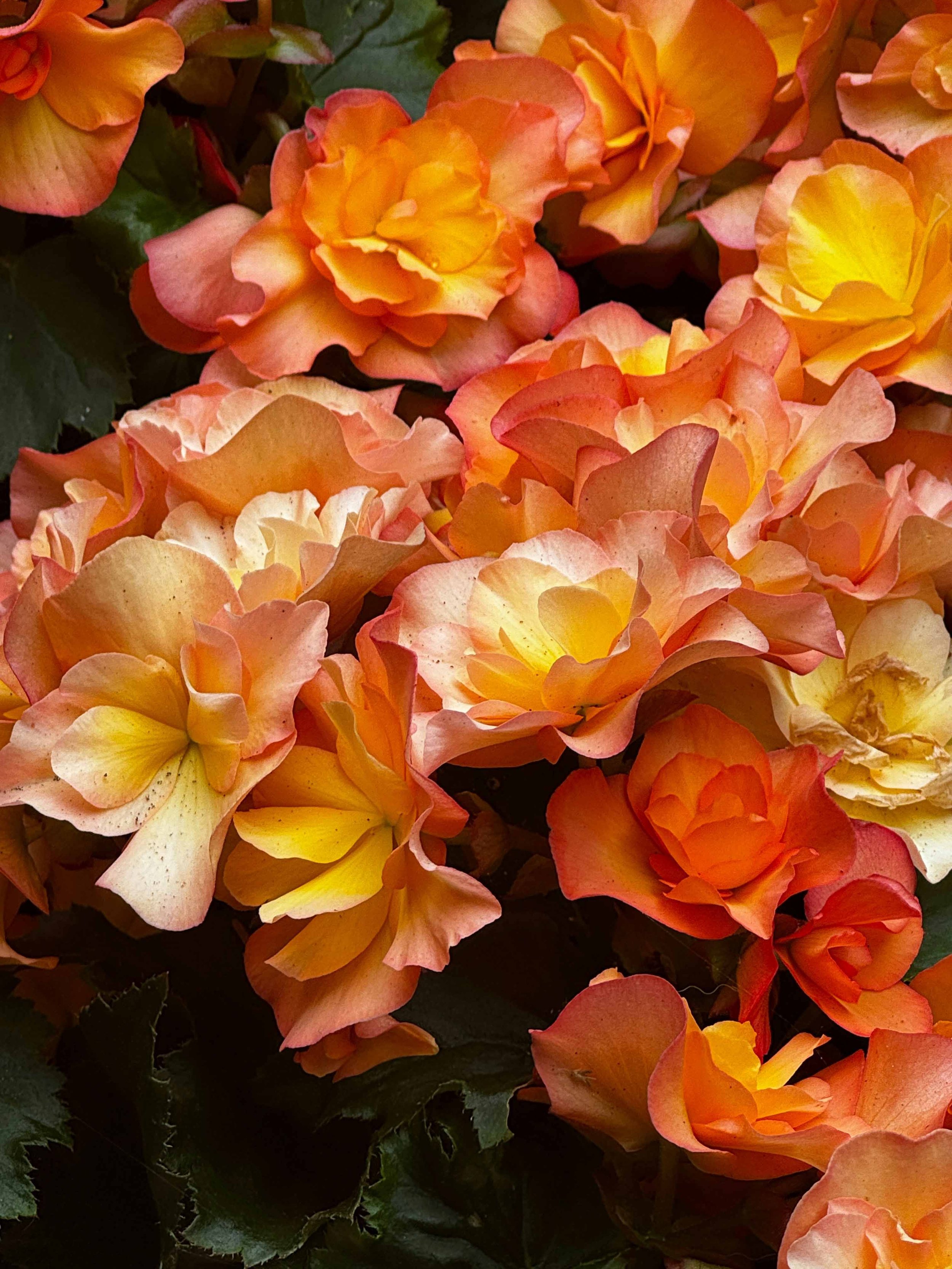
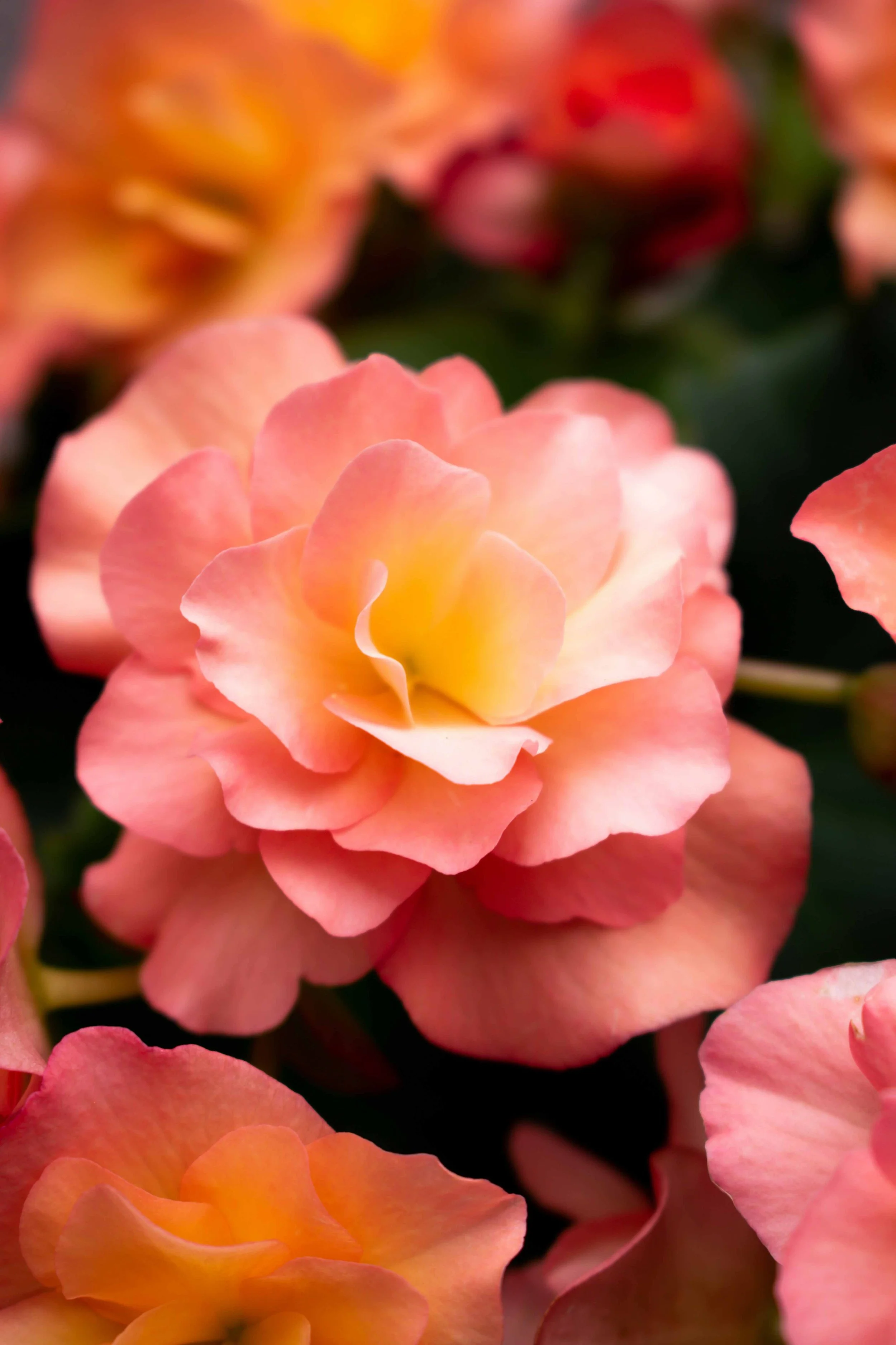
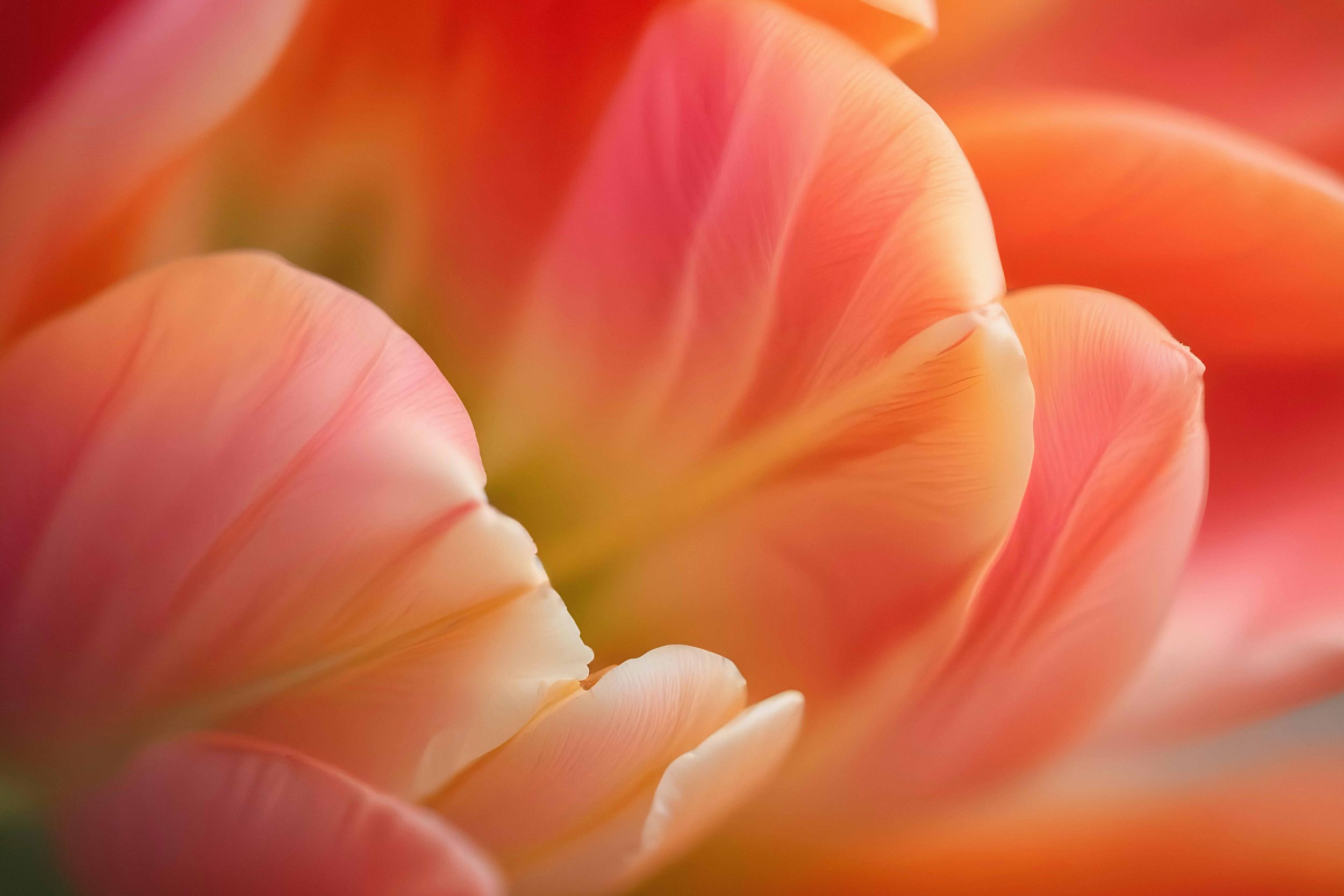
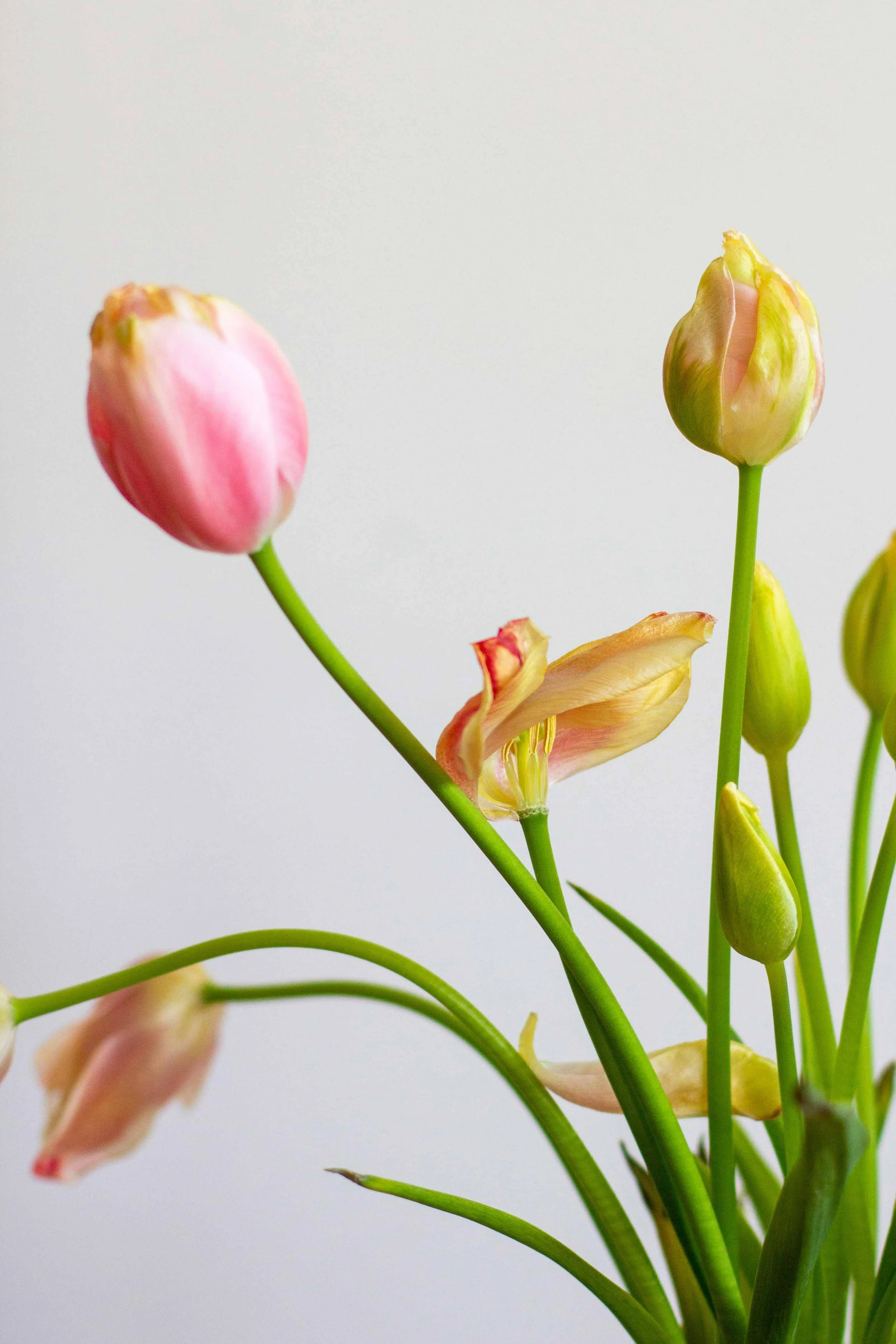
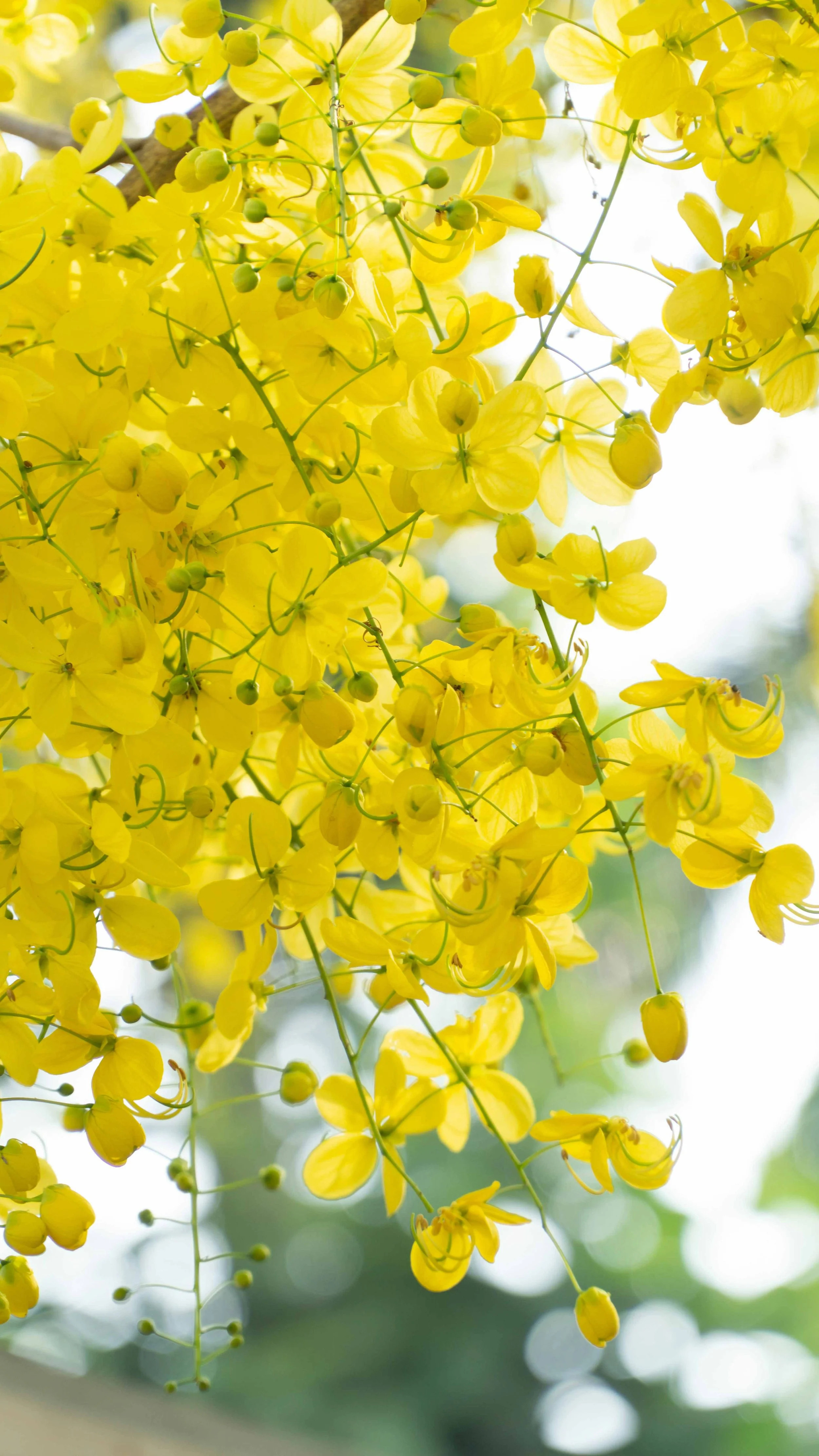
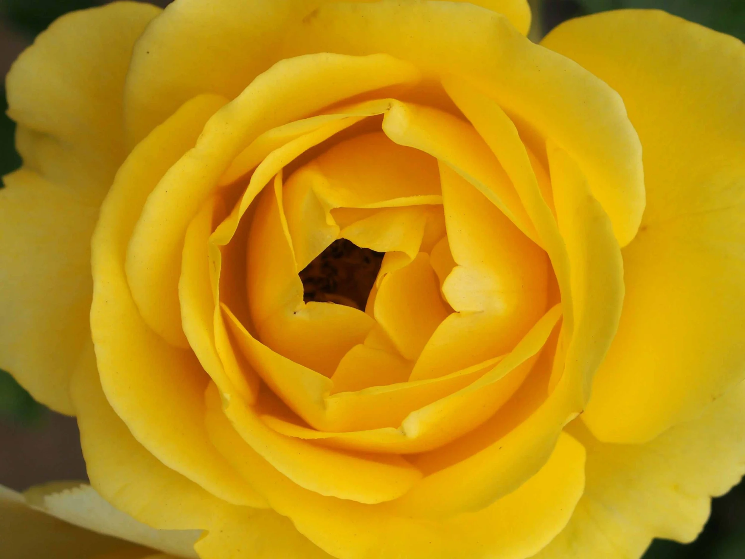
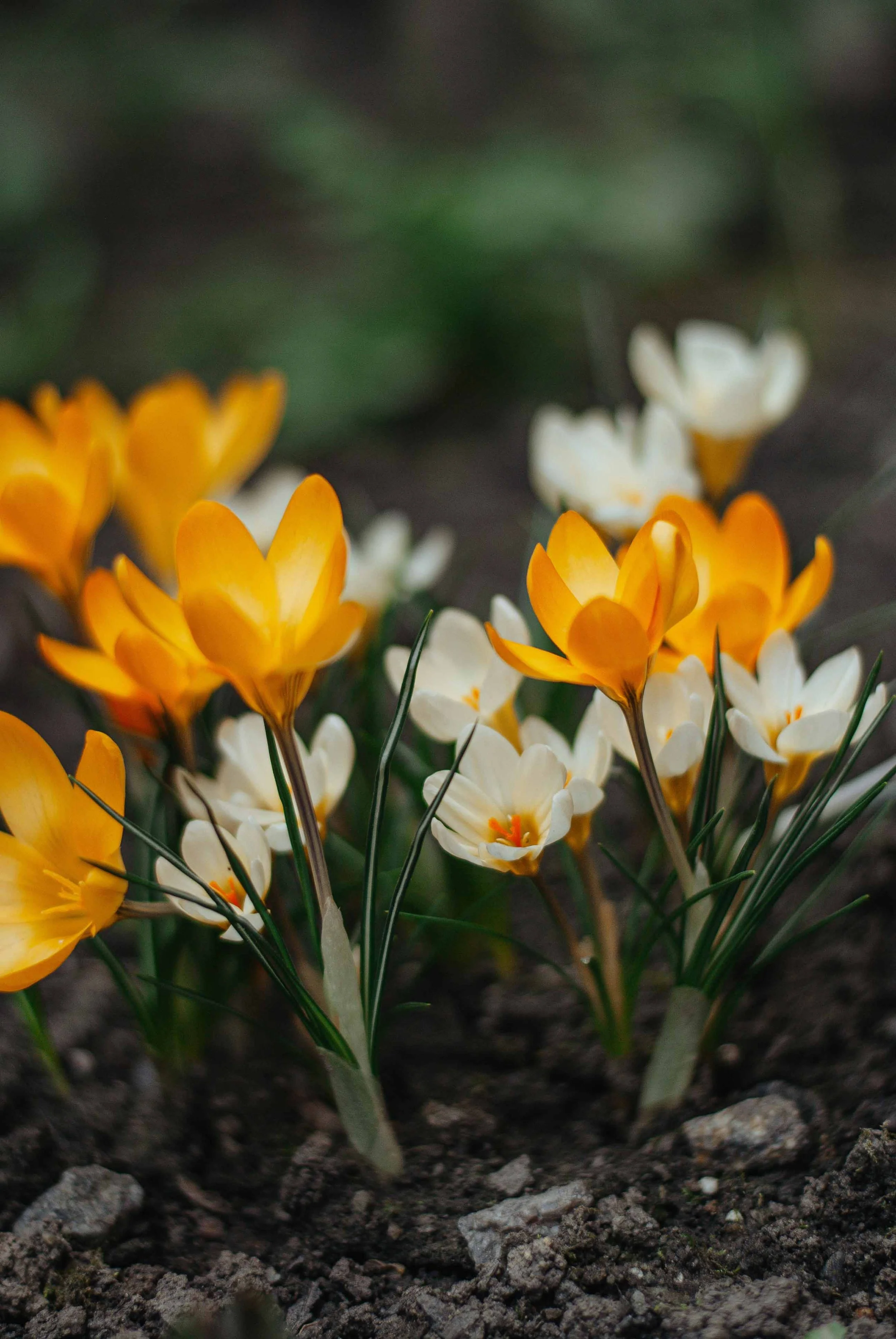
The image collection below offers a baseline for the journal’s color palette, as well as colors that can extend into the covers of the memoir and pocket edition. The gallery below begins with curated palettes of floral shops and arrangements, followed by the colors of individual blossoms. While it might seem riotous at first glance, there is a through line with a mix of colors that balance saturation and delicateness, always with an eye to sophisticated color combinations and juxtapositions.