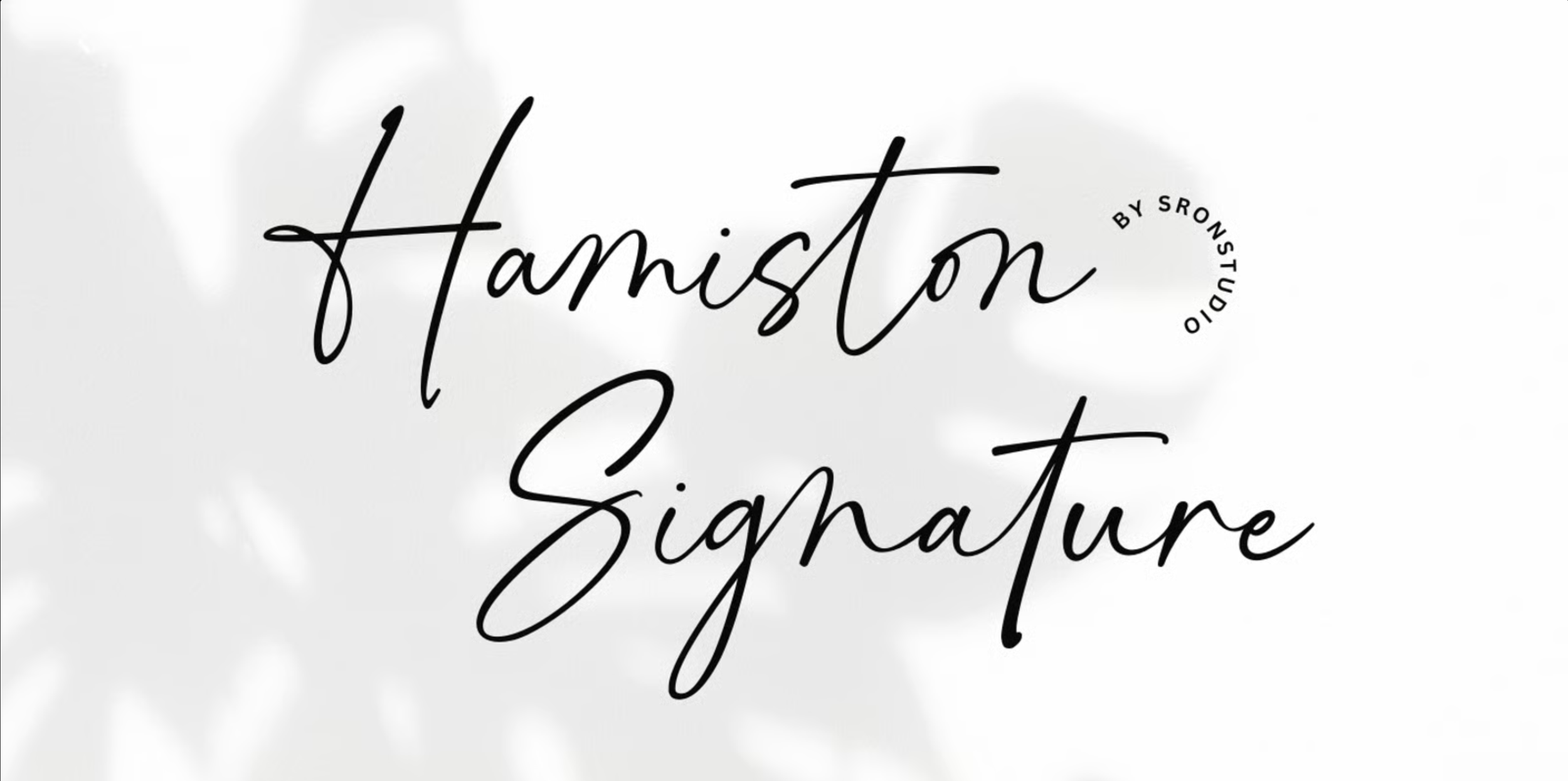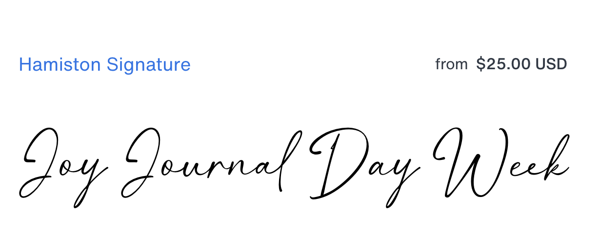
Pure Joy Wellness | potential display fonts
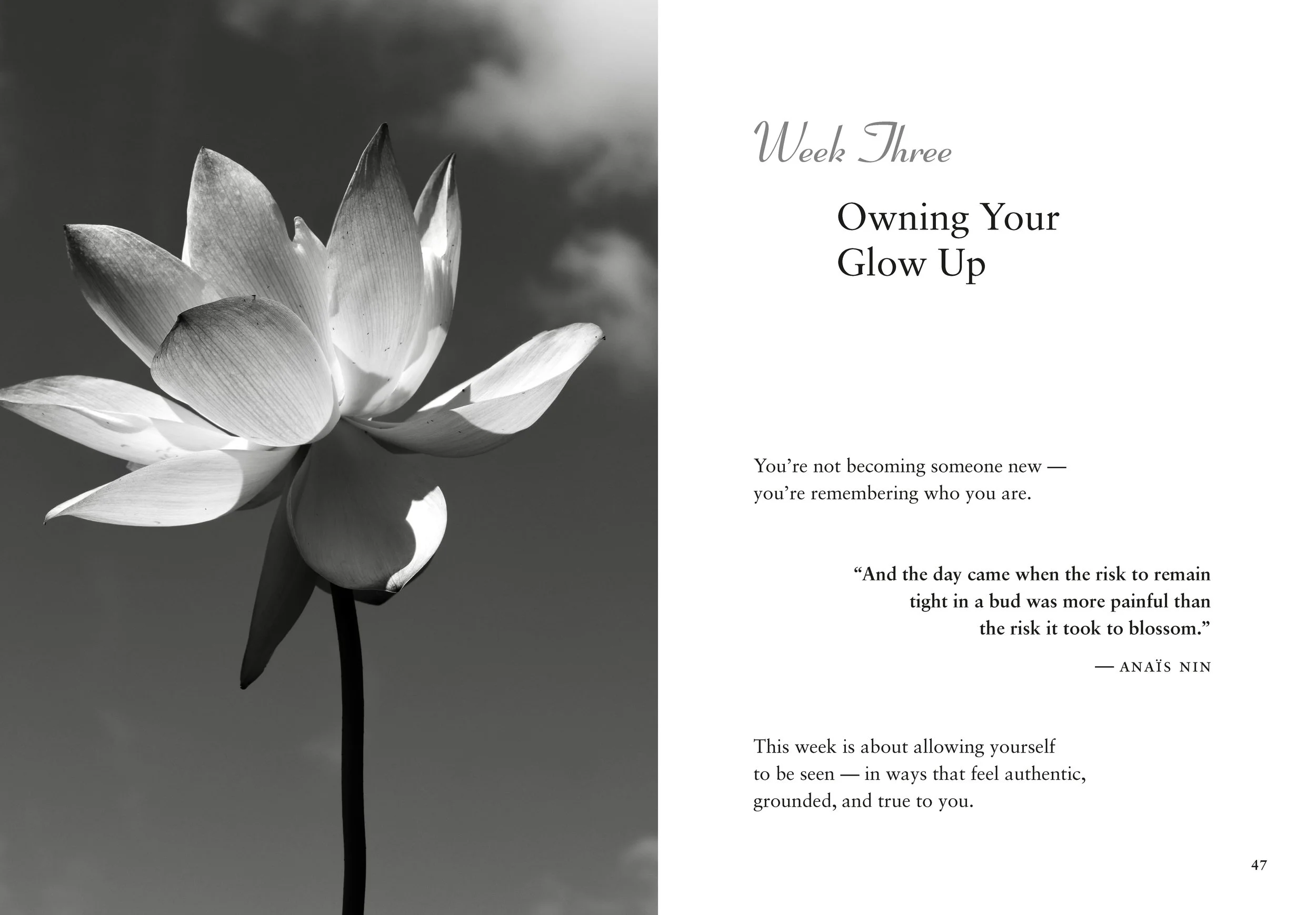
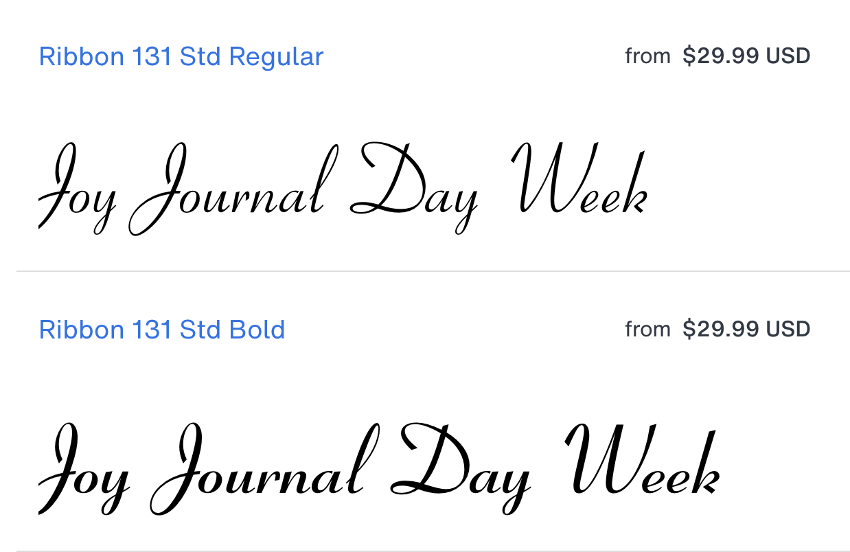
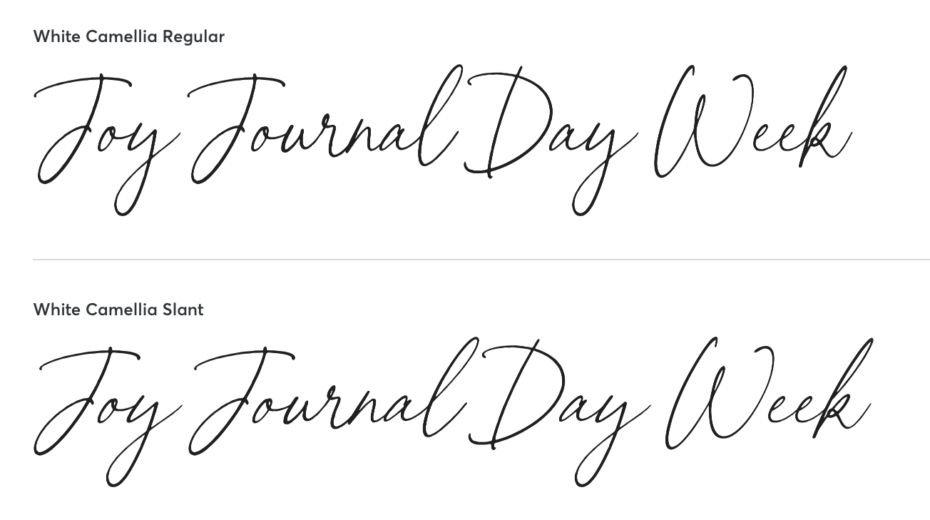
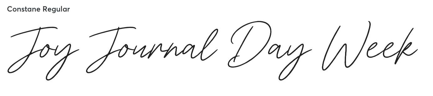
Potential display fonts for use in The Joy Journal (30-day program), The Joy I Came Back For (memoir / essays), and the Pocket Book are shown below.
Key words when considering the display font for the book interiors and covers are: elegant, calm, inviting, sophisticated.
TYPOGRAPHY NOTES:
When discussing the opening sequence in the journal’s front matter, the Design Idea Sheet offers this: “Typography could soften at the very start — something a little warmer or more handwritten for the Dedication and Foreword — and settle into a cleaner, steadier hand by Joy Baseline.”
Judicious use of the selected handwritten font is advised. Finding the right balance is desirable so that the handwriting font is not used too much and it loses its effect. It should also be reserved for elements where extended reading is not required due to readability and legibility factors.