Renata Joy | color palette
In past discussions with the author (Renata Joy) and cover designer (Ann Weinstein), the concept of using B/W floral portraits as key visual elements for The Joy Journal is a welcome approach. The B/W floral portraits strike a nice balance between their presence inside the book and the accompanying text in the journal. All agree full color versions would be too vibrant and overpowering. With the move from a B/W interior to printing with full color for the journal, team members it is worthwhile to shift the B/W images towards a rich black version of each one (i.e., full-color used to enhance the visual depth and richness of each image). There as been discussion of carrying the floral portrait concept over into the cover of the journal, as well as the memoir and pocket edition.
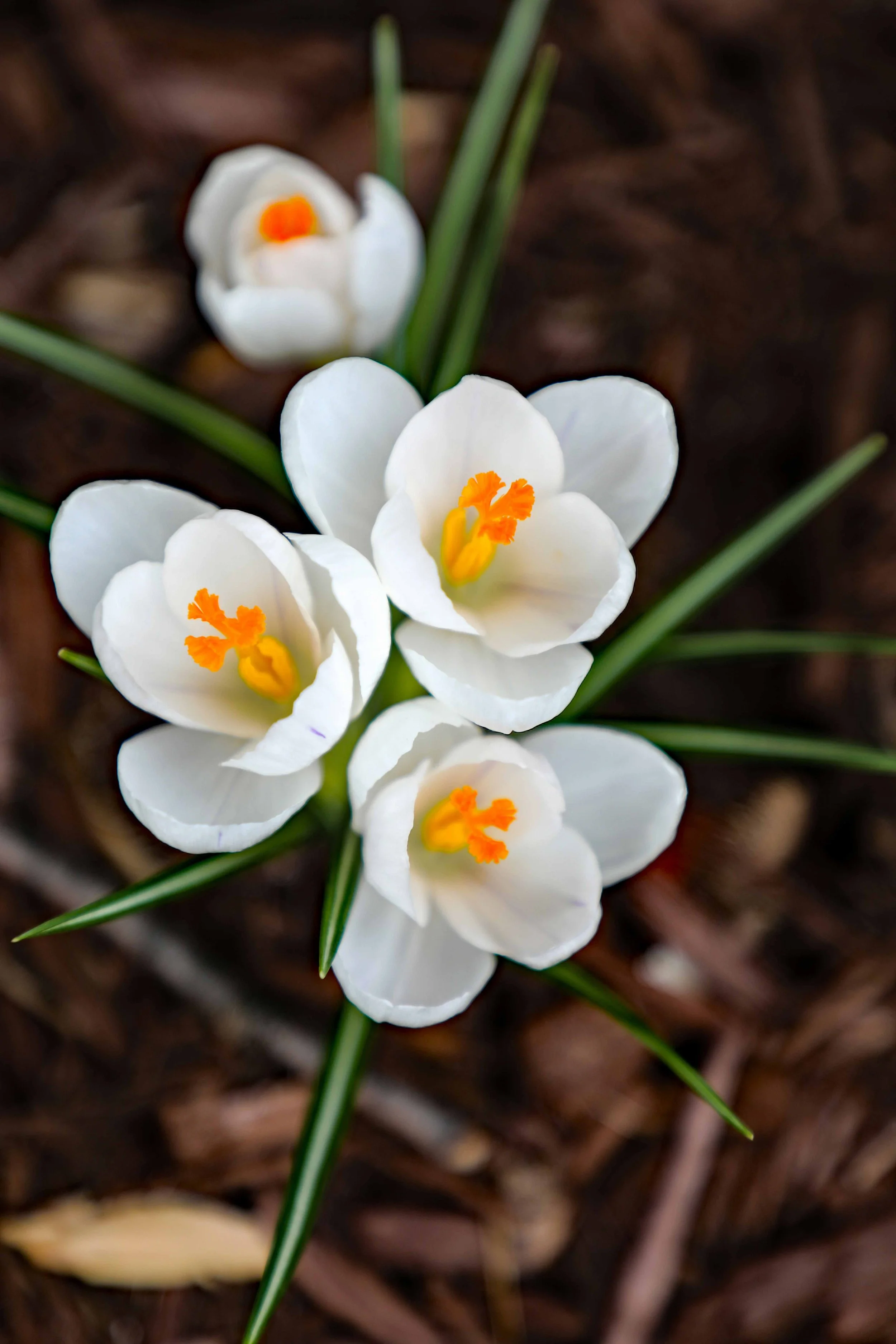
When contemplating an overall color scheme for The Joy Journal, as well as The Joy I Came Back For and the pocket edition, working with colors found in nature — in flowers — would mesh well visually and conceptually.
COLOR NOTES:
The Design Idea Sheet for The Joy Journal requests using a separate color / color family for the first three weeks, and a combined palette for the fourth week. This could be something akin to posies of similarly color flowers each of the first three weeks, and a joyful bouquet of color for the fourth week which reinforces “that connection is the integration of everything — not a separate, final theme.” The key will be matching an appropriate color to the emotional landscape of each of the weeks, yet cultivating an overall visual cohesion color- and design-wise.
The two signature elements of Body Joy Boost and Sprinkle of Joy will have “their own fixed, instantly recognizable visual identity — closer to a logo lockup than a styled text box.” Both signature elements should be easily located within the journal due to their visual identity. Consistent color use will be a key signifier for both.
The Weekly Mocktails will have their own signature identity. The Design Idea Sheet aptly describes these as “celebrations, not recipes.” Again color usage will enhance the celebratory nature of the Weekly Mocktails, as well as help distinguish them as signature elements in their own right.
COLOR PALETTE POSSIBILITIES
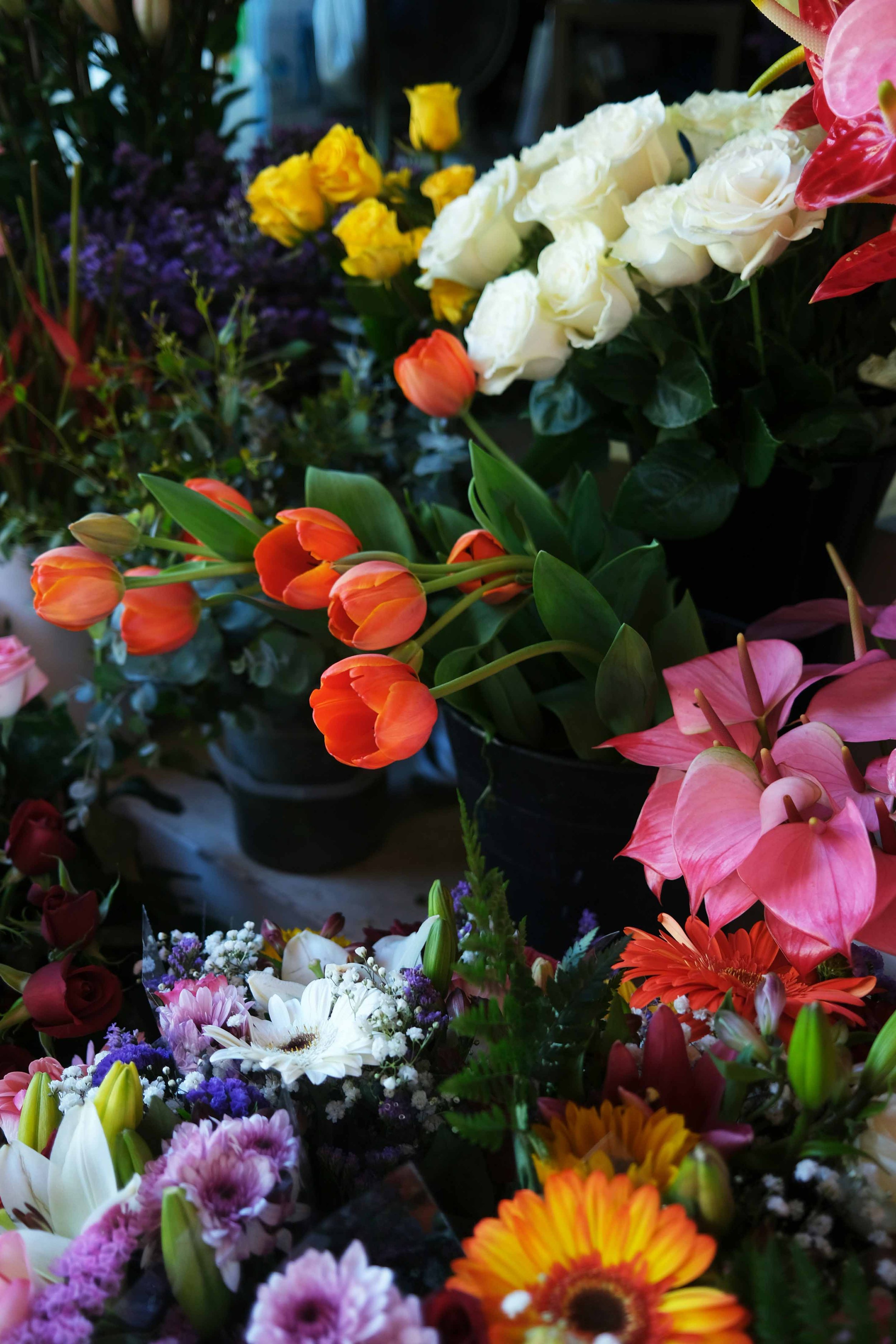
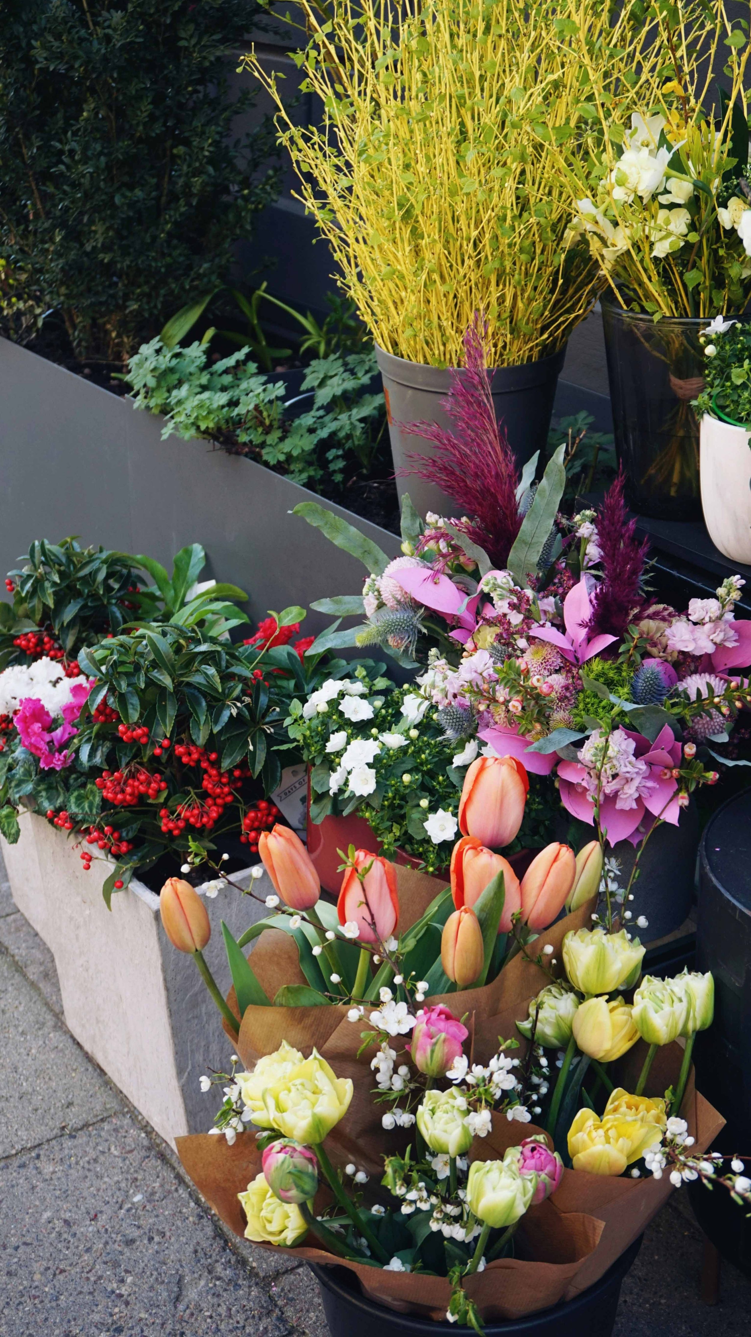
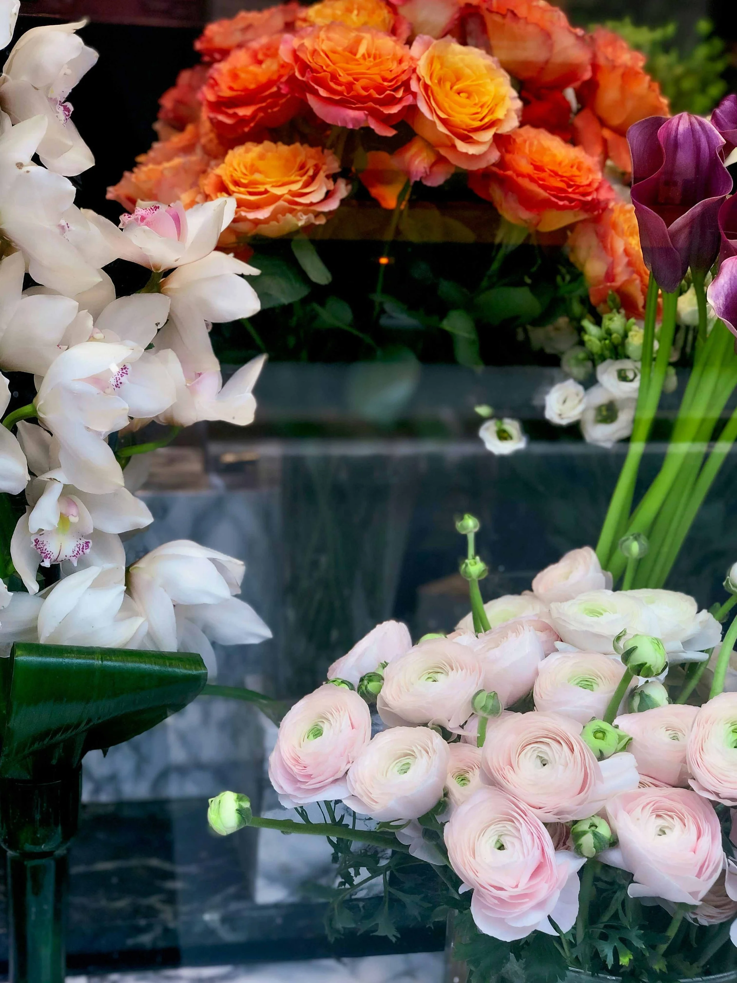
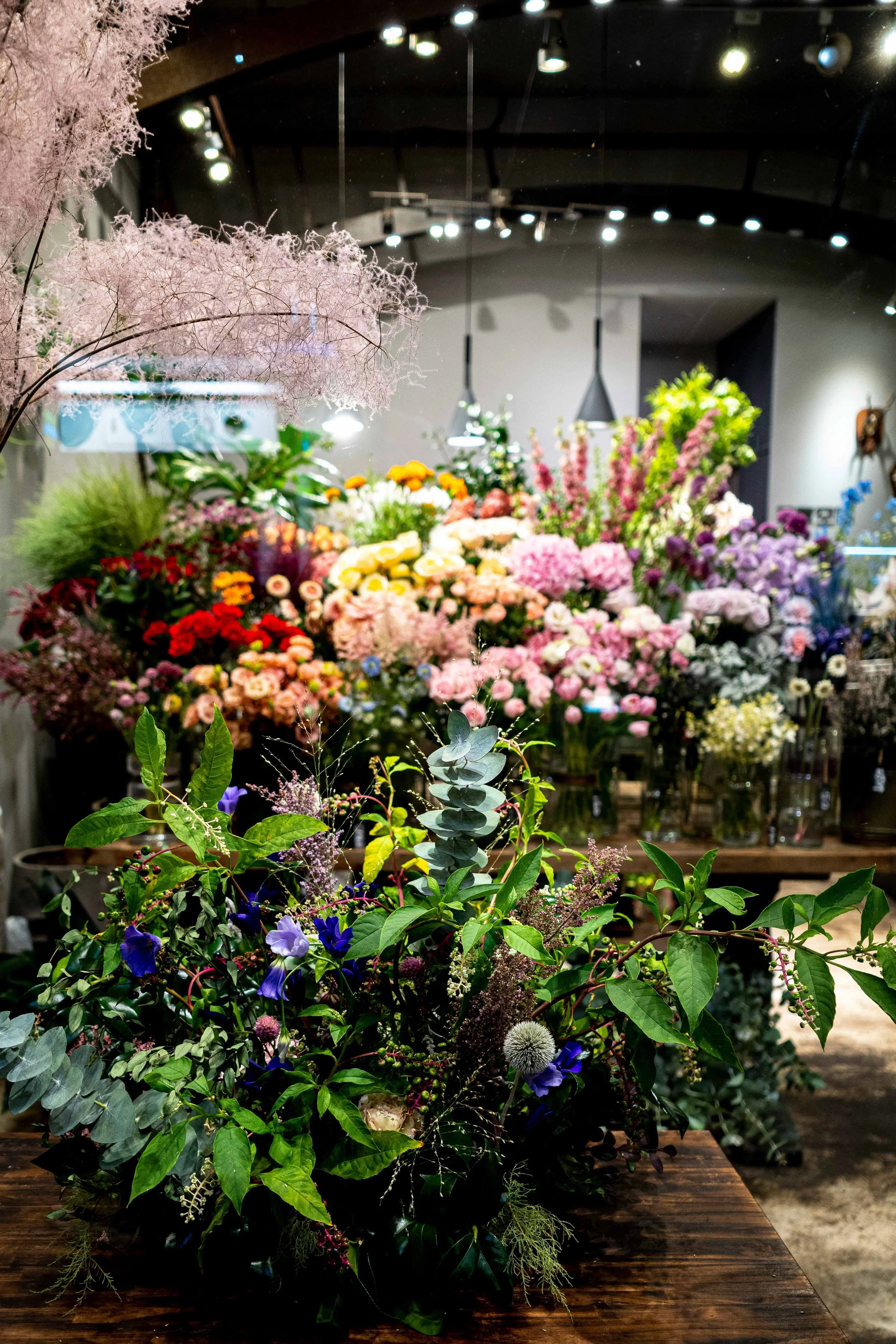
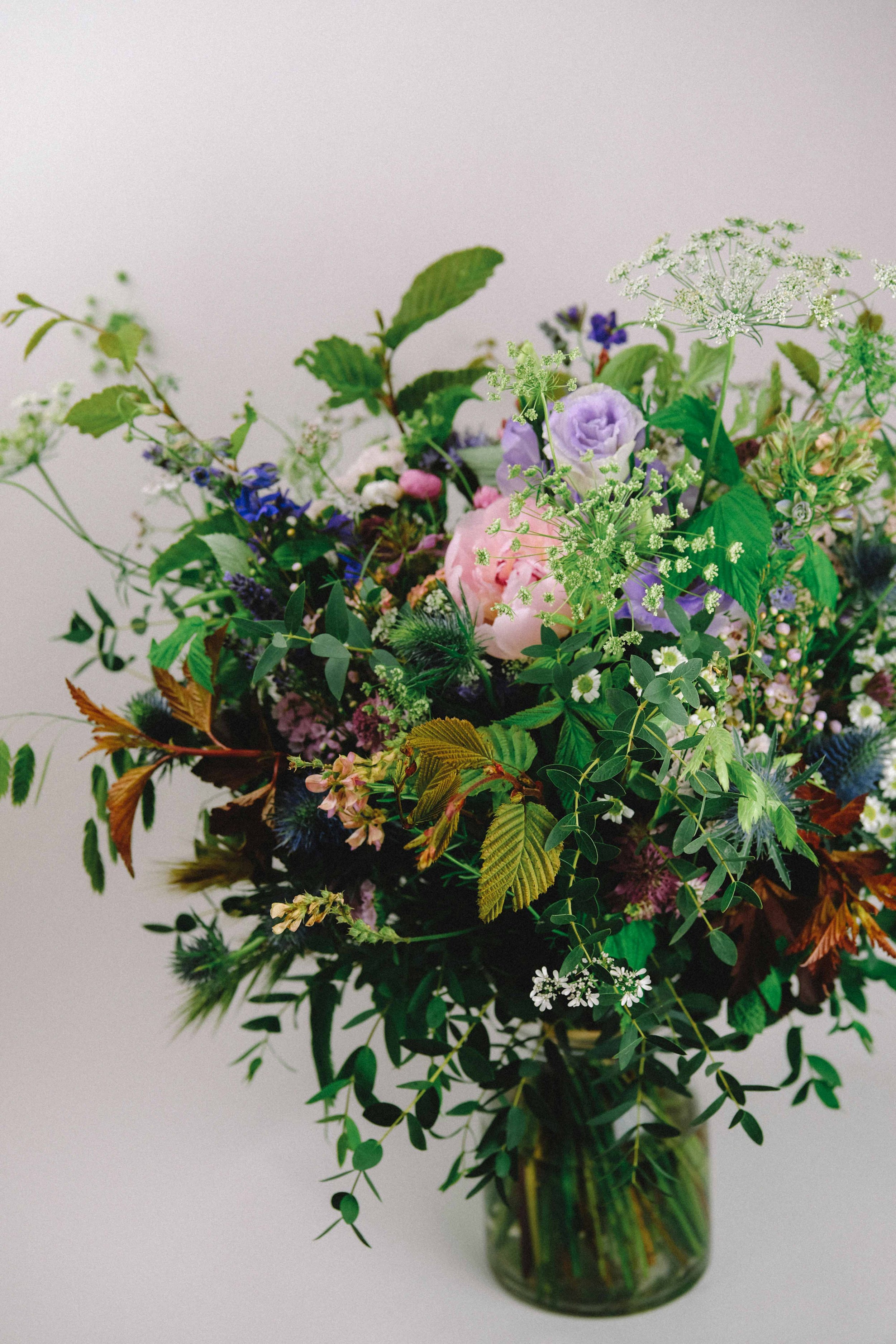
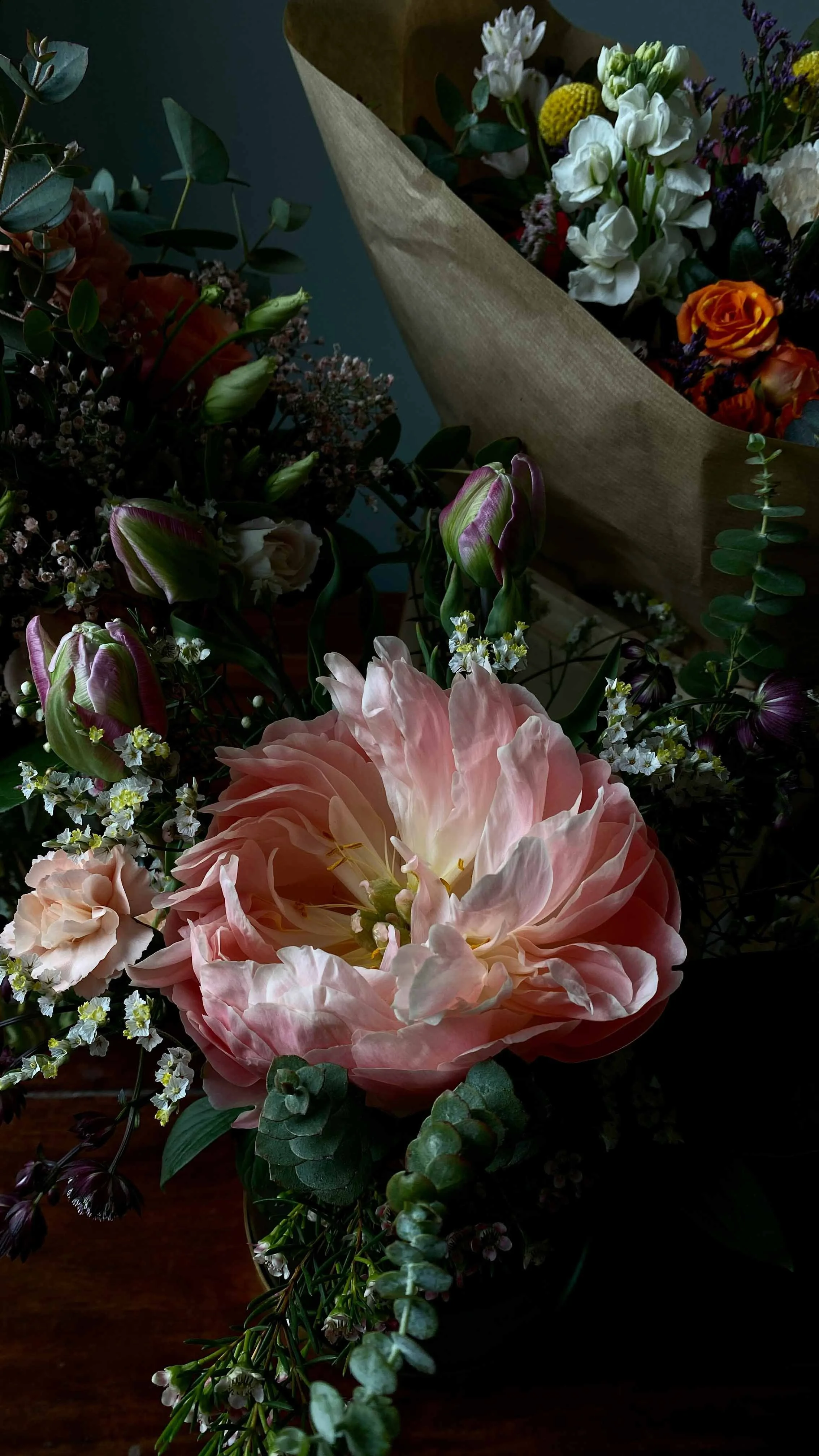
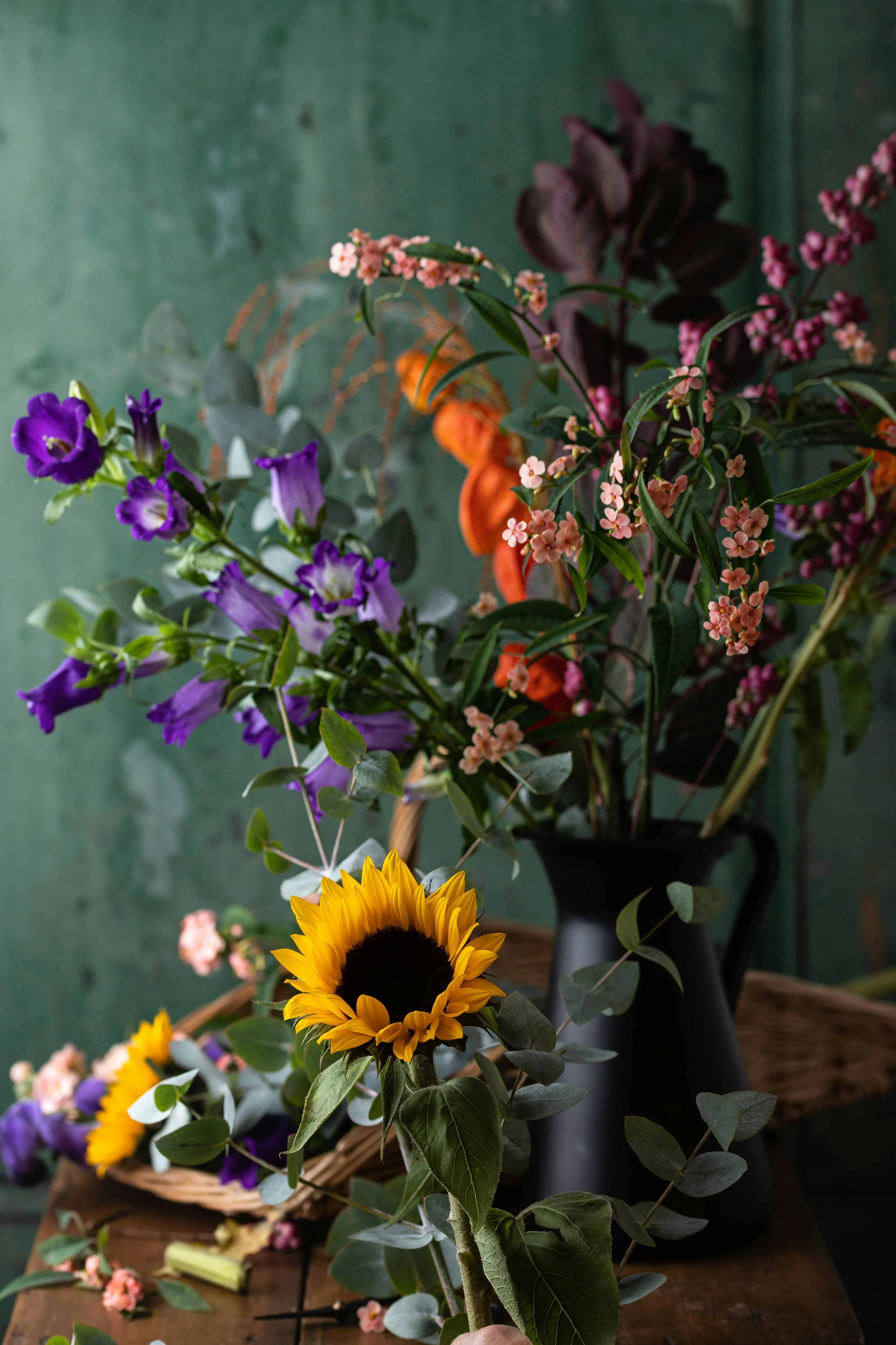
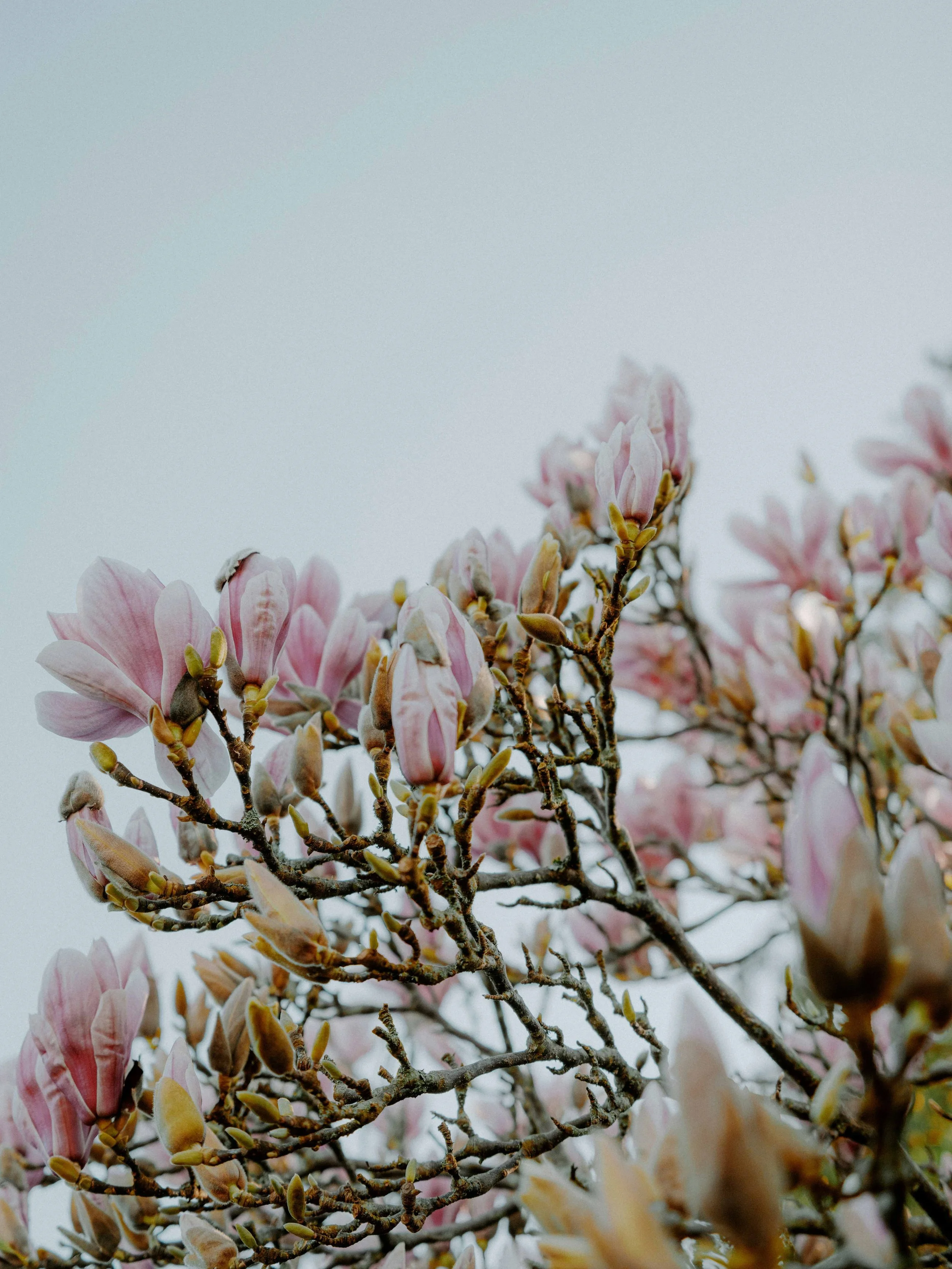
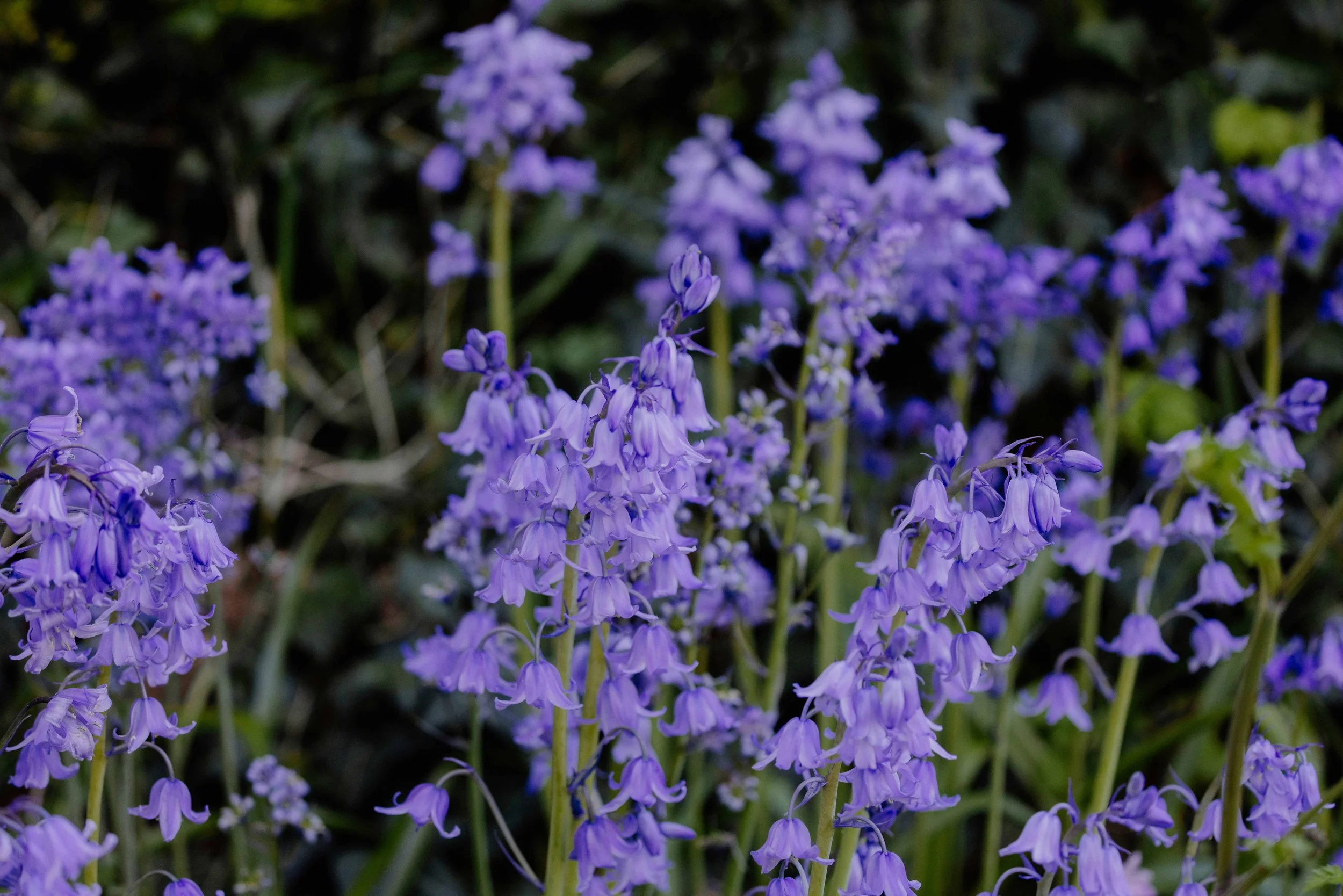
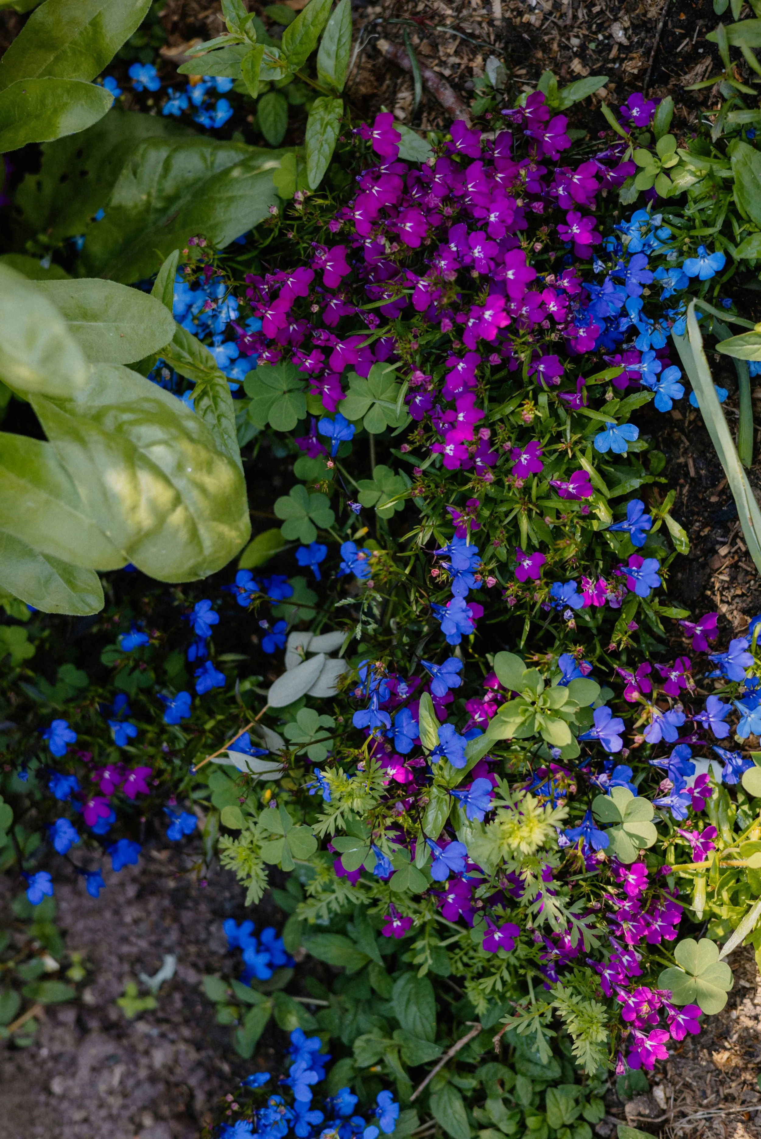
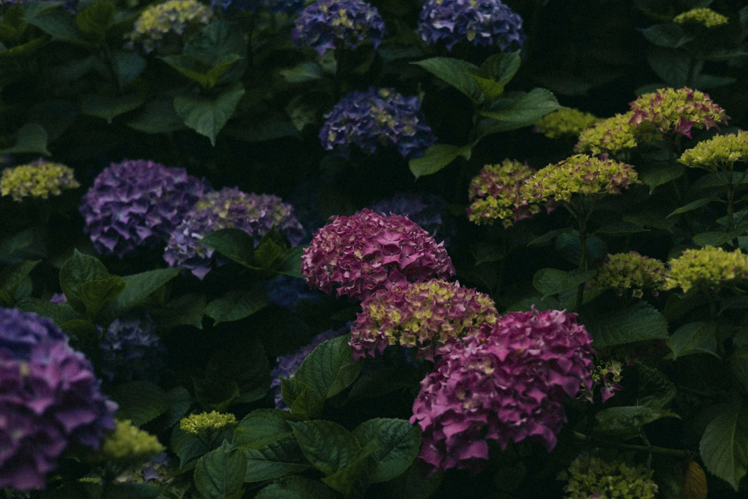
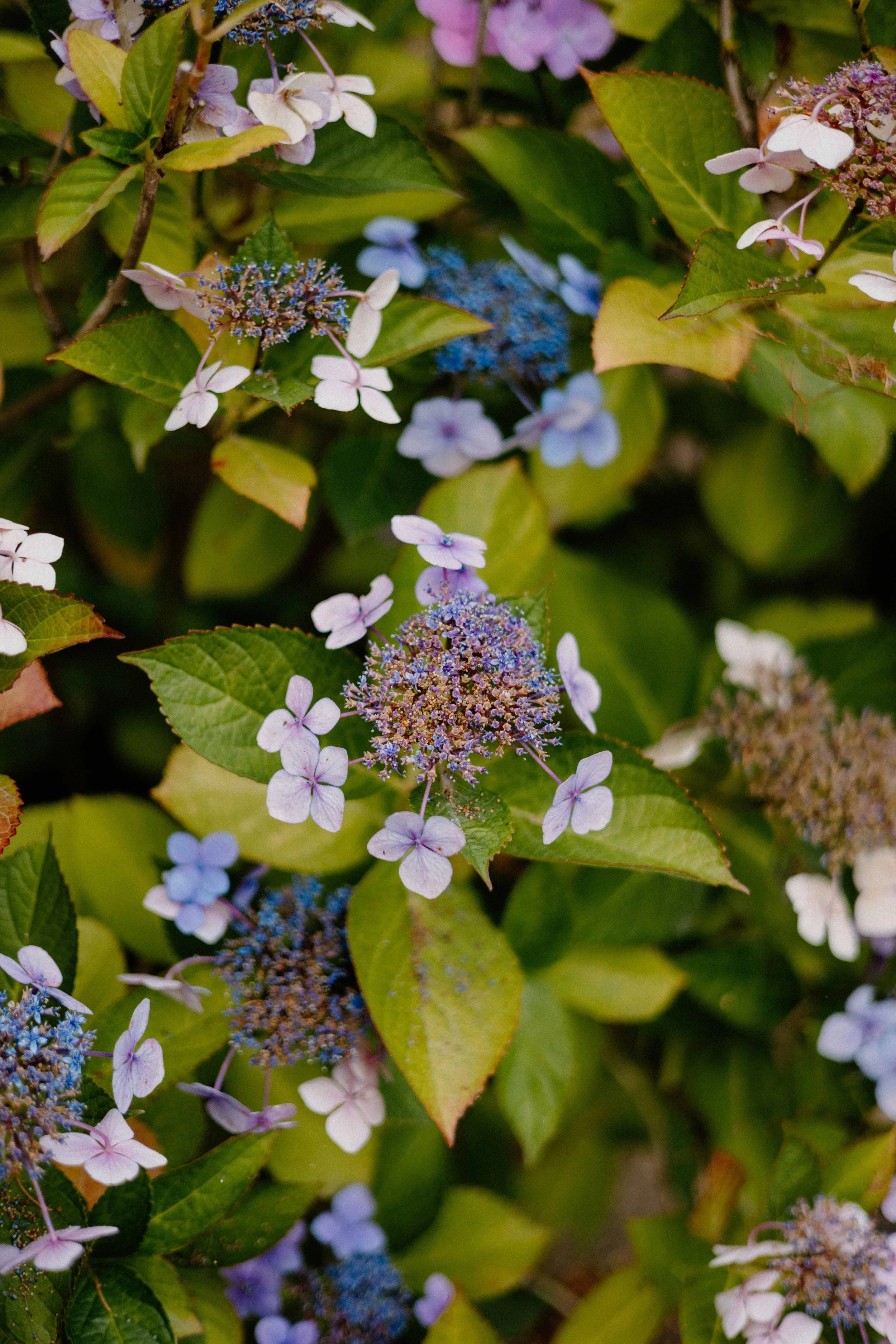
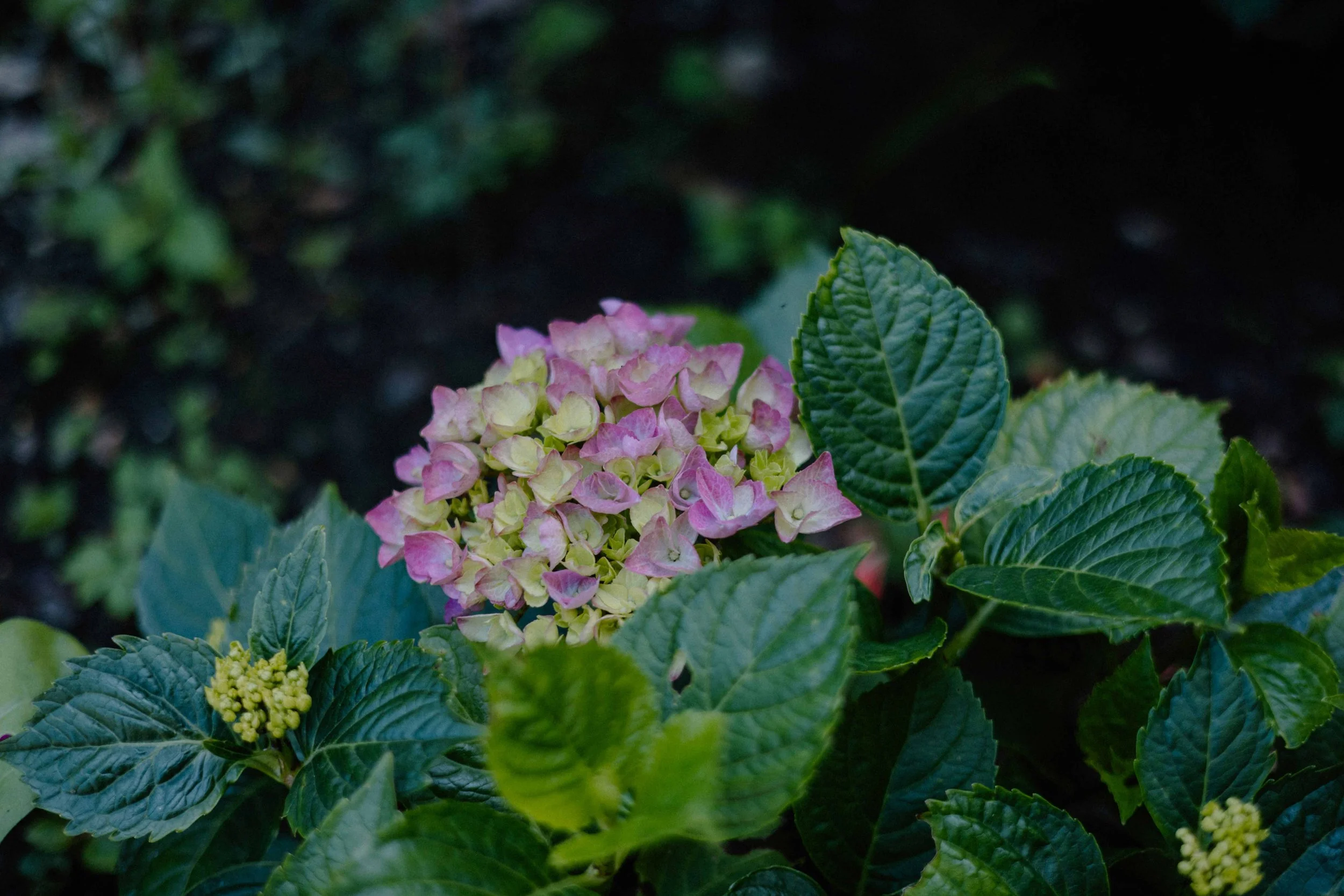
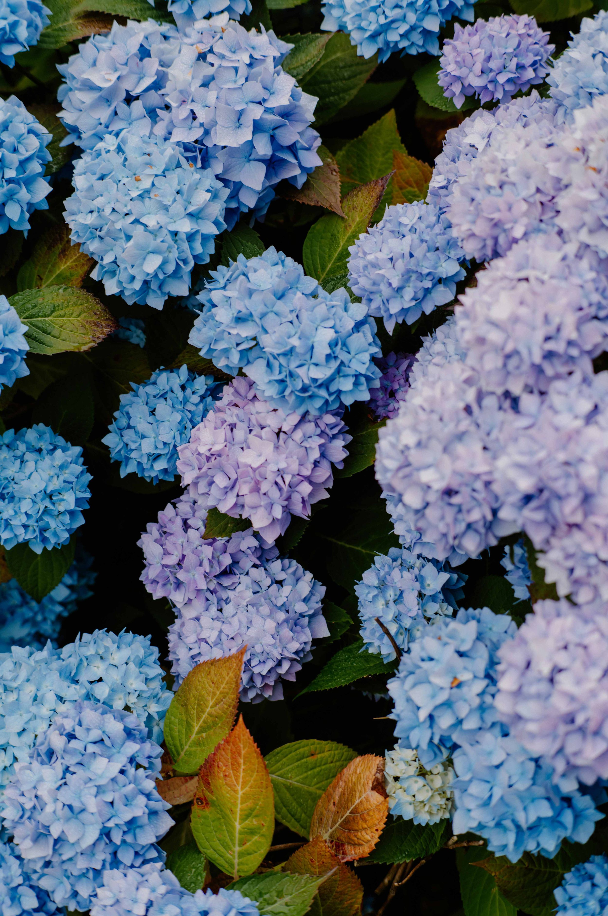
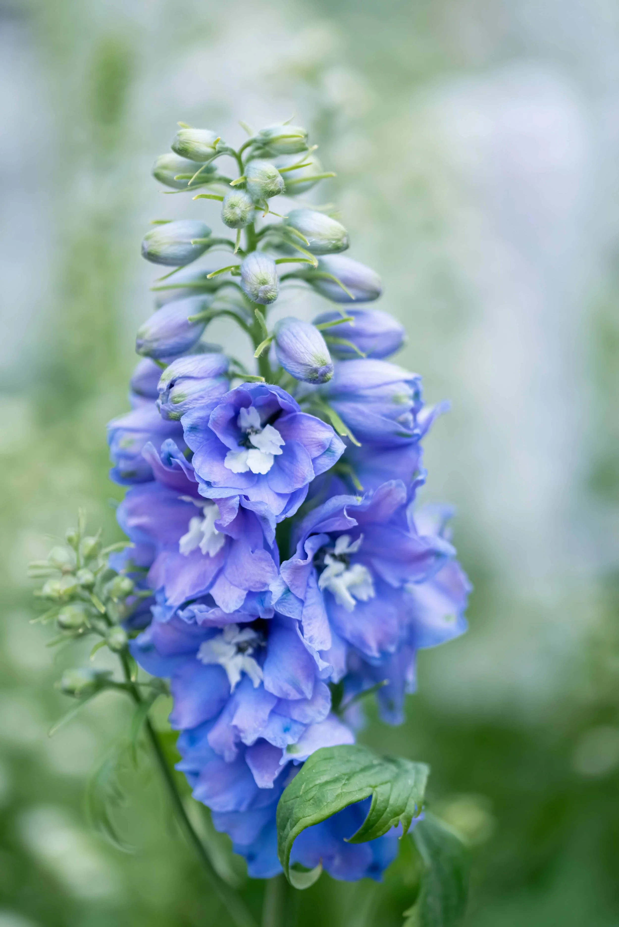
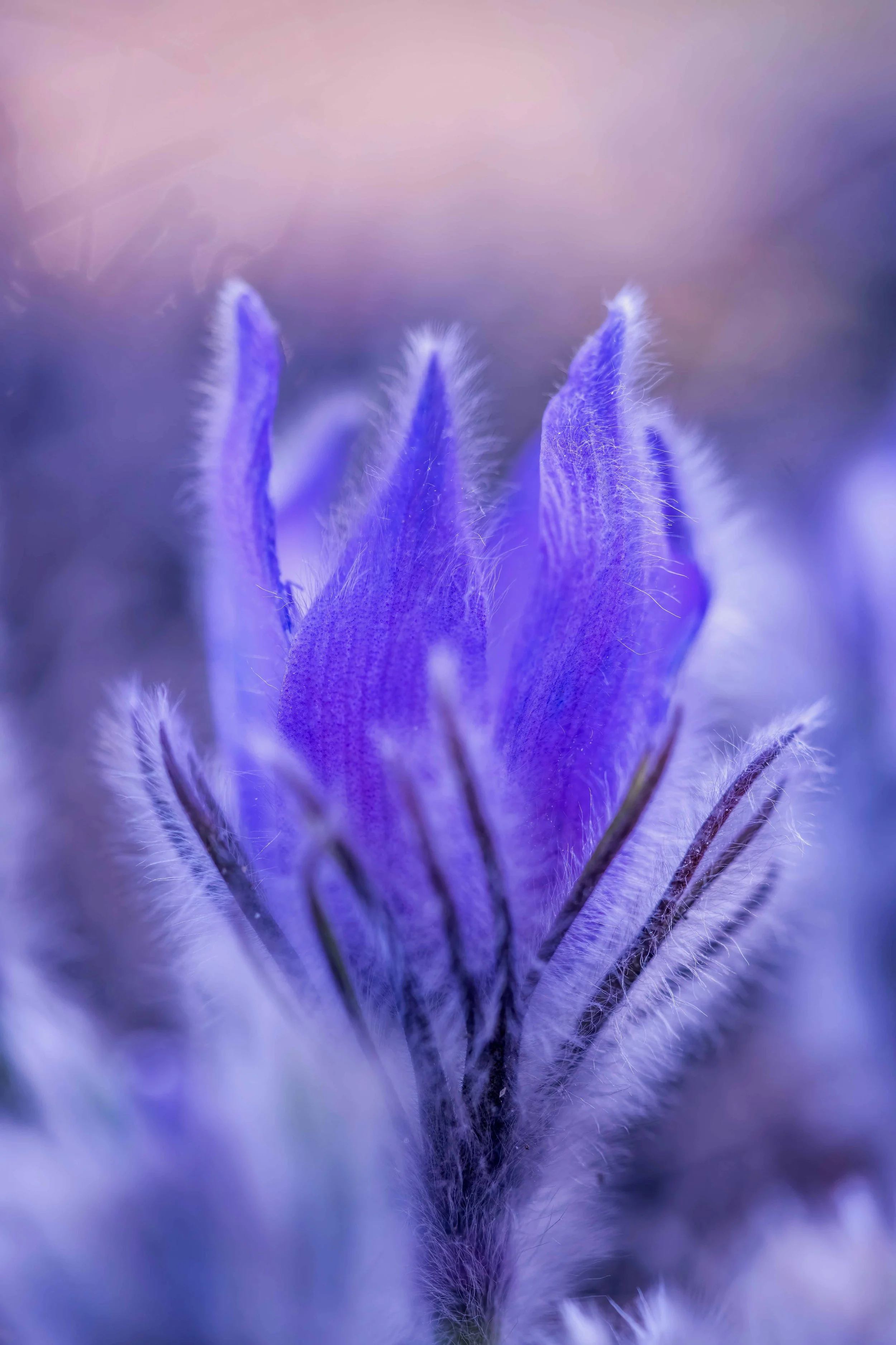
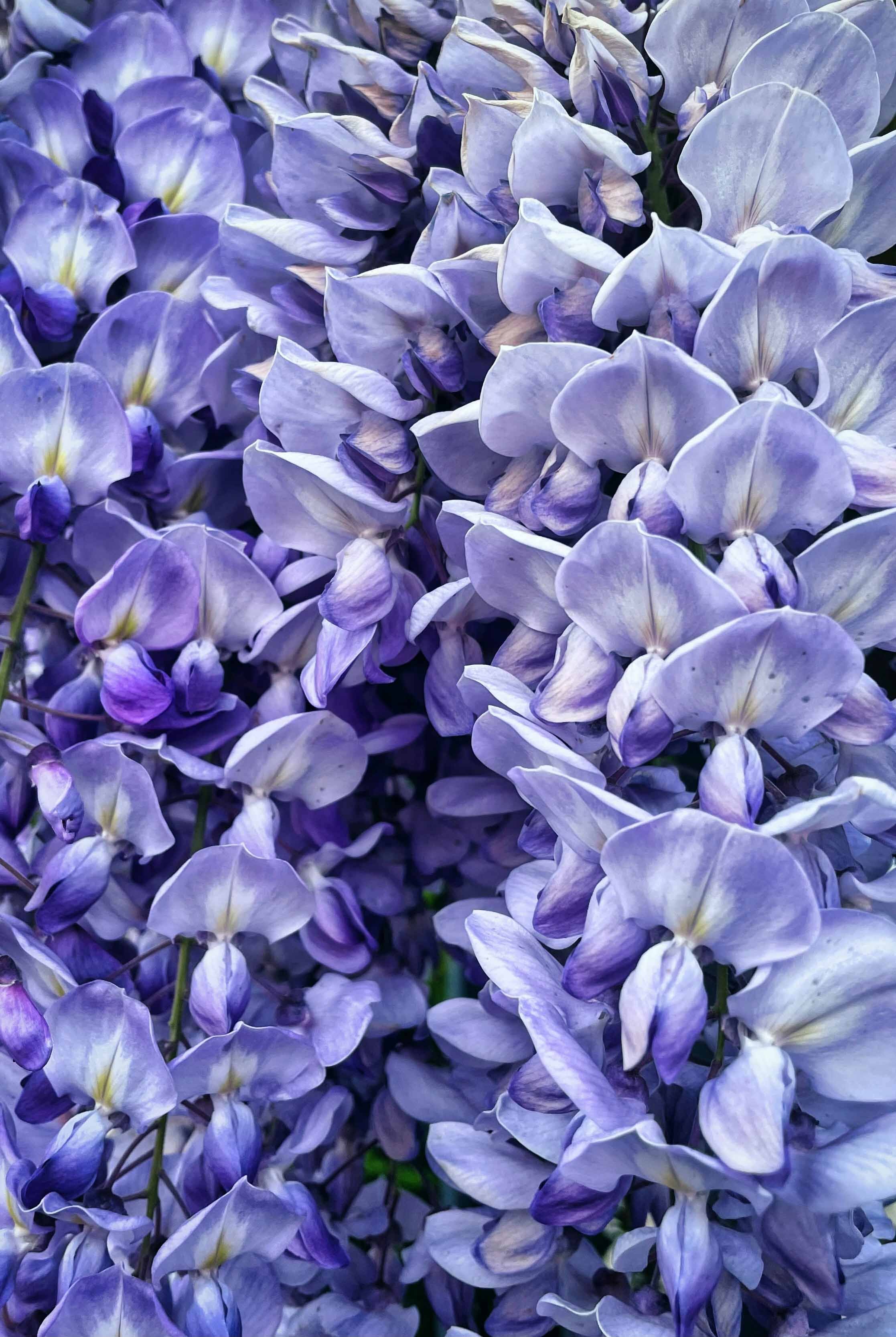
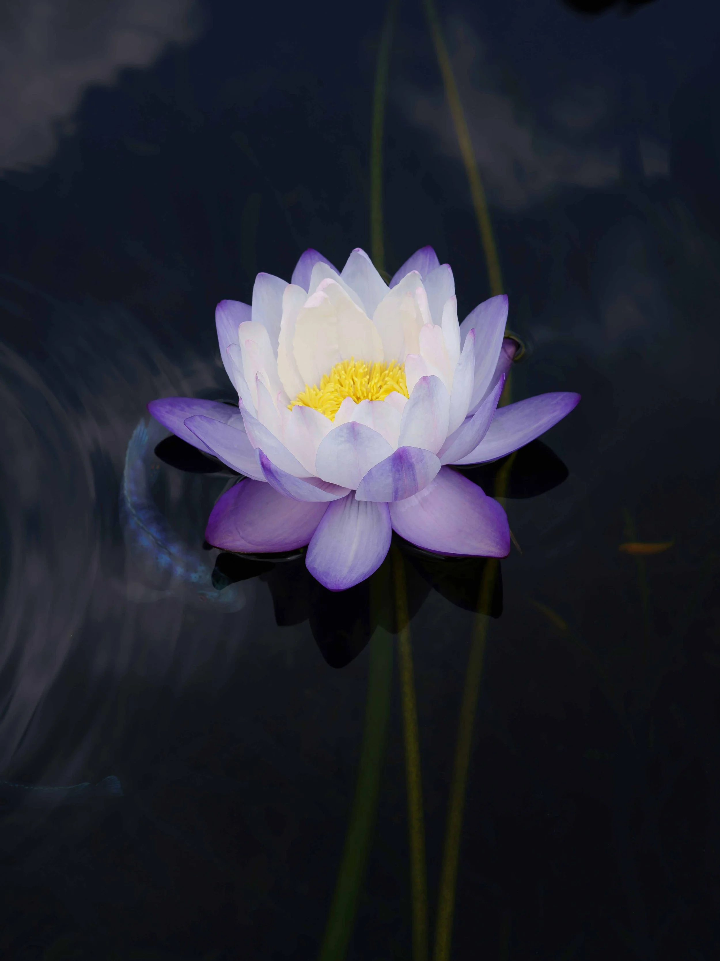
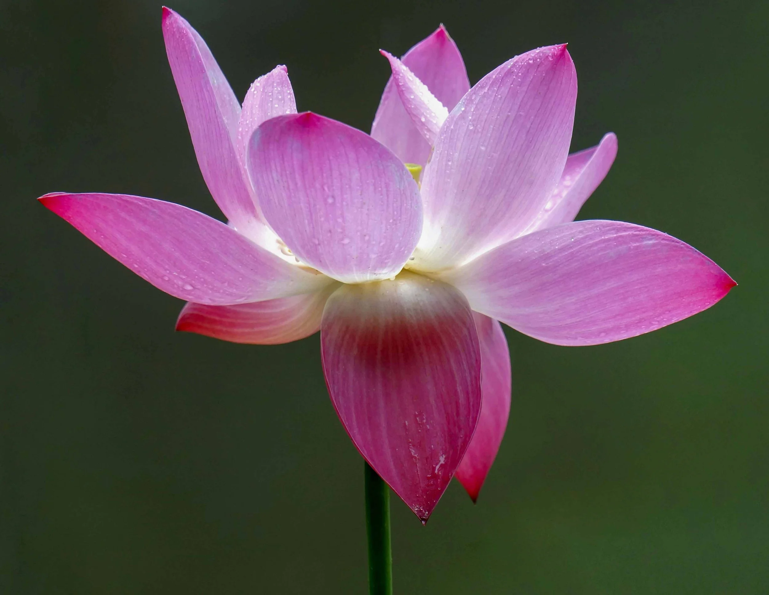
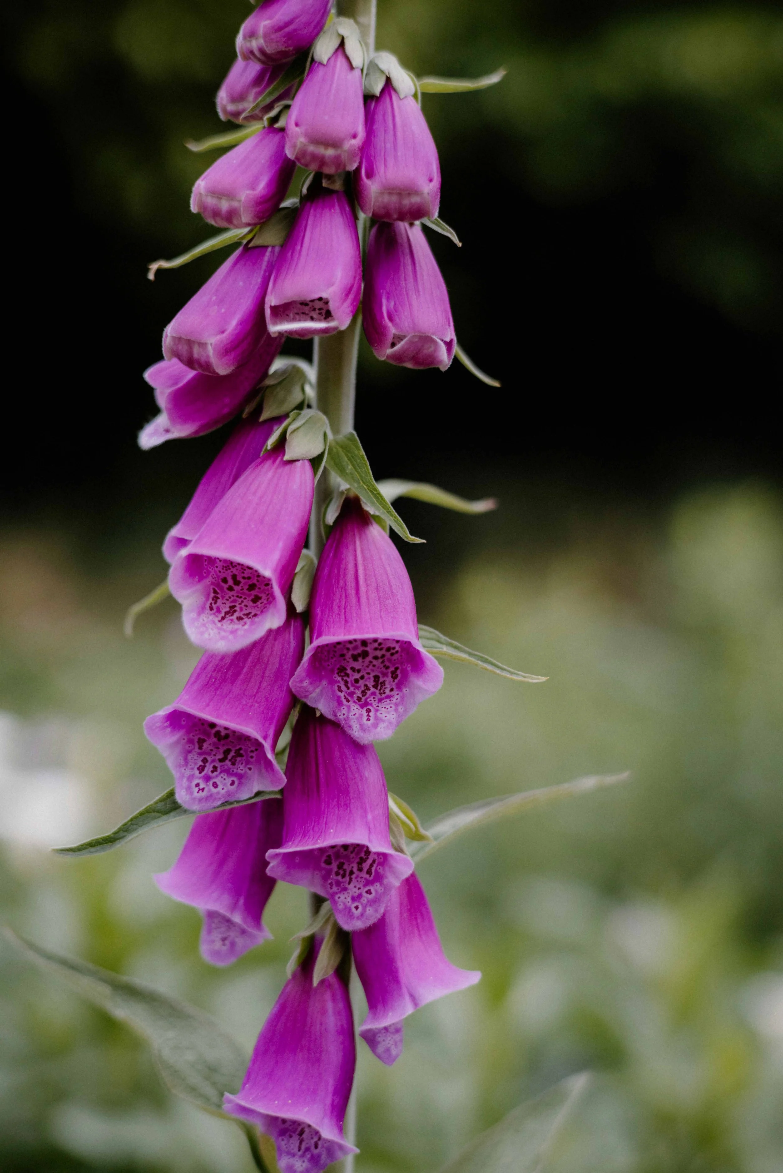
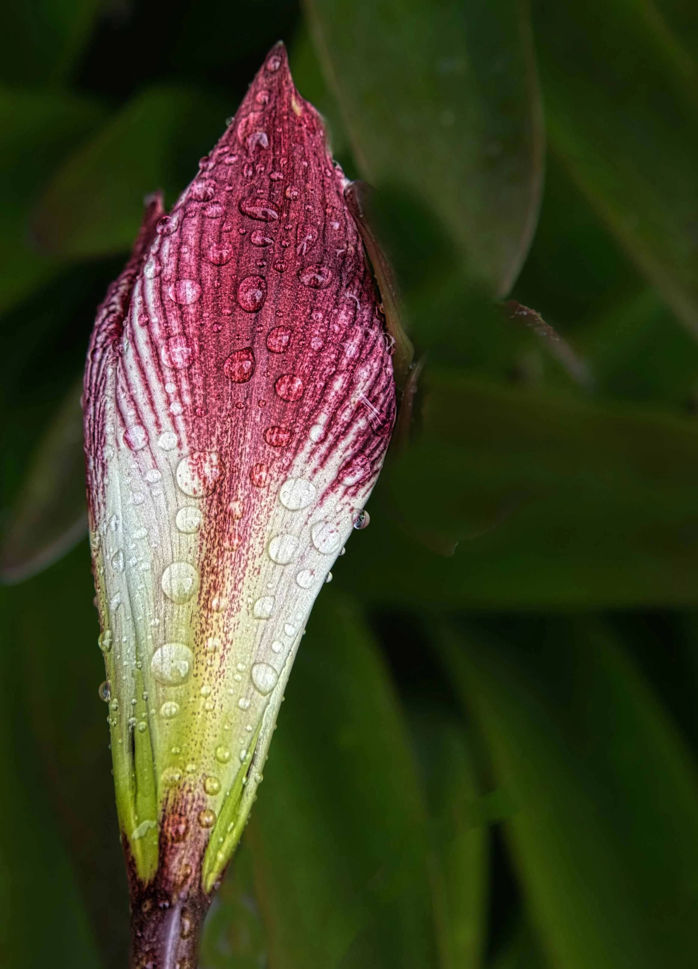
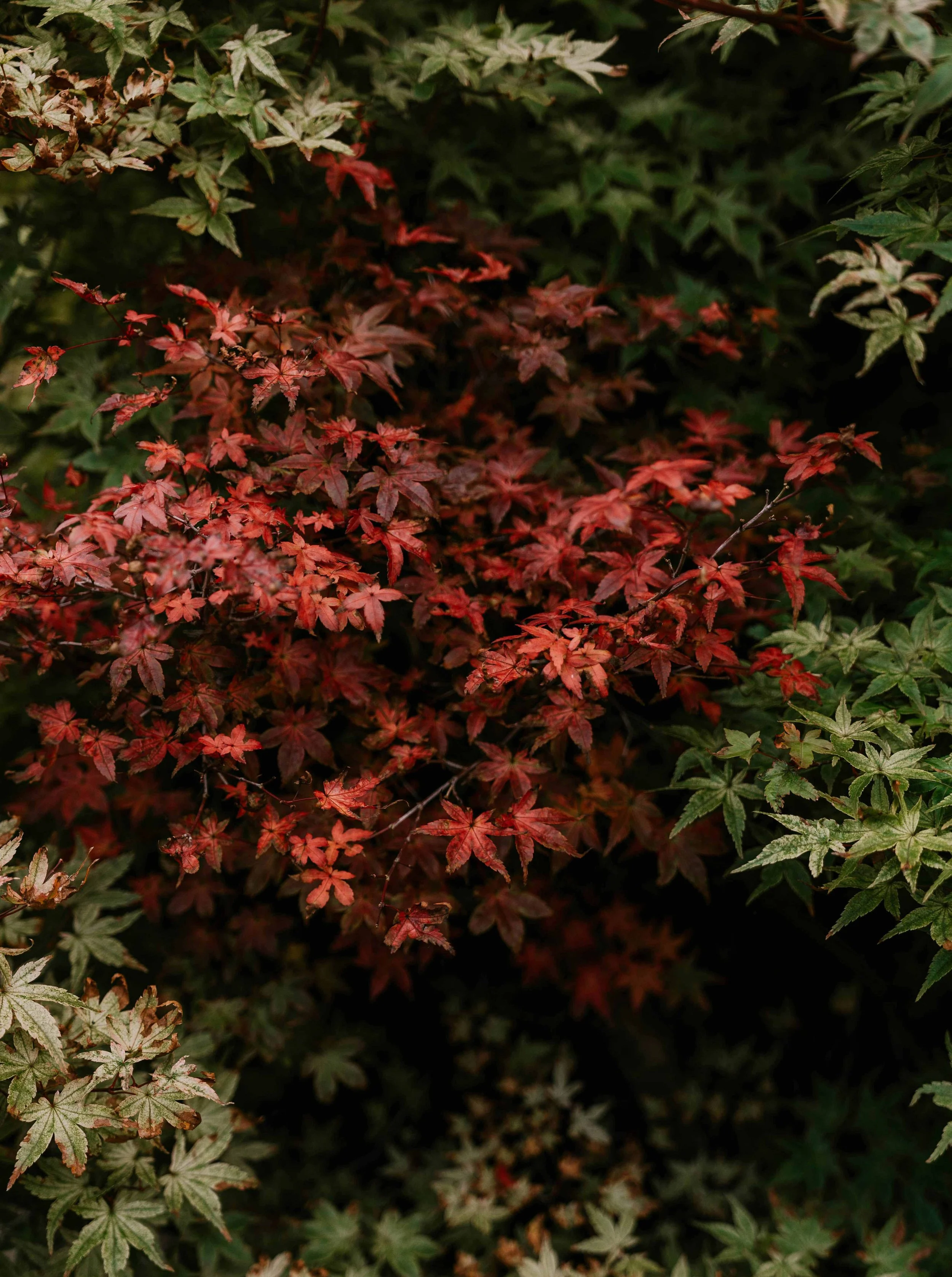
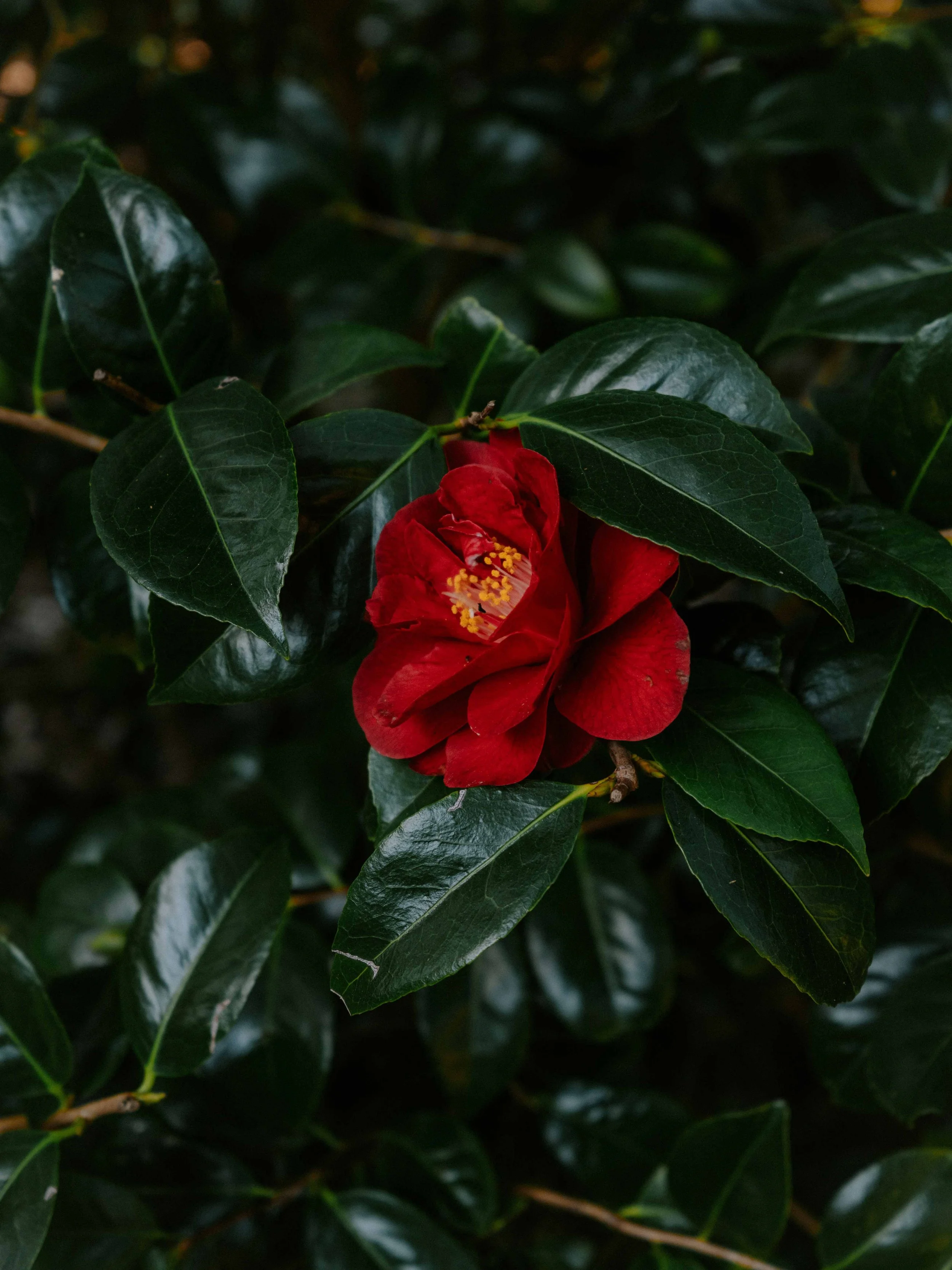
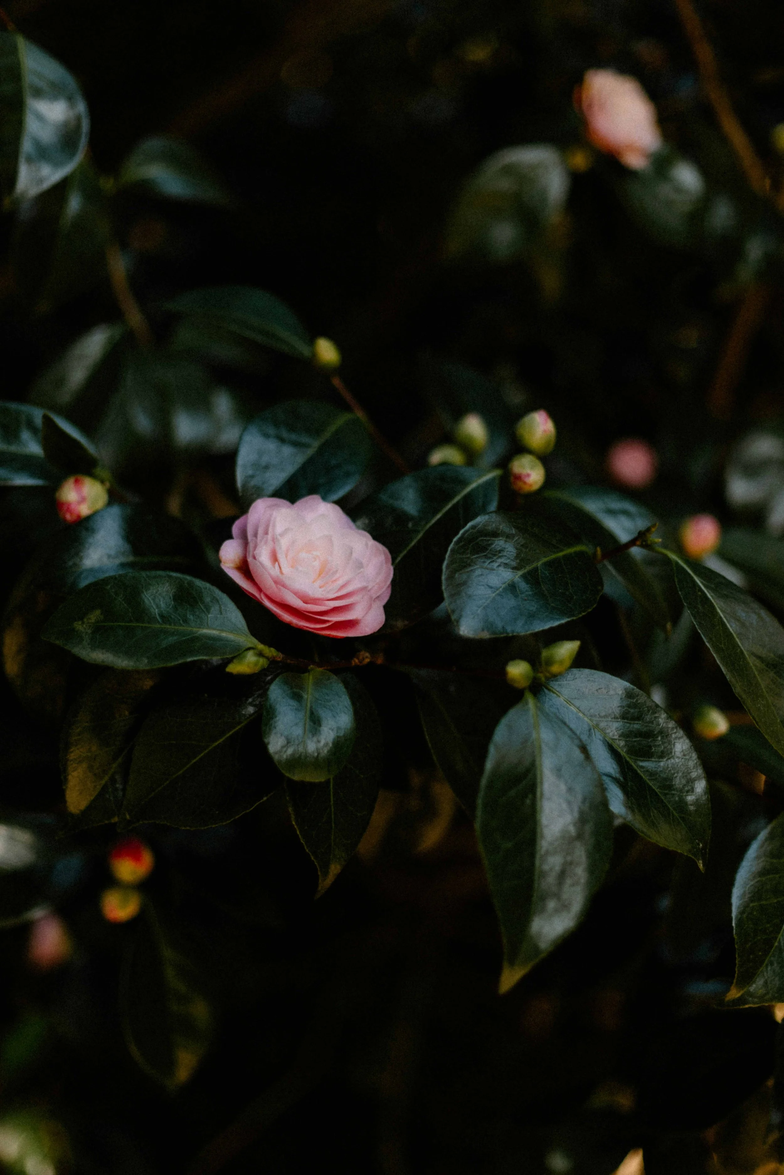
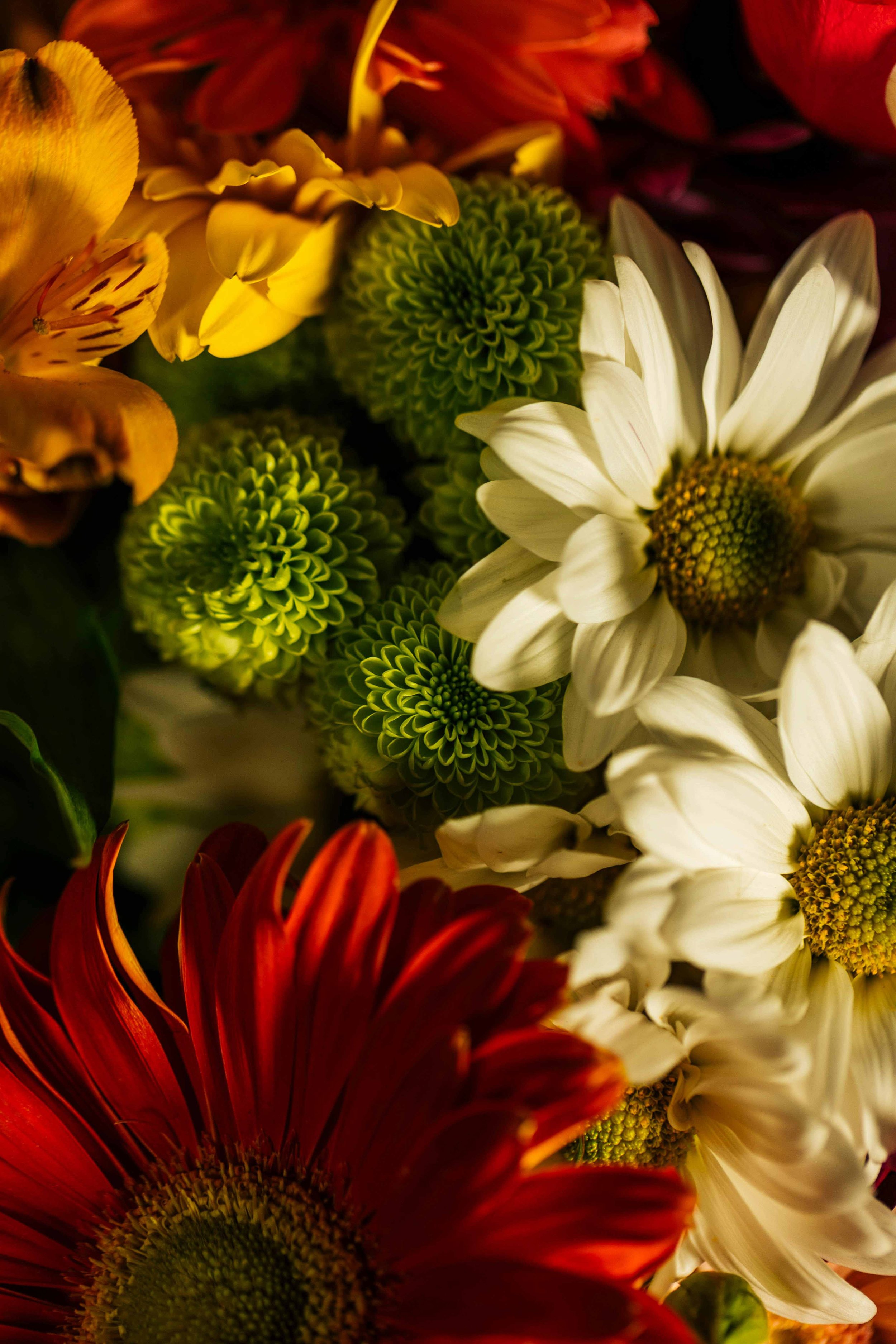
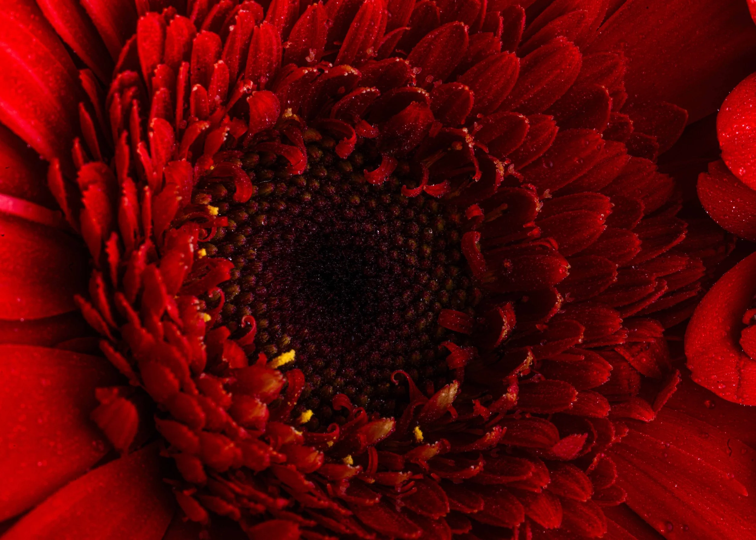
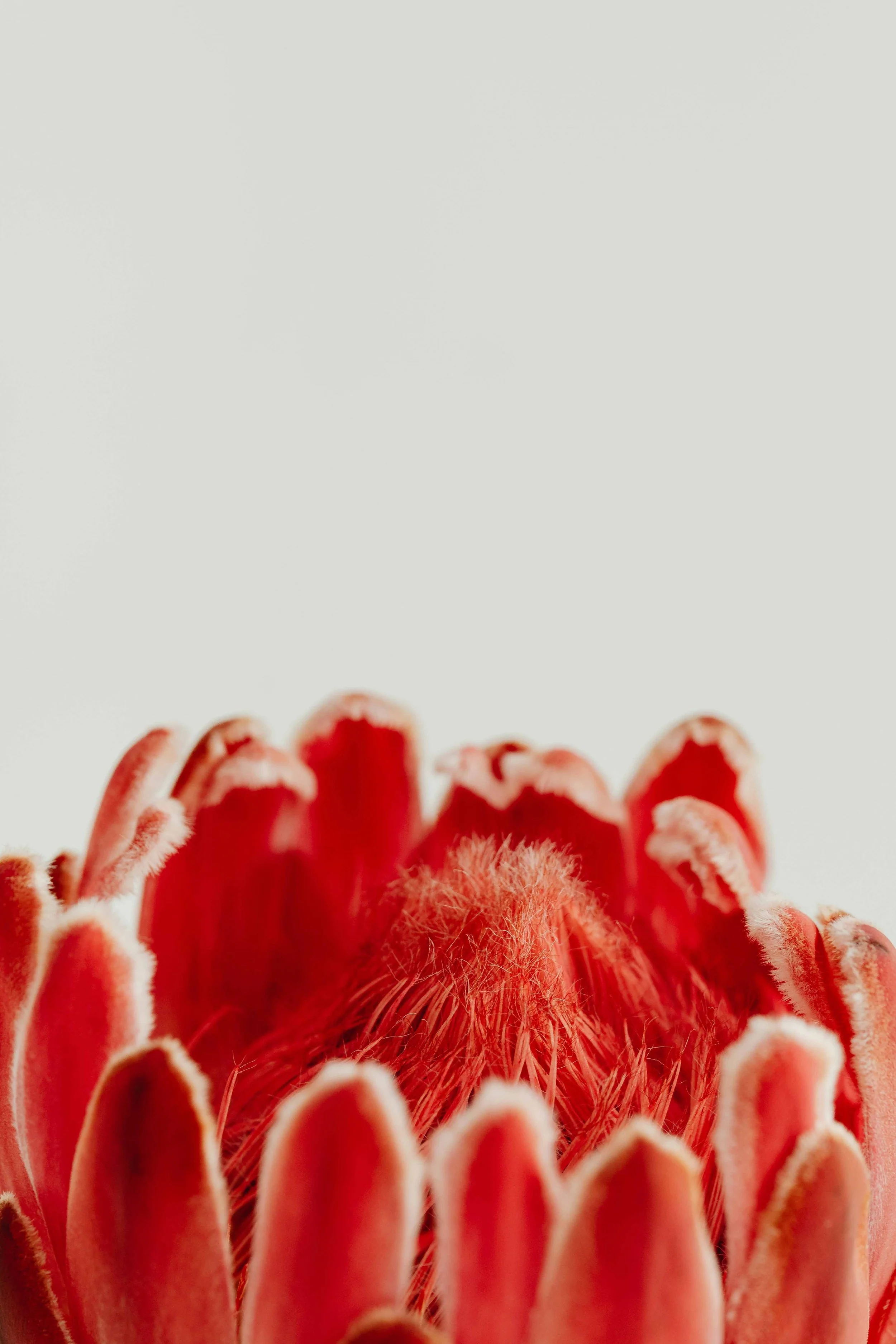
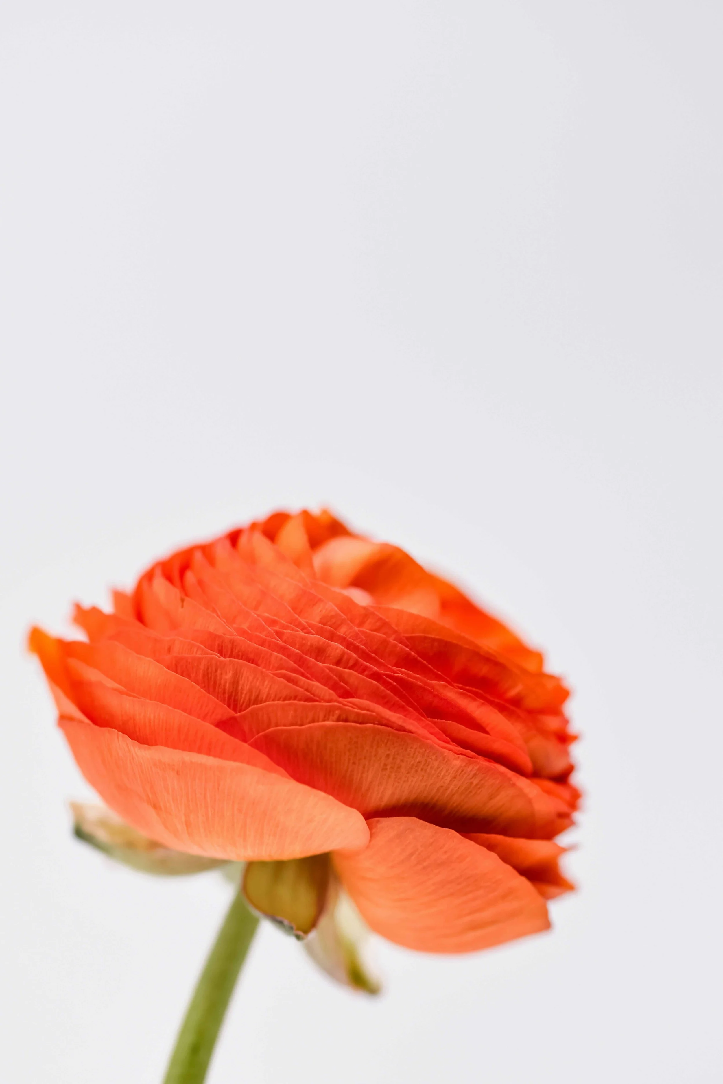
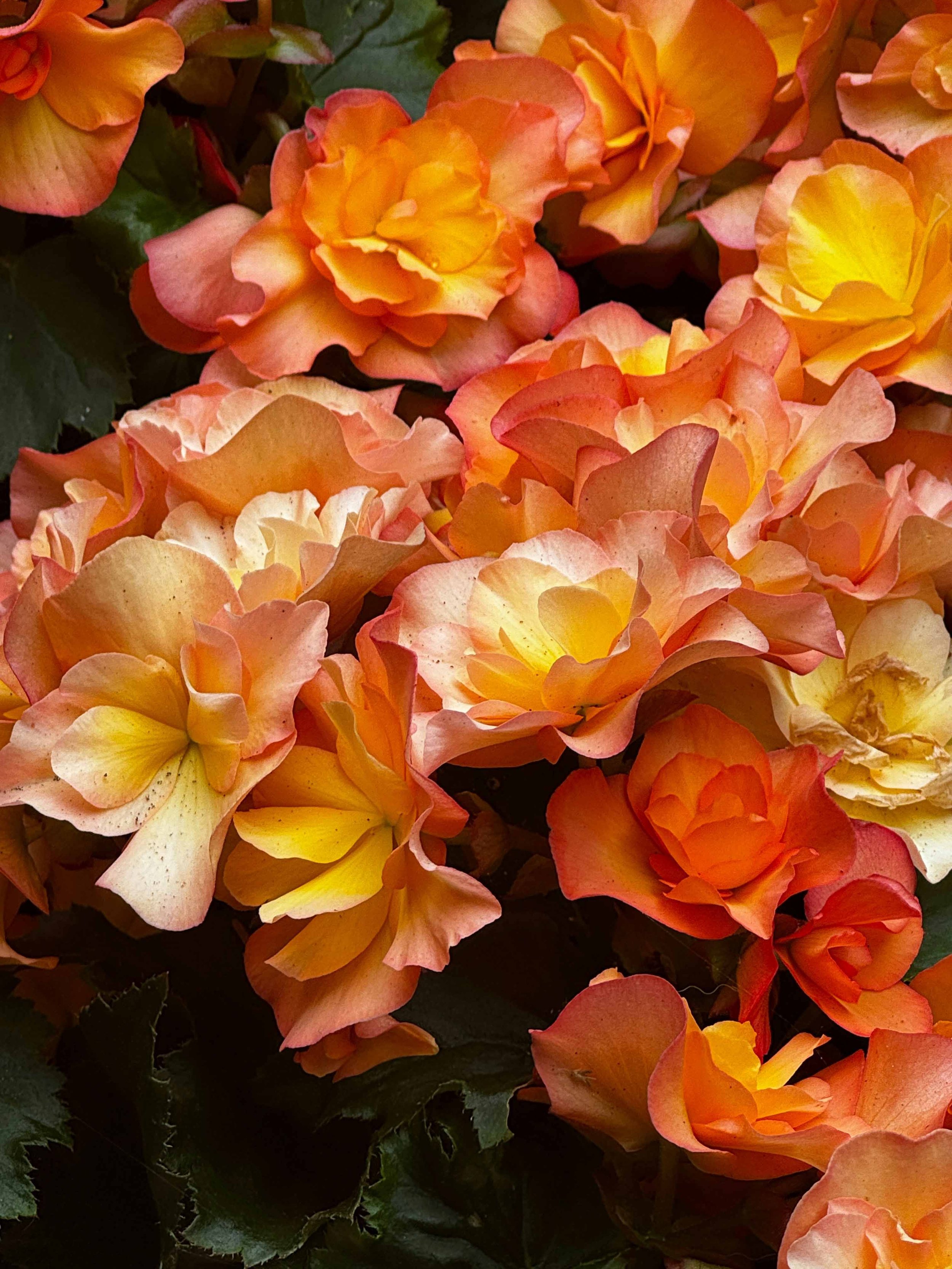
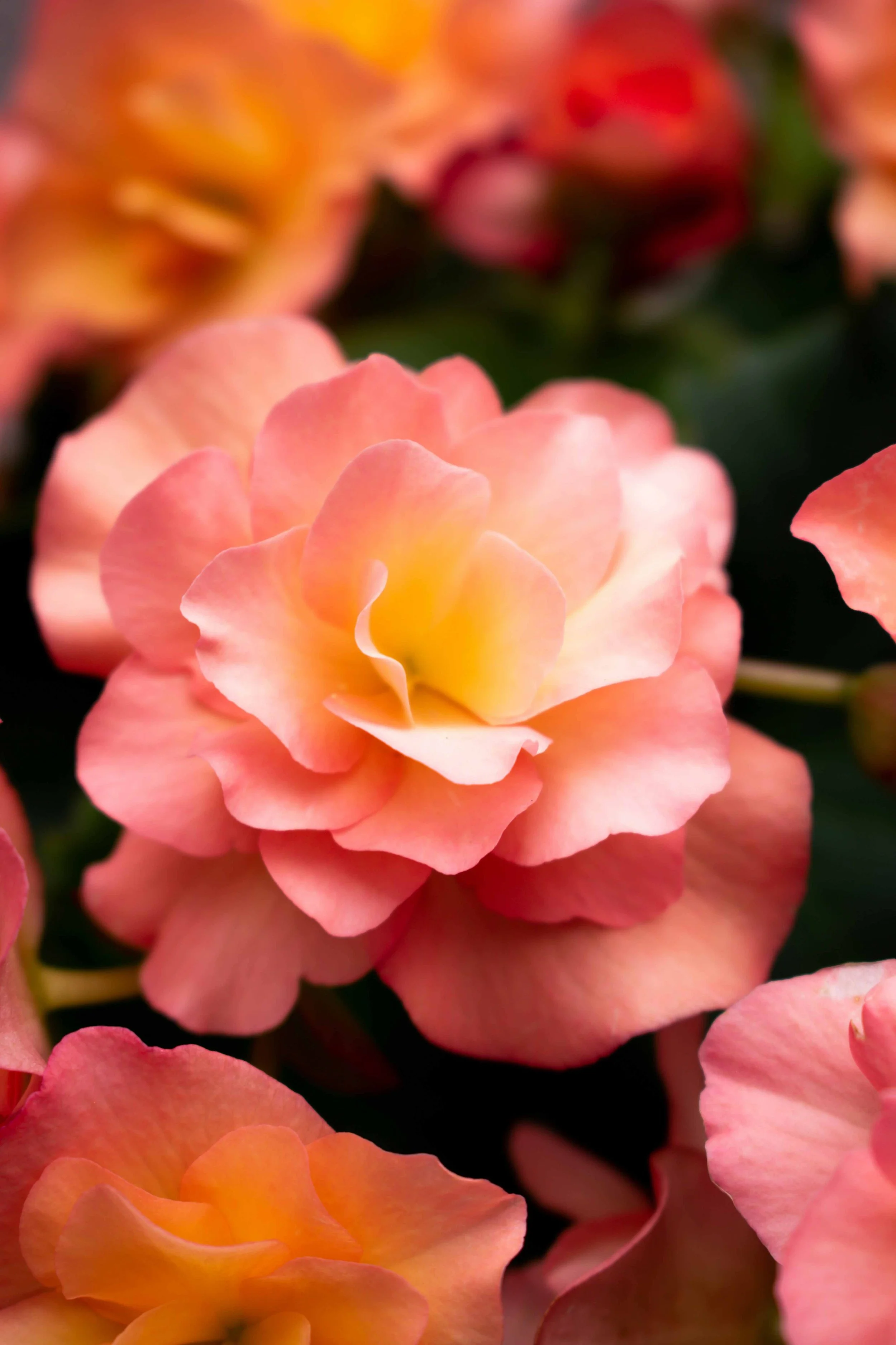
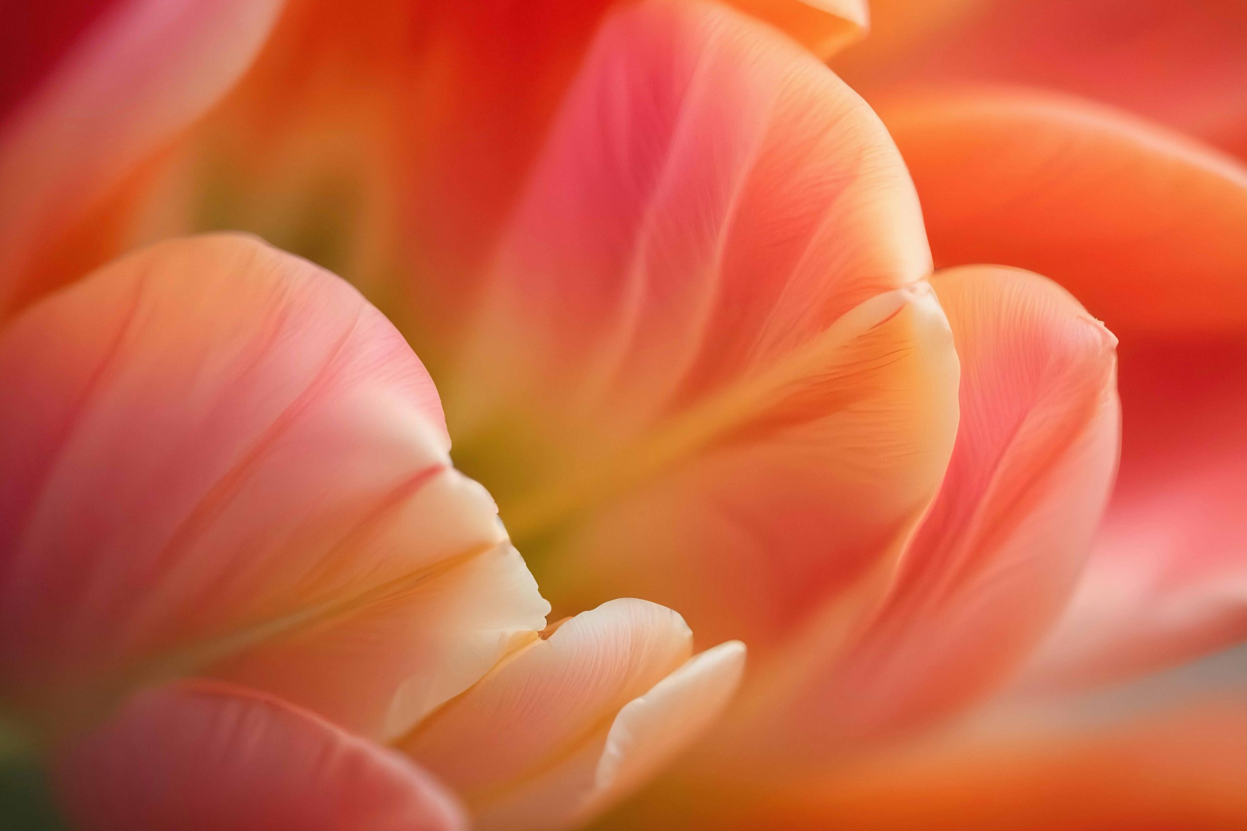
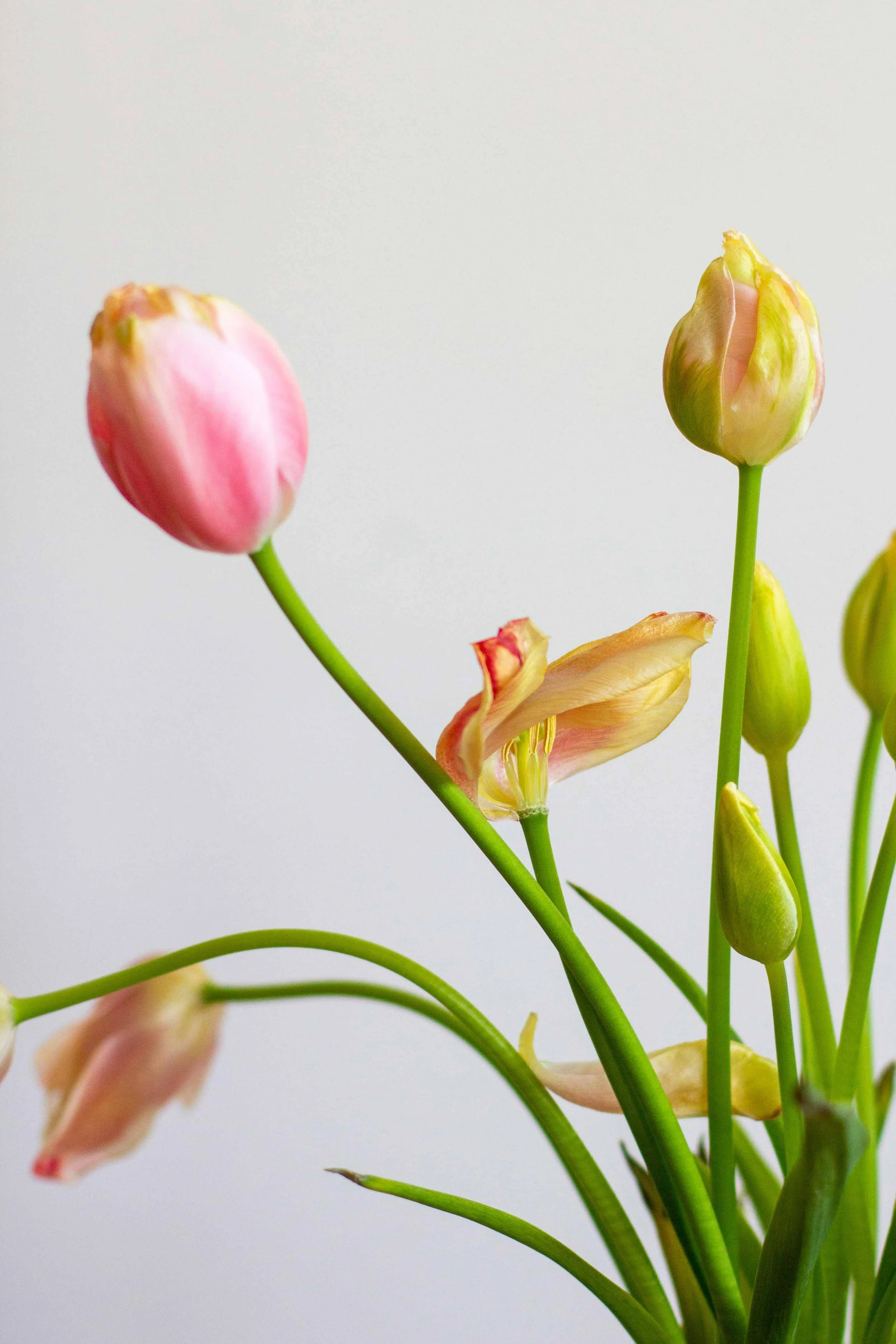
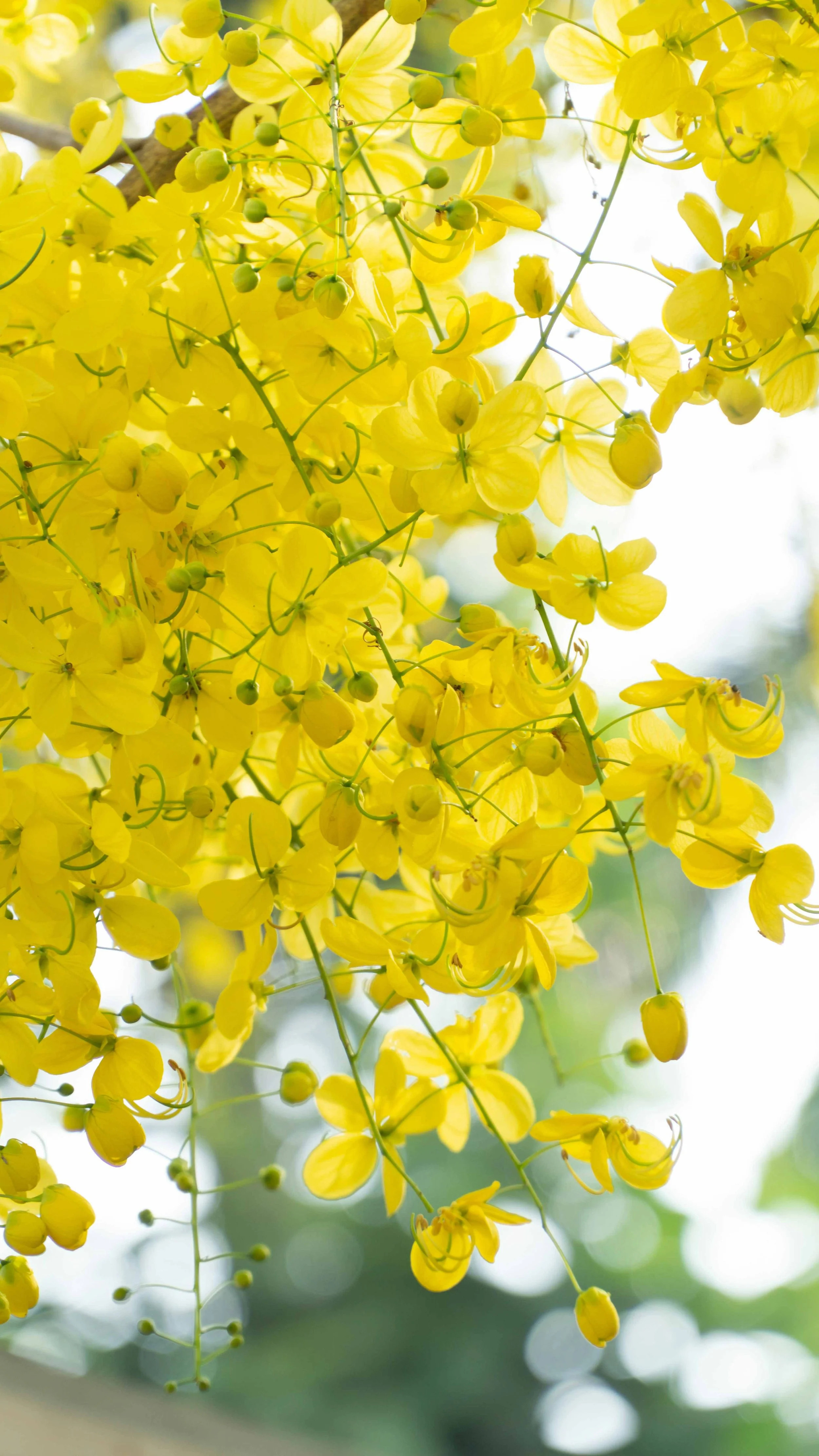
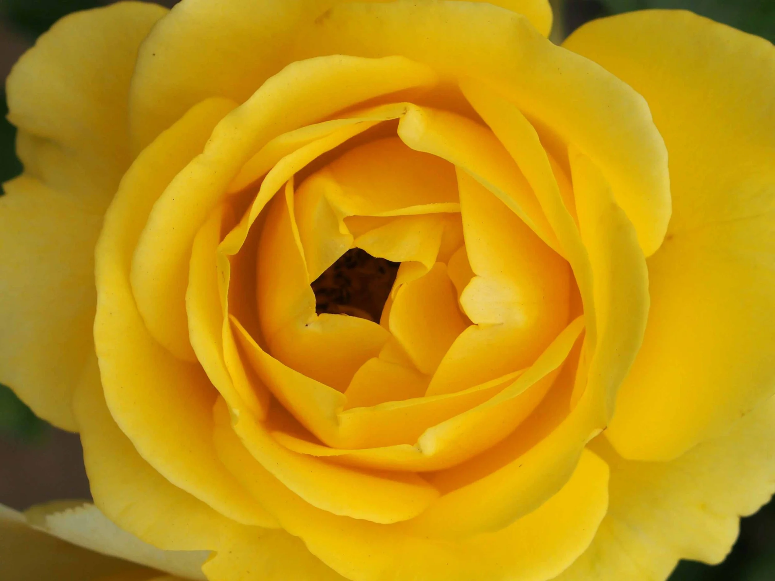
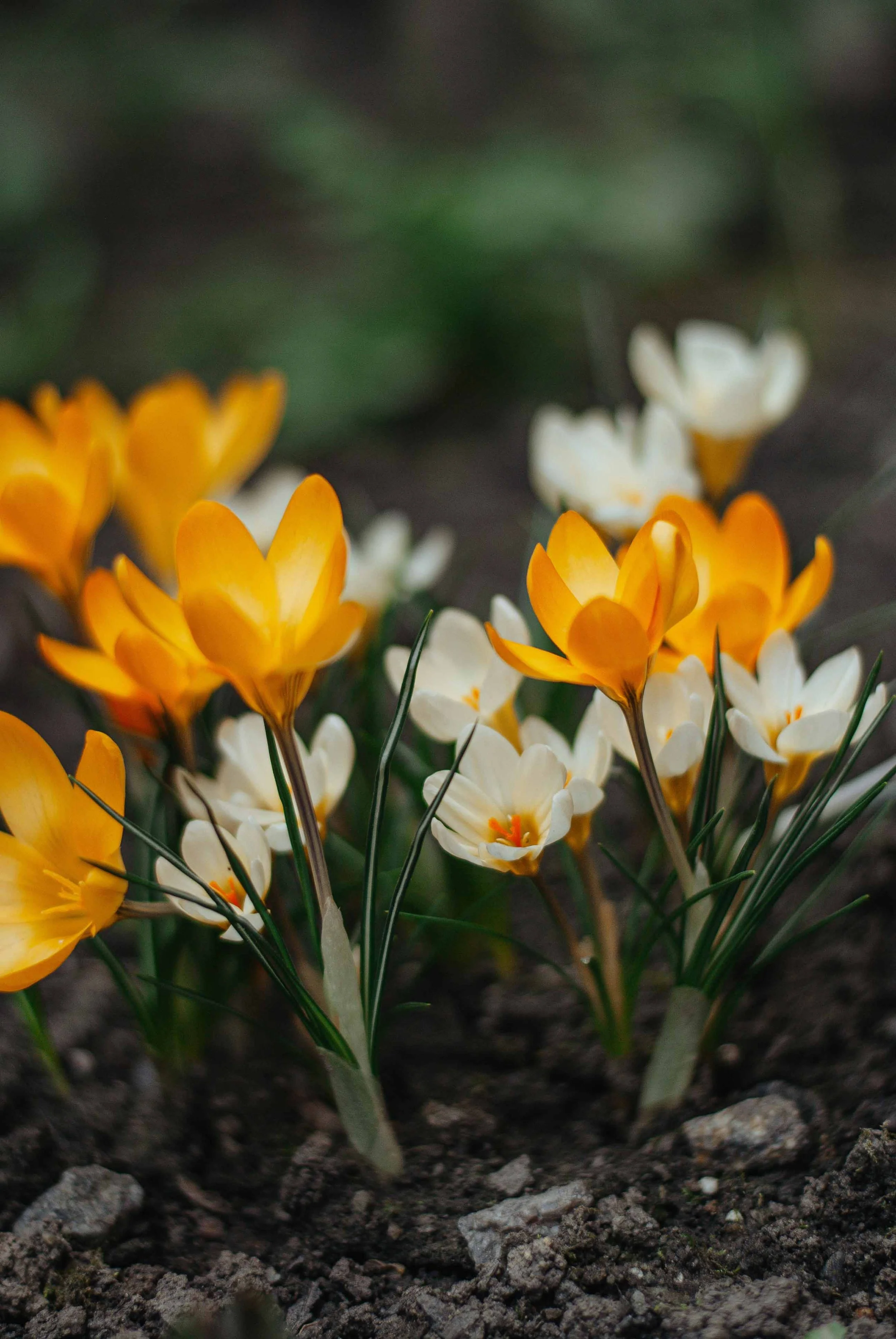
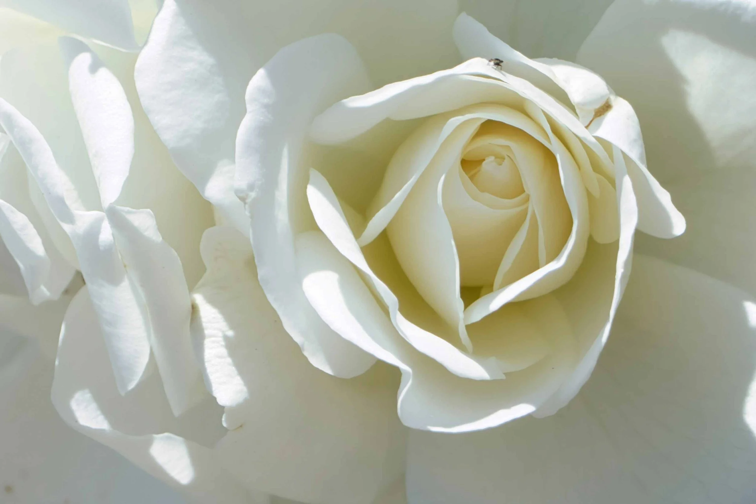
The image collection below offers a baseline for the journal’s color palette, as well as colors that can extend into the covers of the memoir and pocket edition. The gallery below begins with the mixed palette of floral shops and arrangements, followed by the colors of individual blossoms. While it might seem riotous at first glance, there is a through line with a mix of colors that balance saturation and delicateness, always with an eye to sophisticated color combinations and juxtapositions.